RSI Momentum & Trend Suite - O59 Elite QuantRSI Momentum & Trend Suite – O59 Elite Quant
Professional Market Structure & Momentum Analysis Tool
RSI Momentum & Trend Suite – O59 Elite Quant is a comprehensive technical analysis indicator designed to help traders better understand market momentum, trend structure, price reactions, and key support & resistance zones directly on the chart.
This indicator combines RSI-based momentum analysis, dynamic bar coloring, price action signals, and automatic trend & support/resistance detection into a single, clean visual framework.
🔹 Momentum & Bar Coloring Logic
The indicator includes a custom RSI momentum engine that evaluates short-term price changes and momentum strength.
Candles are automatically colored when momentum reaches critical zones:
Above 70 → Strong bullish momentum
Below 30 → Strong bearish momentum
This candle coloring helps traders instantly recognize momentum extremes without switching to a separate RSI pane.
🔺 Buy & Sell Triangle Signals
The script generates triangle-based buy and sell signals based on a combination of:
RSI oversold / overbought conditions
Short-term price action behavior
Candle structure and confirmation logic
These signals are intended to highlight potential reaction zones, not to predict the market.
They work best when used together with trend direction and support/resistance levels.
📈 Automatic Trend Detection
The indicator automatically identifies ascending and descending trend structures using pivot-based swing analysis.
Trendlines are drawn dynamically based on higher lows and lower highs
Broken trendlines are automatically removed to keep the chart clean
Both bullish and bearish trends are visually distinguished
This allows traders to quickly assess whether the market is trending or losing structure.
🟦 Dynamic Support & Resistance Levels
Key support and resistance levels are detected using recent pivot points:
Levels extend forward in real time
Broken levels are removed automatically
Helps identify potential reaction, rejection, and liquidity zones
These levels are designed to adapt continuously as market structure evolves.
🧾 Information Table & Visual Themes
A customizable information table is displayed on the chart, showing:
Indicator name
Current symbol
Active timeframe
Author branding
Users can choose between multiple visual themes, allowing better readability and personal preference while maintaining a professional appearance.
⚠️ Important Notes & Risk Disclaimer
This indicator is designed as a technical analysis support tool only.
It does not provide financial advice
Signals and visual elements should not be used alone
Always confirm signals with your own strategy, risk management, and market context
⚠️ Special caution is advised during:
Low-volume sessions
Weekend price action
High-impact news events
Thin liquidity hours
Market conditions during these periods may produce false signals or reduced reliability.
📌 Final Disclaimer
This indicator is for educational and analytical purposes only.
It is not investment advice.
All trading decisions remain the sole responsibility of the use
Market

US Stock Market Performance by Sector[Dots3Red]This indicator displays the annual performance of the U.S. stock market by sector.
Selected major sectors
IND – Industrials
TECH – Technology
HTH – Healthcare
FIN – Financials
COMM – Communication Services
CONSCYC – Consumer Cyclical
CONSSTAP – Consumer Staples
ENERGY – Energy
REAL ESTATE – Real Estate
BASMAT – Basic Materials
The data is presented in a table below the main chart.
Green cell — the sector was bullish during that year
Red cell — the sector was bearish during that year
The table automatically sorts sectors by performance, placing the best-performing sector at the top for each year.
NOTE:
Annual performance is calculated starting from 2020 by default (arbitrarily chosen) and can be adjusted by the user.

[SUMIT] Trade line strategy 05:00pm to 11:00pmSUMIT INGOLE
This indicator is created by Sumit Ingole, a trader from Maharashtra, India, based on real-time market experience.
It helps identify market direction and clean entry zones with a simple structure.
Best used with proper risk management.

AI-Enhanced MSS HunterAI-Enhanced MSS Hunter
This indicator is a hybrid trading system that merges Mechanical Price Action (ICT Concepts) with Statistical Machine Learning (K-Nearest Neighbors). It is designed to assist traders in identifying high-probability reversals after liquidity sweeps, as well as trend-continuation entries during specific "Kill Zone" sessions.
How It Works
The script operates on a strict 3-step validation process to filter out false signals during choppy market conditions.
1. Liquidity Sweep (The Trigger) The system automatically plots the Previous Day High (PDH) and Previous Day Low (PDL).
The logic begins only when price "sweeps" (breaks) one of these key levels.
State Persistence: Once a level is swept, the system remembers this event for the remainder of the session (or until a signal fires), waiting for the market to reverse.
2. Market Structure Shift (The Setup) After a sweep, the indicator hunts for a Market Structure Shift (MSS).
It tracks dynamic Swing Highs and Swing Lows.
A signal is prepared only if price breaks a recent structural swing point in the opposite direction of the sweep (e.g., Sweep PDL -> Break Swing High).
3. AI / Machine Learning Filter (The Confirmation) To reduce false positives, the signal must be confirmed by a K-Nearest Neighbors (KNN) algorithm.
The Logic: The script analyzes the current values of RSI (14), CCI (14), and ROC (10).
The Comparison: It looks back at the last ~1,000 bars of history to find similar market conditions (neighbors).
The Prediction: If the majority of those historical "neighbors" resulted in a favorable move, the AI confirms the trade. If historical data suggests chop or reversal, the signal is blocked.
Key Features
🎯 Primary Reversal Signals (Circles)
Green Circle: Price swept PDL + Bullish MSS + AI Confirmation.
Red Circle: Price swept PDH + Bearish MSS + AI Confirmation.
♻️ Golden Zone Re-Entries (Triangles) Once a Primary Signal is active, the script tracks the new trend leg.
It automatically draws a dynamic Golden Zone (0.5 – 0.618 Fibonacci Retracement).
If price pulls back into this zone and forms a new MSS, a Re-Entry Triangle is plotted.
Invalidation: If the pullback breaks the original setup's low/high, the zone is removed to prevent bad trades.
⏰ Kill Zone Time Filters Signals are filtered by time to ensure you are trading during high-volume sessions.
Default AM Session: 08:30 – 10:00 (New York Time)
Default PM Session: 14:00 – 15:00 (New York Time)
Fully customizable in settings.
Settings Guide
Key Levels: Toggle PDH/PDL lines and customize colors.
Kill Zones: Enable/Disable time filtering and highlight background colors.
AI Settings:
K-Nearest Neighbors (k): Number of historical neighbors to compare (Default: 5).
Training Window: How far back the AI looks for patterns (Default: 1000 bars).
Visuals: Turn on/off the Golden Zone fib clouds or text labels.
Disclaimer
This tool is for educational purposes only. The "AI" component is a statistical classification algorithm based on historical momentum and does not guarantee future results. Always manage risk and use this indicator as part of a comprehensive trading plan.

Quant Labs Edge Filter (Community Edition)A market-structure filter designed to identify when no real edge exists.
Edge Filter evaluates price location relative to structure to define market posture — long bias, short bias, or stand aside. It does not generate trade signals and is intentionally designed to reduce overtrading.
Clear Posture States
Near Highs — Short Bias
Near Lows — Long Bias
No Edge — Stand Aside
When edge is absent, patience is the strategy.
Why It Stands Out
Most indicators encourage action.
Edge Filter encourages restraint.
Its purpose is to protect capital, attention, and decision quality by filtering out low-quality environments.
Community Edition
This version publishes the core logic openly for transparency and education.
Private access versions may exist for traders seeking continuity and stewardship.
Bottom Line
Trade less.
Trade better.
Wait for edge.
— QuantLabs

DkS Market Structure Breakout Strategy Crypto & ForexDkS Market Structure Breakout Strategy Crypto & Forex
🔍 Overview
DkSPro – Universal Market Analysis is a structure-based trading strategy designed for Crypto and Forex markets, focused on trend alignment, breakout confirmation, and volume validation.
This strategy is built to filter low-quality trades, avoid ranging conditions, and reduce false breakouts by requiring multiple layers of confirmation before any trade is executed.
It is intended for scalping and intraday trading, prioritizing consistency and risk control over trade frequency.
🧠 Strategy Logic (How It Works)
DkSPro follows a sequential decision process, not a single-indicator signal:
Trend Bias (EMA Structure)
A fast and slow EMA define the directional bias.
Long trades are only allowed during bullish EMA alignment.
Short trades are only allowed during bearish EMA alignment.
This prevents counter-trend and ranging-market entries.
Market Structure & Breakout Validation
The strategy identifies recent swing highs and lows.
Trades are triggered only after a confirmed breakout of structure, not during consolidation.
This avoids early entries and false momentum moves.
Volume Confirmation
Volume must exceed its moving average by a defined multiplier.
This ensures participation and filters out low-liquidity breakouts.
Volume thresholds adapt depending on the selected trading mode.
Momentum Confirmation (RSI)
RSI is used strictly as a momentum filter, not as a standalone signal.
It confirms that price movement aligns with the breakout direction.
Risk Management (Mandatory)
Every position includes a predefined Stop Loss and Take Profit.
Position sizing is based on a fixed percentage of equity, keeping risk per trade within sustainable limits.
All conditions must align simultaneously; otherwise, no trade is executed.
⚙️ Trading Modes
SAFE Mode
Stronger volume and RSI thresholds
Fewer trades, higher selectivity
Designed for risk control and consistency
AGGRESSIVE Mode
Slightly relaxed filters
Higher trade frequency during strong momentum
Intended for experienced users only
📊 Markets & Assets
This strategy has been actively used and tested on:
🟢 Crypto (Binance / Binance.US)
SOL-USDT
XRP-USDT
Other high-liquidity pairs (BTC, ETH)
Crypto mode benefits from stronger volume confirmation to adapt to higher volatility.
🔵 Forex
Major pairs such as EURUSD, GBPUSD, USDJPY
Optimized for liquid markets with lower relative volume
The same structural logic applies to both markets, with volume behavior naturally adapting to each asset class.
⏱ Recommended Timeframes
Crypto: 5m – 15m
Forex: 15m – 1H
Lower timeframes (1m) are not recommended due to noise and unreliable volume behavior.
🧪 Backtesting & Settings Transparency
Default strategy properties are intentionally conservative to reflect realistic conditions:
Initial capital: $20,000
Position size: 2% of equity
Commission: 0.08%
Slippage: 1 tick
Fixed Stop Loss and Take Profit on every trade
Backtests should be performed on sufficient historical data (ideally 6–12 months) to ensure a statistically meaningful sample size (100+ trades).
📈 Originality & Usefulness
DkSPro is not a simple indicator mashup.
Each component serves a specific role in a layered confirmation system:
EMAs define direction
Structure defines timing
Volume validates participation
RSI confirms momentum
Risk management controls exposure
Removing any layer significantly reduces signal quality. The strategy is designed as a complete decision framework, not a signal generator.
⚠️ Important Notes
This script is an analysis and execution tool, not financial advice.
Market conditions change, and no strategy performs well in all environments.
Users are encouraged to backtest, forward test, and adjust position sizing according to their own risk tolerance.
🧩 Version Notice
This publication represents a consolidated and refined version of an internal experimental script.
No parallel or duplicate versions are intended.
All future improvements will be released exclusively using TradingView’s Update feature.
🇪🇸 Descripción en Español (Resumen)
DkSPro es una estrategia basada en estructura de mercado, diseñada para Crypto y Forex, que combina tendencia, ruptura de estructura, volumen y control de riesgo.
Solo opera cuando todas las condiciones se alinean, evitando rangos, falsas rupturas y sobreoperar.
Ha sido utilizada en Binance con pares como SOL-USDT y XRP-USDT, así como en Forex, siempre con gestión de riesgo fija y condiciones realistas.

Gap Tracker Indicator v5Gap Tracker Indicator - Description
Purpose: The Gap Tracker identifies price gaps on charts and visualizes unfilled gap zones that may act as future support/resistance levels.
What it shows:
Gap zones as colored rectangles:
Red boxes = bearish gaps (price gapped down, leaving unfilled space above)
Green boxes = bullish gaps (price gapped up, leaving unfilled space below)
How gaps form:
A gap occurs when the opening price of one candle is significantly different from the closing price of the previous candle
Common after weekends, holidays, or major news events when markets are closed
Gaps create "empty" price zones with no trading activity
Trading significance:
Many traders believe gaps tend to "fill" eventually (price returns to the gap zone)
Unfilled gaps can act as magnetic levels - price often revisits them
Gap zones may provide support (bullish gaps) or resistance (bearish gaps)
On your chart:
Multiple red boxes show unfilled bearish gaps where price gapped down
Green boxes show unfilled bullish gaps where price gapped up
The indicator tracks these zones until price fills them completely
Right side shows "GAP TRACKER" panel with active gaps: Aktywne (2), Zamknięte (9), Zakres 7d (168)
Key insight: The concentration of unfilled gaps suggests potential magnetic zones where price may return for "gap fill" trades. Traders often use these levels for entries, exits, or stop placement.

Trade Decision MatrixTrade Decision Matrix (TDM)
Trade Decision Matrix (TDM) is a professional-grade, multi-phase market intelligence indicator designed to assist traders in understanding market structure, regime behavior, capital confidence, and execution readiness using a systematic, probabilistic framework.
This indicator does not generate trade signals. Instead, it provides a structured decision matrix similar to institutional trading desks, combining regime analytics, entropy confidence, Bayesian reliability, capital allocation logic, and scenario interpretation.
🔹 Core Architecture
TDM is built using a nine-phase institutional decision pipeline:
Phase 1 — Market Context
Spot–future basis, volatility normalization, and structural slope detection.
Phase 2 — Regime Engine
Probabilistic classification of Trend, Breakout, Range, or Mean Reversion environments.
Phase 3 — Orthogonal Model Cores
Independent statistical, trend, breakout, and mean-reversion cores.
Phase 4 — Bayesian Reliability Engine
Adaptive reliability scoring for each core using Bayesian reinforcement.
Phase 5 — Capital Engine
Capital confidence and capital mode based on opportunity quality, regime clarity, entropy confidence, and risk filters.
Phase 6 — Decision Matrix
Bias, participation level, and trade quality grading.
Phase 7 — Scenario Engine
Contextual scenario interpretation such as Trend Expansion, Breakout Failure, Range Compression, etc.
Phase 8 — Execution Gate
Execution readiness filter based on capital and model alignment.
Phase 9 — Reversal Engine
Probabilistic reversal risk estimation using multi-factor logic.
🔹 Regime Entropy Confidence
TDM uses Shannon entropy to measure regime uncertainty and converts it into a confidence score.
Lower entropy = higher regime confidence.
Higher entropy = unstable or transitional market state.
This prevents over-confidence in noisy conditions.
🔹 Institutional Commentary Engine
A professional commentary layer interprets all internal engines and outputs institutional-style guidance such as:
• Institutional Alignment
• Capital Protection Mode
• Regime Uncertainty
• Momentum Continuation
• Structural Breakout
• Volatility Coiling
• Reversal Risk Elevated
This commentary is designed for situational awareness, not signal generation.
🔹 Dashboard
The dark-theme dashboard provides a compact institutional decision panel:
• Regime
• Entropy Confidence
• Scenario
• Bias
• Strength
• Capital Confidence
• Capital Mode
• Trade Quality
• Execution State
• Commentary
• Reversal Risk
All values are color-coded with heat shading for instant visual interpretation.
🔹 How To Use
TDM is best used as a decision support layer alongside your own trading strategy.
Typical workflow:
Identify regime and entropy confidence.
Observe capital confidence and capital mode.
Check scenario and bias alignment.
Confirm execution readiness.
Monitor reversal risk before entering or holding positions.
This tool is ideal for:
• Intraday traders
• Swing traders
• Options traders
• Index traders
• Systematic discretionary traders
🔹 Important Notes
• This indicator does NOT produce buy/sell signals.
• It is a decision intelligence framework.
• It should not be used as a standalone trading system.
• Always apply personal risk management.
🔹 Disclaimer
This indicator is provided for educational and informational purposes only.It does not constitute financial advice or investment recommendations.Trading involves risk. Users are responsible for their own trading decisions.

Momentum Status Tracker by VKKScript Coder: Vivek K.
Disclaimer : Use this indicator at your own risk. Do proper back testing to make sure it works for you. I am not responsible for any losses you may have. Indicator may give false signals during consolidation state. Make sure to use other indicators for correct momentum or directional confirmations.
Bullish: Price is above the 5, 13, 20 EMAs AND the VWAP.
Bearish: Price is below the 5, 13, 20 EMAs AND the VWAP.
Cautious: This triggers when the "stack" is broken. For example, if you are in a clear uptrend but the price closes below the 5 EMA, the table will flip to Cautious to warn you of a potential slowdown.
Neutral: Used as a fallback if the price is chopping directly inside the EMA cluster.

Auction Context Engine ( Value Area, VWAP & Regime)📌 Indicator Name
Auction Context Engine (Value Area, VWAP & Regime)
Short name: ACE Context
🧠 Description
Auction Context Engine (ACE) is a professional market context and structure indicator based on Auction Market Theory.It is designed to help traders understand where the market is positioned, not to generate trade signals.
ACE focuses on:
• Developing Value Area (VAH / VAL)
• Developing Point of Control (POC)
• Session VWAP positioning
• Volatility regime expansion
• Opening Range context
• Failed auction / trap detection
• Market bias and environment quality
This indicator provides context only and is intended to be used alongside a separate execution strategy or system.
🎯 What This Indicator Is
✔ A context engine
✔ A market structure filter
✔ A bias alignment tool
✔ A regime and environment classifier
❌ What This Indicator Is NOT
✘ Not a signal generator
✘ Not a buy/sell system
✘ Not a strategy
✘ Not a profitability promise
📊 How To Use
Use ACE to answer:
• Is price accepting or rejecting value?
• Is the market in balance or expansion?
• Is VWAP supporting or opposing price?
• Is this a breakout environment or a trap?
• Is volatility expanding?
• Is the market trending or ranging?
You may then use your own execution strategy aligned with this context.
🟢 Core Components
Developing Value Area
• VAH / VAL dynamically update through the session
• POC tracks highest traded volume area
VWAP Position
• Above VWAP = bullish bias
• Below VWAP = bearish bias
Opening Range Context
• Detects breakouts or balance after session open
Volatility Regime
• Identifies expansion vs normal conditions
Failed Auction Detection
• Highlights trap conditions near value extremes
Market Quality
• Strong / Mixed / Weak environment classification
Context Table
• Clean 1-column vertical dashboard with color-coded bias
🔵 Visual Elements
• Developing VAH, VAL, POC lines
• Session VWAP
• Small context dots when environment turns READY
• Compact professional context table
⚙️ Settings
• Value Area bin size
• Value area percentage
• Opening range duration
• Regime expansion factor
• Line colors and thickness
• Context table ON/OFF
• Context dots ON/OFF
🧩 Best Use Case
This indicator is ideal for:
• Intraday trading
• Index futures and equities
• Options context filtering
• Trend / range regime identification
• Professional discretionary traders
⚠️ Disclaimer
This script is provided for educational and informational purposes only.It does not constitute financial or investment advice.Trading involves risk. Always use proper risk management.

Pre-Market PillarsIndicators that displays where to enter and exit on pre market and low cap stocks.
Inspired by Ross Cameron strategy.

Ultimate Major Contextual Dashboard (Multi-Asset)Overview : The Ultimate Major Dashboard is a performance-optimized market overview tool designed to provide a consolidated snapshot of the 7 major Forex pairs and Gold. It aggregates correlation, trend, momentum, and volatility data into a single, clean table, allowing users to view broader market context without switching charts.
Technical Logic & Components : This indicator utilizes a modular function to analyze EURUSD, GBPUSD, USDJPY, USDCHF, AUDUSD, USDCAD, NZDUSD, and XAUUSD across four key dimensions:
Intermarket Correlation (Pearson Coefficient): Uses ta.correlation() to compare each asset against the symbol currently on your main chart.
Logic: Values above 0.7 (Dark Green) suggest a strong positive relationship, while values below -0.7 (Dark Red) suggest inverse behavior. This is calculated over a rolling 50-period window to balance stability with current market sensitivity.
Trend Bias (EMA-200): Evaluates the long-term trend by checking price position relative to the 200-period Exponential Moving Average.
Visuals: An upward arrow (⬆) indicates price is above the EMA; a downward arrow (⬇) indicates it is below.
Momentum (RSI-14): Calculates the Relative Strength Index. The dashboard automatically highlights readings above 70 (OB) or below 30 (OS) to help identify potential momentum extremes.
Volatility (ATR-14): Displays the Average True Range as a reference for the current active range of each market, helping users compare volatility levels across the majors.
How to Interpret the Dashboard
Asset Alignment: Correlation values help identify when pairs are moving in "unison" versus when a specific currency is diverging from the group.
Directional Context: Combining the Trend (EMA) and Momentum (RSI) columns provides a quick view of whether a market is trending strongly or reaching an exhaustion point.
Volatility Benchmarking: The ATR values offer perspective on which pairs are currently the most active, assisting in market comparison based on volatility preference.
Data Handling & Customization
Multi-Symbol Sync: Data is fetched using request.security(). The calculations are synchronized with the chart's current bar state for real-time accuracy.
Dynamic TF: Users can select the analysis timeframe (60, 240, D, W) via the settings menu.
Flexibility: The dashboard position can be toggled between all four corners of the chart to avoid overlapping with price action.
Disclaimer
This tool is provided for analytical and educational purposes only. It does not generate trading signals and should not be considered financial advice.

WYCKOFF_SHARED_LIBLibrary "WYCKOFF_SHARED_LIB"
EPS()
nz0(x)
Parameters:
x (float)
safe_div(num, den)
Parameters:
num (float)
den (float)
safe_div_eps(num, den)
Parameters:
num (float)
den (float)
safe_ratio(a, b)
Parameters:
a (float)
b (float)
clamp(x, lo, hi)
Parameters:
x (float)
lo (float)
hi (float)
wave_dir(startPx, endPx)
Parameters:
startPx (float)
endPx (float)
wave_amp(startPx, endPx)
Parameters:
startPx (float)
endPx (float)
wave_amp_atr(amp, atr)
Parameters:
amp (float)
atr (float)
wave_speed(ampATR, lenBars)
Parameters:
ampATR (float)
lenBars (int)
wave_eff(amp, path)
Parameters:
amp (float)
path (float)
build_wave_metrics(dir, lenBars, startPx, endPx, ampATR, speed, eff, volRel, epr)
Parameters:
dir (int)
lenBars (int)
startPx (float)
endPx (float)
ampATR (float)
speed (float)
eff (float)
volRel (float)
epr (float)
compare_waves(w0, w1)
Parameters:
w0 (WaveMetrics)
w1 (WaveMetrics)
strengthening_same_dir(c)
Parameters:
c (WaveCompare)
weakening_same_dir(c)
Parameters:
c (WaveCompare)
evr_by_waves(volSum0, ampATR0, volSum1, ampATR1)
Parameters:
volSum0 (float)
ampATR0 (float)
volSum1 (float)
ampATR1 (float)
WaveMetrics
Fields:
dir (series int)
lenBars (series int)
startPx (series float)
endPx (series float)
amp (series float)
ampATR (series float)
speed (series float)
eff (series float)
volRel (series float)
effortPerResult (series float)
WaveCompare
Fields:
amp_ratio (series float)
speed_ratio (series float)
eff_ratio (series float)
volRel_ratio (series float)
epr_ratio (series float)
EVR
Fields:
state (series int)

Opening Path Selector (EMA200 Context Tool)📝 Description
Opening Path Selector is a context-based indicator designed to help traders quickly identify which asset may offer the cleanest directional path at the market open.
This tool does not generate entry or exit signals.
Its purpose is to reduce decision fatigue during the first minutes of the session by ranking a small set of high-liquidity assets based on higher-timeframe EMA200 structure.
🔍 What this indicator evaluates
The dashboard compares a predefined group of major symbols and ranks them according to:
• Proximity to the nearest EMA200
• Relative position versus higher-timeframe EMA200 levels
• Directional context inferred from EMA structure
The result is a priority-based list that highlights which asset may present:
• Less immediate EMA resistance
• Clearer directional context
• Lower probability of early-session chop
📊 How to read the dashboard
• Priority – Ranking based on opening context
• Symbol – Evaluated instrument
• Nearest EMA200 – Distance and side relative to price
• Possible Path – Direction with less immediate EMA resistance
• Bias – Strength of the higher-timeframe context
Colored markers are used to provide fast visual identification of the highest-priority assets.
⚠️ Important notes
• This is a context and selection tool, NOT a trading system
• No buy/sell signals, alerts, TP, or SL logic are included
• Designed to be used alongside your own execution methodology
🔧 Compatibility
Due to Pine Script multi-symbol and multi-timeframe constraints, this public version is intentionally limited to a small set of symbols.
TradingView Pro / Premium or higher is recommended for consistent performance.
🔗 Complementary tools
This indicator can be complemented with Multi-Tool VWAP + EMAs (Multi-Timeframe) + Key Levels , which provides detailed visibility of multiple EMA levels, VWAP structure, and higher-timeframe reference zones directly on the chart.
While Opening Path Selector helps decide which asset to focus on at the open, the complementary tool can assist with in-chart context and confirmation once an asset has been selected.
Both tools are designed to serve different stages of the decision process and can be used independently.

Market Sessions V2🔄 MAJOR UPDATE v2.0
✨ NEW FEATURES:
- Live Info Panel with session status, timer, range & change%
- Average range statistics (based on history period)
- Weekend mode highlighting (Fri US Close → Mon Asia Open)
- Pre-market & Post-market tracking for US session (table only)
- Auto/Manual session times with validation
🔧 IMPROVEMENTS:
- Accurate official exchange hours (TSE 09:00-15:30, LSE 08:00-16:30, NYSE 09:30-16:00, ASX 10:00-16:00)
- Automatic DST handling via native timezones
- Tokyo Lunch Break indicator (11:30-12:30 JST)
- Works on all timeframes with smart adaptation (boxes ≤4H, table always)
- Bar Replay compatible
🛡️ RELIABILITY:
- Input validation for manual time entries
- Graceful handling of higher timeframes
- Optimized memory management
📖 For Forex/Crypto traders: Sessions show continuous trading hours.
Tokyo lunch (11:30-12:30 JST) is indicated in table only.

Market Acceptance Envelope [Interakktive]The Market Acceptance Envelope (MAE) is a diagnostic tool that shows where price statistically belongs — not where it might go. Unlike traditional bands that expand with volatility, MAE expands with acceptance: regions where price rotates comfortably, efficiency drops, and the market agrees on fair value.
This is the anti-Bollinger thesis: bands should represent where price IS accepted, not where it MIGHT reach based on standard deviation.
█ USAGE
The filled corridor represents the current acceptance zone — where price has demonstrated rotational behavior with low directional efficiency. When price is inside the corridor, it's "home." When outside, it's exploring territory the market hasn't yet accepted.
For discretionary traders, MAE provides instant context: "Is price where it belongs, or is it extended?"
For systematic traders, the exported values (confidence, asymmetry, position) can inform position sizing and filter logic.
█ ACCEPTANCE CENTROID
Unlike traditional bands centered on a moving average, MAE uses an Acceptance Centroid — a time-weighted price level where acceptance behavior concentrates. The centroid is calculated by weighting price by:
• Inverse efficiency (low efficiency = high acceptance)
• Volatility stability (stable vol = higher weight)
• Dwell factor (time spent near level)
This means the centroid drifts toward where price actually rotates, not simply where it averages.
█ ASYMMETRIC BOUNDARIES
MAE calculates upper and lower boundaries independently. Markets rarely treat up and down equally — during uptrends, the upper boundary may be wider (more accepted upside exploration), while the lower boundary stays tight (quick rejection of dips).
This asymmetry is visible on the chart and exported as a metric (-1 to +1).
█ CONFIDENCE-BASED VISIBILITY
The corridor's opacity reflects acceptance confidence:
• High confidence → clearly visible corridor (price is in accepted rotation)
• Low confidence → faded corridor (trending/directional market, acceptance not established)
When the corridor fades, it's telling you: "Acceptance hasn't been earned here yet."
█ WHAT THIS INDICATOR IS
• A diagnostic acceptance envelope showing where price statistically belongs
• Asymmetric by design — upper and lower calculated independently
• Confidence-weighted visibility — fades when acceptance is not earned
• Non-repainting — uses closed-bar data only
█ WHAT THIS INDICATOR IS NOT
• NOT Bollinger Bands (no standard deviation around a mean)
• NOT Keltner Channels (no ATR-scaled envelope)
• NOT a signal generator — no touches = signals philosophy
• NO arrows, NO entries/exits, NO buy/sell recommendations
█ HOW IT WORKS
MAE uses an acceptance-weighted calculation approach:
1. ACCEPTANCE WEIGHT
Each bar receives a weight based on:
• Efficiency: (1 - efficiency) — low efficiency = rotational = high acceptance
• Volatility Stability: stable vol environment = higher weight
• Dwell Factor: price staying near central tendency = higher weight
2. ACCEPTANCE CENTROID
Weighted average of price using acceptance weights:
centroid = Σ(price × weight) / Σ(weight)
Smoothed adaptively — faster during drift, slower when stable.
3. ASYMMETRIC BOUNDARIES
Upper and lower distances calculated separately:
• rngUp = acceptance-weighted average of (price - centroid) when price > centroid
• rngDn = acceptance-weighted average of (centroid - price) when price < centroid
4. CONFIDENCE SCORE
Composite of average acceptance weight, volatility stability, and centroid stability.
Maps to corridor opacity: high confidence = visible, low confidence = faded.
█ SETTINGS
Market Acceptance Envelope — Core
• Acceptance Lookback (20): Bars to evaluate for acceptance conditions. Higher = smoother, slower response.
• Preset (Swing): Scalper = tight/fast, Swing = balanced, Position = wide/stable.
• Envelope Sensitivity (1.0): Width multiplier. Higher = wider corridor.
Market Acceptance Envelope — Visuals
• Show Corridor (true): Display the acceptance corridor.
• Show Centroid (false): Display the acceptance centroid line.
Market Acceptance Envelope — Data Window
• Show Data Window Values (false): Export MAE metrics for external use.
█ EXPORTED VALUES
When Data Window is enabled:
• mae_upper: Upper boundary value
• mae_lower: Lower boundary value
• mae_centroid: Acceptance centroid value
• mae_width: Corridor width (upper - lower)
• mae_asymmetry: Asymmetry ratio (-1 to +1, negative = lower wider)
• mae_confidence: Acceptance confidence (0-100)
• mae_position: Price position (-1 = below, 0 = inside, +1 = above)
█ SUITABLE MARKETS
Works on all markets: Stocks, Futures, Forex, Crypto, Indices.
Works on all timeframes. Higher timeframes show more stable acceptance zones.
█ DISCLAIMER
This indicator is for educational and informational purposes only. It does not constitute financial advice. Past performance does not guarantee future results. Always conduct your own analysis and use proper risk management. This is a diagnostic tool — it provides context, not signals.

Market State Intelligence [Interakktive]Market State Intelligence (MSI) is a diagnostic market-context indicator that reveals how the market is behaving — not where price "should" go.
MSI does not generate buy/sell signals. Instead, it classifies market conditions into clear behavioural regimes by continuously measuring:
- DRIVE (directional effort)
- OPPOSITION (absorption / resistance)
- STABILITY (structural persistence)
MSI is designed to answer three practical questions:
- What state is the market in right now?
- Is energy building, releasing, or decaying?
- Is participation aligned with price, or opposing it?
█ WHAT MSI DOES
MSI operates as a real-time regime classification engine that processes each closed bar through three independent measurement systems:
DRIVE — Directional Effort (0–100)
- Displacement efficiency (net progress vs total path)
- Range expansion quality (actual range vs expected ATR range)
- Body dominance (body vs candle range)
OPPOSITION — Absorption / Resistance (0–100)
- Wick pressure (rejection relative to attempt)
- Effort–result gap (high effort, low progress)
- Reversal density (counter-moves frequency)
STABILITY — Persistence (0–100)
- Condition persistence (how long conditions hold)
- Variance score (flip frequency)
- Follow-through consistency (reaction continuity)
These three forces feed a deterministic classifier with hysteresis (anti-flicker) to identify five regimes:
COMPRESSION — low drive, low opposition, higher stability (pressure building, direction unclear)
EXPANSION — high drive, low opposition (directional energy release)
TREND — medium-high drive, higher stability, low-medium opposition (healthy continuation)
DISTRIBUTION — medium drive, high opposition (effort absorbed; progress blocked)
TRANSITION — rapidly rising opposition, low stability (regime breakdown / uncertainty)
█ WHAT MSI DOES NOT DO
- No buy/sell signals, entries/exits, or performance claims
- No prediction of future direction
- No repainting: calculations use closed-bar data only
MSI is a market state layer intended to support your execution framework.
█ VISUAL SYSTEM
MSI uses a layered visual grammar designed to remain readable on live charts:
Regime Ribbon
A thin horizontal band showing the current regime via colour. Ribbon opacity reflects regime confidence (stronger confidence = more visible).
Pressure Envelope (core visual)
A soft corridor around price that expands with Drive and becomes more visible as Opposition increases. This visualises "pressure thickness" around current action (not a volatility band for entries).
Structural Memory
Faint background stains appear where regimes previously failed (e.g., expansion collapsing into absorption). These are behavioural context zones showing where market intention was rejected — not support/resistance.
Regime Change Markers (optional)
Subtle labels appear when regimes transition after confirmation. Useful for replay and education.
Effort Halo (optional)
Candle highlighting when Opposition materially exceeds Drive, indicating absorption/inefficiency.
█ HUD PANEL
The HUD displays:
- Current regime name + colour indicator
- A context gate showing whether conditions are aligned with long-bias or short-bias context (not an entry/exit system)
█ REGIME LEGEND
When enabled, displays:
- A one-line definition of the current regime
- Live Drive / Opposition / Stability values for interpretation
█ TIME-TO-DECISION METER
A visual pressure gauge that tends to fill during Compression (energy building) and drain during Expansion (energy releasing). It is a state-tracking meter, not a timing tool.
█ SETTINGS
MSI — Settings
- Preset Mode: Scalper / Swing / Position
- Analysis Mode (Minimal): ON = subtle visuals, OFF = full intensity
- Regime Ribbon, Structural Memory, HUD Panel, Time-to-Decision Meter, Effort Halo
MSI — Visual Options
- Show Regime Changes: Labels when regime transitions occur
- Show Regime Legend: Definition and live values display
- Panel Position: Move the entire panel anywhere on chart
MSI — Advanced (Tuning)
- Sensitivity (0.5–2.0)
- Smoothing (0.5–2.0)
- Memory Decay (0.5–2.0)
- Visual Intensity (Low / Medium / High)
█ PRESETS EXPLAINED
Scalper
Higher sensitivity + lower smoothing + faster memory decay. Best for 1m–15m monitoring.
Swing (default)
Balanced behaviour. Best for 15m–4H analysis.
Position
Lower sensitivity + higher smoothing + slower memory decay. Best for 4H–1D macro context.
█ STRUCTURAL MEMORY
When a regime fails (example: Expansion → Distribution), MSI creates a memory imprint:
- Fixed stain window (preset dependent)
- Strength decays over time
- Limited to a maximum number of imprints to reduce chart clutter
These zones represent behavioural rejection, not levels.
█ SUITABLE MARKETS
MSI is designed for Forex, Crypto, Indices, Stocks, and Commodities.
Works from intraday to Daily, with particularly strong readability on 15m–4H.
█ DISCLAIMER
This indicator is for educational and informational purposes only. It does not constitute financial advice, trading recommendations, or solicitation. Trading involves substantial risk. Always use proper risk management and make independent decisions.

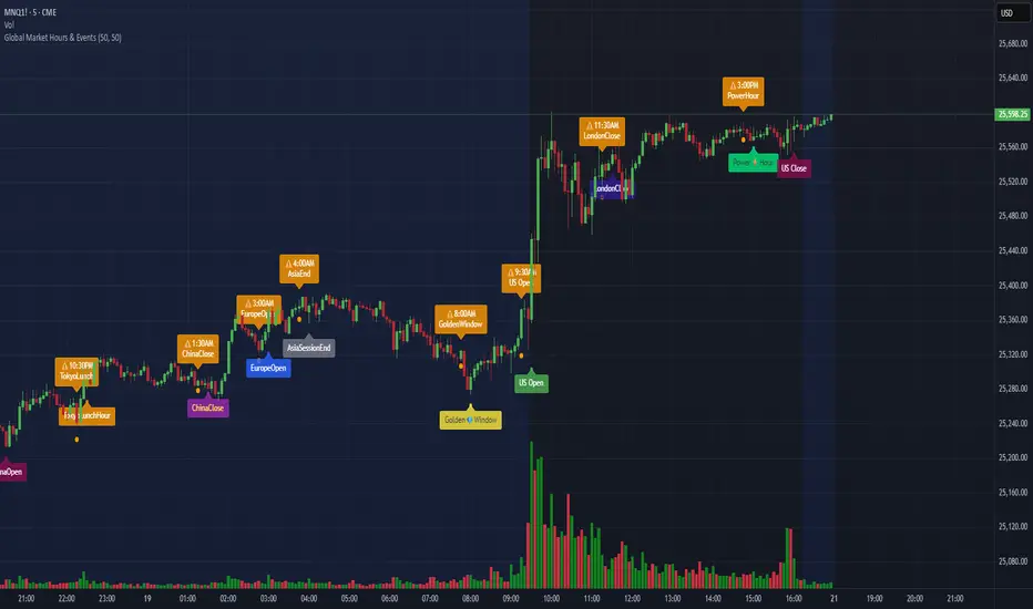
Global Market Hours & Eventswww.tradingview.com
Global Market opens and closes and other related events,
15min warning ahead of time, visual indicator for warning and for the event
not over-crowded with the possibility to remove labels and have just a little circle marker.
Adjustements for labels and circles are in the settings
Activate Pane Label to identify
MarketMind LITEM🜁rketMind LITE ────────────────────
Essential Market Awareness, Reduced to Its Core
M🜁rketMind LITE is a lightweight market awareness tool designed to display essential situational context .
It provides basic orientation and movement awareness without interpretation, risk framing, diagnostics, or decision guidance.
This script is designed as a standalone awareness layer. It does not evaluate trade quality, issue signals, or influence decision-making.
WHAT IT DOES ────────────────────
M🜁rketMind LITE presents a minimal, static view of current market conditions focused entirely on awareness rather than analysis.
The system displays only essential context, allowing traders to stay oriented without introducing judgment, noise, or implied direction.
The script provides visibility into:
Time-of-day session context
Basic market regime classification (trending, range-bound, mixed)
Short-term momentum direction only (up, down, neutral)
A clean, static HUD display
M🜁rketMind LITE also includes a minimal visual state indicator that reflects recent price responsiveness, intended to be observed over time alongside the trader’s own experience.
The goal is to support awareness without influence .
HOW TO USE IT ────────────────────
M🜁rketMind LITE is not a signal generator.
It is designed to remain visible in the background of any chart, offering quiet orientation while traders rely entirely on their own process for analysis and execution.
Common use cases include:
Maintaining session awareness
Preserving context during focused trading periods
Reducing cognitive load while monitoring markets
M🜁rketMind LITE does not evaluate risk, alignment, or opportunity.
It simply shows what is happening.
DESIGN PHILOSOPHY ────────────────────
M🜁rketMind LITE is intentionally minimal.
It includes only essential awareness elements and excludes all interpretive or evaluative logic:
Situational context only
Directional momentum (up / down / neutral)
No diagnostics, confidence, or conviction framing
No process, risk, or quality assessment
Presentation controls only (HUD on/off, size, position)
Nothing is inferred.
Nothing is suggested.
This script shows market state without interpretation.
WHO IT IS FOR ────────────────────
M🜁rketMind LITE is suited for traders who:
Want passive situational awareness
Prefer minimal on-chart information
Already operate with a defined decision process
It is not designed for:
Analytical or diagnostic use
Risk evaluation or context synthesis
Traders seeking guidance or confirmation
IMPORTANT NOTES ────────────────────
M🜁rketMind LITE does not provide financial advice
No system can predict future price behavior
This tool is designed for awareness only
Used appropriately, M🜁rketMind LITE helps traders stay oriented without interference.

UIA TrendCompass V1.0UIA TrendCompass v1.0 is a market structure interpretation tool designed to visualize trend states in real time.
The script identifies four structural states based on price behavior and trend continuity:
• T — Trend Start
• E — Trend Extension
• H — Structural High / Low
• X — Trend Exit / Reversal
This indicator is intended for market structure analysis and educational purposes only.
It does NOT provide trading signals, buy/sell recommendations, or investment advice.
All labels are generated based on historical price data and do not predict future market movements.
Users should combine this tool with their own analysis and risk management framework.
This script is provided "as is" with no guarantee of accuracy or performance.

FVG Heatmap [Hash Capital Research]FVG Map
FVG Map is a visual Fair Value Gap (FVG) mapping tool built to make displacement imbalances easy to see and manage in real time. It detects 3-candle FVG zones, plots them as clean heatmap boxes, tracks partial mitigation (how much of the zone has been filled), and summarizes recent “fill speed” behavior in a small regime dashboard.
This is an indicator (not a strategy). It does not place trades and it does not publish performance claims. It is a market-structure visualization tool intended to support discretionary or systematic workflows.
What this script detects
Bullish FVG (gap below price)
A bullish FVG is detected when the candle from two bars ago has a high below the current candle’s low.
The zone spans from that prior high up to the current low.
Bearish FVG (gap above price)
A bearish FVG is detected when the candle from two bars ago has a low above the current candle’s high.
The zone spans from the current high up to that prior low.
What makes it useful
Heatmap zones (clean, readable FVG boxes)
Bullish zones plot below price. Bearish zones plot above price.
Partial fill tracking (mitigation progress)
As price trades back into a zone, the script visually shows how much of the zone has been filled.
Mitigation modes (your definition of “filled”)
• Full Fill: price fully trades through the zone
• 50% Fill: price reaches the midpoint of the zone
• First Touch: price touches the zone one time
Optional auto-cleanup
Optionally remove zones once they’re mitigated to keep the chart clean.
Fill-Speed Regime Dashboard
When zones get mitigated, the script records how many bars it took to fill and summarizes the recent environment:
• Average fill time
• Median fill time
• % fast fills vs % slow fills
• Regime label: choppy/mean-revert, trending/displacement, or mixed
How to use
Use FVG zones as structure, not guaranteed signals.
• Bullish zones are often watched as potential support on pullbacks.
• Bearish zones are often watched as potential resistance on rallies.
The fill-speed dashboard helps provide context: fast fills tend to appear in more rotational conditions, while slow fills tend to appear in stronger trend/displacement conditions.
Alerts
Bullish FVG Created
Bearish FVG Created
Notes
FVGs are not guaranteed reversal points. Fill-speed/regime is descriptive of recent behavior and should be treated as context, not prediction. On realtime candles, visuals may update as the bar forms.

CRUX-3 Macro Regime Index"CRUX-3 Macro Regime Index"
Description:
CRUX-3 Macro Regime Index is a higher-timeframe macro indicator designed to evaluate how crypto markets are performing relative to traditional equities. It compares Bitcoin, Ethereum, and the broader altcoin market (TOTAL3) against the S&P 500 using Z-score normalization to highlight periods of relative outperformance or underperformance.
The indicator incorporates liquidity-based regime detection using Bitcoin dominance and stablecoin dominance to classify market environments as Risk-On, BTC-Led, or Risk-Off. Background shading visually highlights these regimes, helping users identify broader macro conditions rather than short-term trade signals.
CRUX-3 is intended for macro context, regime awareness, and allocation bias decisions, not for precise trade entries or timing.
How to Use:
Weekly timeframe recommended for best results
Rising Z-scores indicate crypto outperforming equities
ETH/SPX typically acts as an early rotation signal
TOTAL3/SPX confirms broader altcoin participation
Regime shading reflects liquidity conditions, not price forecasts
Regime Definitions:
Risk-On: BTC dominance and stablecoin dominance declining
BTC-Led: BTC dominance strong while stablecoin dominance eases
Risk-Off: BTC dominance and stablecoin dominance rising
Notes:
Forward regime bands are statistical reference guides based on historical behavior
This indicator does not predict future prices or market direction
Best used alongside price charts and other macro tools
Disclaimer:
This indicator is for educational and informational purposes only. It does not constitute financial advice, investment advice, or trading recommendations.
Recommended Settings:
Timeframe: Weekly (1W)
Z-Score Lookback: 52
Forward Regime Bands: Enabled

NeuroSwarm ETH — Crowd vs Experts Forecast TrackerEnglish:
NeuroSwarm — Crowd vs Experts Forecast Tracker (ETH)
This indicator visualizes monthly forecast data collected from two independent groups:
Crowd – a large sample of retail participants
Experts – a curated group of analysts and experienced market participants
For each month, the indicator plots the following values as horizontal levels on the price chart:
Median forecast (Crowd)
Average forecast (Crowd)
Median forecast (Experts)
Average forecast (Experts)
Shaded zones highlighting the difference between median and mean
All values are fixed for each month and stay unchanged historically.
This allows traders to analyze sentiment dynamics and compare how expectations from both groups align or diverge from actual price action.
Purpose:
This tool is intended for sentiment visualization and analytical insight — it does not generate trading signals.
Its main goal is to compare collective expectations of retail traders vs experts across time.
Data source:
All forecasts come from monthly surveys conducted within the NeuroSwarm project between the 1st and 5th day of each month.
Interface notice:
The script's UI may contain non-English labels for convenience, but a full English documentation is provided here in compliance with TradingView rules.
Русская версия:
NeuroSwarm — Мудрость Толпы vs Эксперты (ETH)
Индикатор отображает ежемесячные прогнозы двух групп:
Толпа: медиана и средняя прогнозов
Эксперты: медиана и средняя прогнозов
Значения фиксируются для каждого месяца и показываются горизонтальными уровнями.
Заливка отображает диапазон между медианой и средней, что упрощает визуальное сравнение настроений.
Это аналитический инструмент для визуализации настроений — не торговая стратегия.
Все данные берутся из ежемесячных опросов проекта NeuroSwarm.
