BTC Fundamental Value Hypothesis [OmegaTools]BTC Fundamental Value Hypothesis is a macro-valuation and regime-detection model designed to contextualize Bitcoin’s price through relative market-cap comparisons against major capital reservoirs: Gold, Silver, the Altcoin market, and large-cap equities. Instead of relying on traditional on-chain metrics or purely technical signals, this tool frames BTC as an asset competing for global liquidity and “store-of-value mindshare”, then estimates an implied fair value based on how BTC historically coexists (or diverges) from these benchmark universes.
Core concept: relative market-cap anchoring
The indicator builds a reference-based fair price by translating external market capitalizations into implied BTC valuation using a dominance framework. In practice, you choose one or more reference universes (Gold, Silver, Altcoins, Stocks). For each selected universe, the script computes how large BTC “should be” relative to that universe (dominance ratio), and converts that into an implied BTC price. The final fair price is the average of the implied prices from the enabled universes.
Two dominance modes: automatic vs manual
1. Automatic Dominance % (default)
When enabled, the model estimates dominance ratios dynamically using a 252-period simple moving average of BTC market cap divided by each reference market cap. This produces an adaptive baseline that follows structural changes over time and reduces sensitivity to short-term spikes.
2. Manual Dominance %
If you prefer a discretionary macro thesis, you can directly input dominance parameters for each reference universe. This is useful when you want to stress-test scenarios (e.g., “BTC should converge toward X% of Gold’s market cap”) or align the model with a specific long-term adoption narrative.
Reference universes and data construction
- BTC market cap: pulled from CRYPTOCAP:BTC.
- Gold and Silver market caps: derived from the corresponding futures symbols (GC1!, SI1!) multiplied by an assumed total above-ground quantity (constant tonnage converted to troy ounces). This provides a practical and tradable proxy for spot valuation context.
- Altcoin market cap: pulled from CRYPTOCAP:TOTAL2 (total crypto market excluding BTC).
- Stocks market cap proxy (Σ3): a deliberately conservative equity benchmark built from three mega-cap stocks (AAPL, MSFT, AMZN) using total shares outstanding (request.financial) multiplied by price. This avoids index licensing complexity while still tracking a meaningful slice of global equity beta/liquidity.
Valuation output: overvalued vs undervalued (log-based)
The valuation readout is expressed as a percentage derived from the logarithmic distance between BTC price and the model’s fair price. This choice makes valuation comparable across long time horizons and reduces distortion during exponential growth phases. A positive valuation indicates BTC trading below the model’s implied value (undervalued), while a negative valuation indicates trading above it (overvalued).
Oscillator: relative momentum and regime confirmation
In addition to fair value, the indicator includes a momentum differential oscillator built from RSI(50):
- BTC RSI is compared to the average RSI of the selected reference universes.
- The oscillator highlights when BTC strength is leading or lagging the broader macro benchmarks.
- Color is rendered through a gradient to provide immediate regime readability (risk-on vs risk-off behavior, expansion vs contraction phases).
Visualization and UI components
- Fair Price overlay: the computed fair price is plotted directly on the BTC chart for immediate comparison with spot price action.
- Valuation shading: the area between price and fair price is filled to visually emphasize dislocation and potential mean-reversion zones.
- Oscillator panel: a zero-centered oscillator with filled bands helps you identify persistent trend regimes versus transitional conditions.
- Summary table: a right-side table displays the current valuation (over/under) and, when Automatic mode is enabled, the live dominance ratios used in the model (BTC/GOLD, BTC/SILVER, BTC/ALTC, BTC/STOCKS).
How to use it (practical workflows)
- Macro valuation context: use fair price as a structural anchor to assess whether BTC is trading at a premium or discount relative to external liquidity baselines.
- Regime filtering: combine valuation with the oscillator to distinguish “cheap but weak” from “cheap and strengthening” (and the inverse for tops).
- Mean-reversion mapping: large, persistent deviations from fair value often highlight speculative extremes or capitulation zones; this can support systematic entries/exits, position sizing, or hedging decisions.
- Scenario analysis: switch to Manual Dominance % to model adoption outcomes, policy-driven shifts, or multi-year re-rating assumptions.
Important notes and limitations (read before use)
- This is a hypothesis-driven macro model, not a literal intrinsic value calculation. Results depend on dominance assumptions, proxies, and data availability.
- Gold/Silver market caps are approximations based on futures pricing and fixed supply constants; real-world supply dynamics, above-ground estimates, and spot/futures basis can differ.
- The Stocks (Σ3) benchmark is a proxy and intentionally not “the whole market”. It is designed to represent a large-cap liquidity reference, not total equity capitalization.
- Always validate signals with additional context (market structure, volatility regime, risk management rules). This indicator is best used as a macro layer in a broader decision framework.
Designed for clarity, macro discipline, and repeatability
BTC Fundamental Value Hypothesis by OmegaTools is built for traders and investors who want a clean, data-driven way to interpret BTC through the lens of competing asset classes and capital flows. It is particularly effective on higher timeframes (Daily/Weekly) where macro relationships are more stable and valuation signals are less noisy.
© OmegaTools, Eros
Intermarket

Ultimate Major Contextual Dashboard (Multi-Asset)Overview : The Ultimate Major Dashboard is a performance-optimized market overview tool designed to provide a consolidated snapshot of the 7 major Forex pairs and Gold. It aggregates correlation, trend, momentum, and volatility data into a single, clean table, allowing users to view broader market context without switching charts.
Technical Logic & Components : This indicator utilizes a modular function to analyze EURUSD, GBPUSD, USDJPY, USDCHF, AUDUSD, USDCAD, NZDUSD, and XAUUSD across four key dimensions:
Intermarket Correlation (Pearson Coefficient): Uses ta.correlation() to compare each asset against the symbol currently on your main chart.
Logic: Values above 0.7 (Dark Green) suggest a strong positive relationship, while values below -0.7 (Dark Red) suggest inverse behavior. This is calculated over a rolling 50-period window to balance stability with current market sensitivity.
Trend Bias (EMA-200): Evaluates the long-term trend by checking price position relative to the 200-period Exponential Moving Average.
Visuals: An upward arrow (⬆) indicates price is above the EMA; a downward arrow (⬇) indicates it is below.
Momentum (RSI-14): Calculates the Relative Strength Index. The dashboard automatically highlights readings above 70 (OB) or below 30 (OS) to help identify potential momentum extremes.
Volatility (ATR-14): Displays the Average True Range as a reference for the current active range of each market, helping users compare volatility levels across the majors.
How to Interpret the Dashboard
Asset Alignment: Correlation values help identify when pairs are moving in "unison" versus when a specific currency is diverging from the group.
Directional Context: Combining the Trend (EMA) and Momentum (RSI) columns provides a quick view of whether a market is trending strongly or reaching an exhaustion point.
Volatility Benchmarking: The ATR values offer perspective on which pairs are currently the most active, assisting in market comparison based on volatility preference.
Data Handling & Customization
Multi-Symbol Sync: Data is fetched using request.security(). The calculations are synchronized with the chart's current bar state for real-time accuracy.
Dynamic TF: Users can select the analysis timeframe (60, 240, D, W) via the settings menu.
Flexibility: The dashboard position can be toggled between all four corners of the chart to avoid overlapping with price action.
Disclaimer
This tool is provided for analytical and educational purposes only. It does not generate trading signals and should not be considered financial advice.

TFPS_EngineLibrary "TFPS_Engine"
f_calculate_lead_lag(series1, series2, length, max_lag)
Parameters:
series1 (float)
series2 (float)
length (int)
max_lag (int)
f_calculate_pressure_score(spx_ticker, vix_ticker, dxy_ticker, us10y_ticker, benchmark_source, trend_lookback, score_smoothing, use_dynamic_weights, corr_lookback, w_spx, w_vix, w_dxy, w_us10y, zscore_lookback, max_lag)
Parameters:
spx_ticker (string)
vix_ticker (string)
dxy_ticker (string)
us10y_ticker (string)
benchmark_source (float)
trend_lookback (int)
score_smoothing (simple int)
use_dynamic_weights (bool)
corr_lookback (int)
w_spx (float)
w_vix (float)
w_dxy (float)
w_us10y (float)
zscore_lookback (int)
max_lag (int)
LeadLagOutput
Fields:
best_lag (series int)
max_corr (series float)
TFPS_Output
Fields:
historical_score (series float)
smoothed_score (series float)
z_score (series float)
regime_signal (series int)
lead_lag_bars (series int)
lead_lag_corr (series float)
weight_spx (series float)
weight_vix (series float)
weight_dxy (series float)
weight_us10y (series float)

Strength Comparison @joshuuuexample:
if you want to find the stronger/weaker pair between eurusd and gbpusd, what you can do is check the eurgbp charts. if eurgbp is bullish, that means, that longs longs on eurusd are better than on gbpusd.
Unfortunately, there is no such thing to compare for example usoil with ukoil, or us100 with us500.
That's where this indicator comes in handy. You can choose whatever two symbols you want, that are supported by tradingview and you will get a chart, which shows symbol1/symbol2.
Now you can use normal market structure, or the ema option, to find out the stronger symbol.
This can also help predicting the so called SMT Divergences, taught by ICT.
⚠️ Open Source ⚠️
Coders and TV users are authorized to copy this code base, but a paid distribution is prohibited. A mention to the original author is expected, and appreciated.
⚠️ Terms and Conditions ⚠️
This financial tool is for educational purposes only and not financial advice. Users assume responsibility for decisions made based on the tool's information. Past performance doesn't guarantee future results. By using this tool, users agree to these terms.

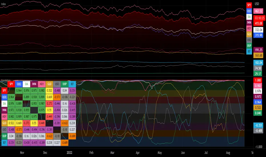
Correlation with Matrix TableCorrelation coefficient is a measure of the strength of the relationship between two values. It can be useful for market analysis, cryptocurrencies, forex and much more.
Since it "describes the degree to which two series tend to deviate from their moving average values" (1), first of all you have to set the length of these moving averages. You can also retrieve the values from another timeframe, and choose whether or not to ignore the gaps.
After selecting the reference ticker, which is not dependent from the chart you are on, you can choose up to eight other tickers to relate to it. The provided matrix table will then give you a deeper insight through all of the correlations between the chosen symbols.
Correlation values are scored on a scale from 1 to -1
A value of 1 means the correlation between the values is perfect.
A value of 0 means that there is no correlation at all.
A value of -1 indicates that the correlation is perfectly opposite.
For a better view at a glance, eight level colors are available and it is possible to modify them at will. You can even change level ranges by setting their threshold values. The background color of the matrix's cells will change accordingly to all of these choices.
The default threshold values, commonly used in statistics, are as follows:
None to weak correlation: 0 - 0.3
Weak to moderate correlation: 0.3 - 0.5
Moderate to high correlation: 0.5 - 0.7
High to perfect correlation: 0.7 - 1
Remember to be careful about spurious correlations, which are strong correlations without a real causal relationship.
(1) www.tradingview.com
USDJPY Assumption v1Based on the "logical trading" post of Charles Cornley (thanks!).
Indicator States:
Very Bullish (Lime) = USD trend rising and JPY trend falling and Gold trend falling and US 10Y Bond trend falling and
Dow Jones trend rising and Nasdaq trend rising and Russell 2000 trend rising and
S&P 500 trend rising and Nikkei 225 trend rising
Bullish (Green) = USD trend rising and JPY trend falling
Bearish (Red) = USD trend falling and JPY trend rising
