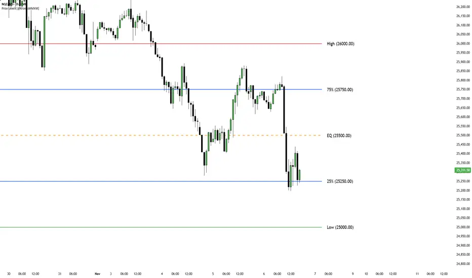
Fixed Price LevelsOverview
This indicator automatically calculates and plots fixed horizontal dealing ranges based on "Power of 10" mathematics. Unlike dynamic ranges that move with every tick or rely on lagging averages, these levels are fixed to specific mathematical grids (10s, 100s, 1000s, etc.). This provides a clean, objective structure for analyzing price action, psychological levels, and market equilibrium without the noise of repainting levels.
How it Works
The indicator uses a mathematical floor function to "snap" the current price to the nearest grid bottom based on your selected multiplier. This creates a static box around price.
The core formula concept is:
Dealing Range Low = math.floor(price / multiplier) * multiplier
Dealing Range High = Dealing Range Low + multiplier
Equilibrium (EQ) = Dealing Range Low + (multiplier / 2)
Key Features
Power of 10 Multipliers: Select between 1, 10, 100, 1000, or 10000 to suit your asset class (e.g., 100 for Indices, 0.01 logic for Forex).
Adjacent Ranges: Automatically plots ranges above and below the current price action to see future targets or support levels immediately.
Overlap Prevention: Includes logic to prevent label clutter. When multiple ranges are active, it ensures that a "Range High" and the next "Range Low" do not overlap visually.
Quarter Levels: Option to display the 25% and 75% levels within the range for granular precision.
Visual Customization: Full control over line extensions (Left, Right, Both, None) and label placement.
Settings Overview
Range Multiplier: Select the base grid size.
Number of Adjacent Ranges: Determines how many grid boxes to draw above and below the current price.
Visual Settings: Customize colors, styles (Solid, Dashed, Dotted), and widths for Low, High, EQ, and Quarters.
Educational
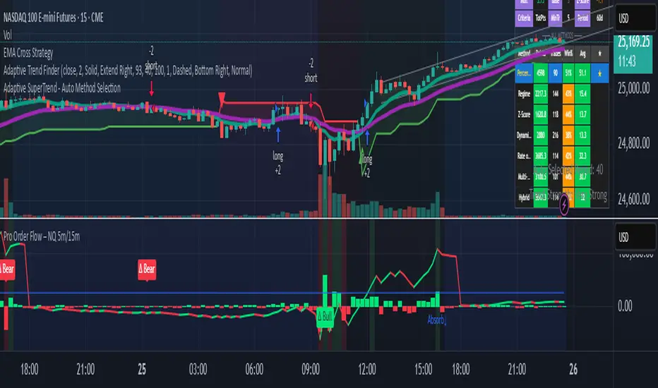
Pro Order Flow – NQ 5m/15mThis is a professional-grade order flow tool designed for scalpers and intraday futures traders (especially NQ 5m/15m, ES, SPY, BTC, and gold).
Right-click indicator → Move to new pane below (recommended, so price is clean)
It combines five high-probability institutional signals into one clean, fast indicator:
What This Indicator Shows
1. Candle Delta Histogram (Buyer vs Seller Pressure)
Each bar shows whether aggressive buyers (market orders lifting ask) or aggressive sellers (hitting bid) controlled that candle.
Green = buying pressure
Red = selling pressure
2.Session Cumulative Delta (True Direction)
Tracks buyer/seller domination for the entire session.
Rising cumDelta = buyers absorbing sellers
Falling cumDelta = sellers absorbing buyers
If price goes up but cumulative delta goes down → distribution (short signal)
If price goes down but cumulative delta goes up → accumulation (long signal)
This is one of the strongest institutional signals.
3 Big Delta Bars (Unusual Aggression)
Highlights candles where delta is 2.2× larger than average volume.
These mark:
Institutional absorption
Breakout pressure
Stop-run attacks
Failed breakout reversals
Green = big buying aggression
Red = big selling aggression
4 Smart-Money Wick Absorption (Absorb↑ / Absorb↓)
Tracks wick length vs body size + delta.
Used to detect:
Stop hunts
Liquidity grabs
Reversals off trapped traders
Absorb↓ (triangle up) = buyers absorbed sell-side liquidity (bullish)
Absorb↑ (triangle down) = sellers absorbed buy-side liquidity (bearish)
This is a high-confidence signal for NQ.
5 Real Delta Divergences (Δ Bull / Δ Bear)
Not RSI divergences — order flow divergences:
🔻 Bearish Delta Divergence (Δ Bear)
Price makes higher high
Cumulative delta makes lower high → buyers weakening
High-probability short
🔺 Bullish Delta Divergence (Δ Bull)
Price makes lower low
Cumulative delta makes higher low → sellers weakening
High-probability long
These are professional reversal points.
How to Use (Trading Strategy)
Recommended for:
NQ 5m entries + 15m bias, ES, SPY, BTC, gold.
🟩 Long Setup (Buy)
On 15m, session cumulative delta sloping UP
Price in an uptrend (higher highs/lows)
On 5m, look for ANY of these:
Δ Bull divergence
Absorb↓ tail after a stop-hunt wick
Big positive delta bar at support
Delta flips from red → green at VWAP
Entry: Enter on close of the signal candle
Stop: Below swing low or wick
Targets: Next liquidity high, or 2R–3R
🟥 Short Setup (Sell)
On 15m, session cumulative delta sloping DOWN
Price in a downtrend
On 5m, look for:
Δ Bear divergence
Absorb↑ tail above a high
Big negative delta bar
Delta flips from green → red at resistance
Entry: Enter on close
Stop: Above wick or structure
Targets: Prior low, or 2R–3R
Best Timeframes
15m = trend/bias
5m = signal + entry
Works on: NQ, ES, SPY, QQQ, BTC, Gold, Oil
Settings (Recommended)
Avg Volume Length = 100 (best for NQ volatility)
Big Delta Sensitivity = 2.2×
Pivots = 3 left / 3 right (good for intraday swings)
Included Alerts
Bullish Delta Divergence
Bearish Delta Divergence
Big Positive Delta (aggressive buying)
Big Negative Delta (aggressive selling)
Perfect for scalpers who want real-time signals.
Sessions Indicator(clean))🔰 True Day Open + Asian / London / NY Session Levels
Intraday Market Structure & Session Liquidity Indicator
This indicator automatically plots the True Day Opening Price, Asian Session High & Low, London Session High & Low, and New York Session Open — helping you understand daily directional bias, session liquidity zones, and potential reversal levels.
📌 What It Does
✔ Plots True Day Open (not broker-based — captures real market direction)
✔ Marks Asia Session High & Low – accumulation zone
✔ Marks London Session High & Low – expansion zone
✔ Shows New York Session Open – reversal / continuation zone
✔ Works on any chart: Forex, Indices, Crypto, Commodities
✔ Ideal for ICT / SMC / Day Trading / Scalping
✔ Fully customizable colors & display options
🧠 Why It’s Useful
The market often moves in this sequence:
➡ Asia → consolidation
➡ London → expansion / breakout
➡ New York → reversal OR continuation
This indicator helps you see this structure clearly, allowing traders to:
Avoid fake breakouts
Understand the daily bias earlier
Trade liquidity grabs & session-to-session transitions
Time entries with precision
📌 Best Timeframes
M5 / M15 / M30 → Scalping & intraday setups
H1 / H4 → Market structure view
Daily → Session zone backtesting
⚙ Inputs & Customization
Enable/Disable each session
Change session time manually
Color settings
Line styles: solid / dashed / background zones
🧠 Suggested Trading Concepts
Works great with:
Smart Money Concepts (SMC)
ICT Models
Liquidity Sweep Strategy
Session Breakout Trading
Mean Reversion Trading
📈 How to Use
Wait for Asian Range
Trade break of Asian High/Low during London
At NY Open, check for reversal or continuation
Use True Day Open for directional bias
Look for liquidity sweeps near session levels
📢 Coming Soon (Next Update)
🔔 Session Break Alerts
📊 Liquidity Sweep Labels

RSI Rate of Change (ROC of RSI)The RSI Rate of Change (ROC of RSI) indicator measures the speed and momentum of changes in the RSI, helping traders identify early trend shifts, strength of price moves, and potential reversals before they appear on the standard RSI.
While RSI shows overbought and oversold conditions, the ROC of RSI reveals how fast RSI itself is rising or falling, offering a deeper view of market momentum.
How the Indicator Works
1. RSI Calculation
The indicator first calculates the classic Relative Strength Index (RSI) using the selected length (default 14). This measures the strength of recent price movements.
2. Rate of Change (ROC) of RSI
Next, it computes the Rate of Change (ROC) of the RSI over a user-defined period.
This shows:
Positive ROC → RSI increasing quickly → strong bullish momentum
Negative ROC → RSI decreasing quickly → strong bearish momentum
ROC crossing above/below 0 → potential early trend shift
What You See on the Chart
Blue Line: RSI
Red Line: ROC of RSI
Grey dotted Zero Line: Momentum reference
Why Traders Use It
The RSI ROC helps you:
Detect momentum reversals early
Spot bullish and bearish accelerations not visible on RSI alone
Identify exhaustion points before RSI reaches extremes
Improve entry/exit precision in trend and swing trading
Validate price breakouts or breakdowns with momentum confirmation
Best For
Swing traders
Momentum traders
Reversal traders
Trend-following systems needing early confirmation signals
BETA ZONES v1.0BETA ZONES v1.0 Indicator
Overview
BETA ZONES v1.0 is a comprehensive technical analysis tool designed for TradingView, combining an EMA-based ribbon with dynamic glow zones, structural pivot detection, and real-time ATR visualization. This overlay indicator helps traders identify trends, support/resistance zones, and potential breakout points by blending moving averages, volatility-based shading, and pivot structures. It's particularly useful for trend-following strategies, swing trading, and confirming market reversals on any timeframe or asset, including those using Heikin Ashi candles (as it incorporates real close data to bypass transformations).
The indicator emphasizes visual clarity with color-coded elements: bullish trends in shades of green/lime and bearish in red/maroon. It includes customizable toggles for each component, allowing users to focus on specific features without cluttering the chart.
Key Features
• EMA Ribbon & Glow System:
o Displays a ribbon formed by three EMAs (5, 20, and 50 periods) with gradient fills between them, colored based on trend strength.
o A dynamic "glow" zone around the 50-period EMA, calculated using ATR (Average True Range), acts as a volatility-based support (bullish) or resistance (bearish) band. The glow expands/contracts with market volatility, providing a visual buffer for potential price reactions.
o Real Close Dot: A small circle plotted at the actual closing price of each bar (sourced from standard candles), aiding in precise data verification even on transformed charts like Heikin Ashi.
• Structural Pivots:
o Automatically detects and labels confirmed pivot highs and lows using customizable symbols (e.g., arrows, dots, or curves).
o Draws breakout lines connecting pivots to the bar where structure is broken (Break of Structure - BOS), highlighting bullish (green) or bearish (red) shifts.
o Pivots are trend-aware: In uptrends, it tracks higher highs/lows until a downside break; in downtrends, lower highs/lows until an upside break.
• Real ATR Display:
o A compact table at the bottom-center of the chart showing the current 14-period ATR value (calculated on real data), useful for gauging volatility and setting stop-losses or targets.
How It Works
• EMA Ribbon Logic: The fast EMA (5) is compared to the mid (20), and mid to slow (50), to determine sub-trends. Price relative to the slow EMA sets the overall bullish/bearish bias. Fills create a "ribbon" effect, with colors intensifying in strong trends.
• Glow Zone: Uses a user-defined ATR length and multiplier to create upper/lower bands around the slow EMA. The glow is one-sided: below for bullish (support) and above for bearish (resistance), with semi-transparent shading for easy price overlay.
• Pivot Detection: Tracks the current trend direction (up or down) and reference high/low from the last confirmed pivot. A breakout (close crossing the reference level) confirms a new pivot, labels it, and optionally draws a line to the breakout bar. Bar coloring (yellow) highlights breakout candles.
• Data Handling: All calculations use real close prices via request.security to ensure accuracy on non-standard chart types.
Settings and Customization
The indicator is divided into intuitive input groups for easy configuration:
1. EMA Ribbon & Glow:
o Show EMA Ribbon & Glow: Master toggle to enable/disable the entire ribbon and glow (default: true). Note: Real Close Dot is independent.
o ATR Length (Glow): Lookback for ATR calculation (default: 3; higher = smoother glow).
o ATR Multiplier (Glow Size): Scales the glow width (default: 0.15; higher = wider zone).
o Show Real Close Dot: Toggle for the orange dot at real closes (default: true).
o Real Close Dot Color: Customize the dot's color (default: orange).
2. Structural Pivots:
o Show Pivot Labels: Toggle visibility of high/low symbols (default: true).
o Pivot Symbol Style: Choose from pairs like "︽ ︾" (low/high) or "•" (dots) (default: "•").
o Label Size: Adjust symbol size (Tiny to Huge; default: Normal).
o Pivot High/Low Label Colors: Set colors for labels (default: white).
o Show Breakout Lines: Toggle lines from pivot to breakout (default: true).
o Line Width: Thickness of breakout lines (default: 2).
o Line Style: Solid, Dashed, or Dotted (default: Solid).
o Resistance Break Line (Bullish): Color for upside breaks (default: green).
o Support Break Line (Bearish): Color for downside breaks (default: red).
No additional inputs are required for the ATR table, as it's always displayed on the last bar for quick reference.
Usage Tips
• Trend Identification: Use the EMA ribbon colors to gauge momentum—full green for strong bulls, red for bears. The glow zone can act as a dynamic entry/exit area (e.g., buy near bullish glow support).
• Breakout Trading: Watch for pivot labels and BOS lines as signals for trend reversals. Combine with volume or other indicators for confirmation.
• Volatility Awareness: The displayed ATR(14) helps in position sizing; for example, set stops at 1-2x ATR from entry.
• Chart Compatibility: Works best on candlestick or Heikin Ashi charts. For lower timeframes, reduce ATR length for faster reactivity; increase for higher timeframes.
• Limitations: Pivots are reactive and may lag in ranging markets. Glow is based on historical ATR, so it doesn't predict future volatility.
This indicator is in beta (v1.0) and open to feedback for improvements. Add it to your chart via TradingView's indicator search and experiment with settings to fit your strategy!

Wyckoff Accumulation/Distribution - Enhanced by ChakraWyckoff Accumulation/Distribution - Enhanced Indicator
Overview
An advanced Pine Script v6 indicator that detects Wyckoff accumulation and distribution patterns using RSI-based trend analysis, pivot detection, and volume confirmation. This enhanced version improves upon traditional Wyckoff indicators with cleaner code, English variable names, and additional market structure signals.
Key Features
Wyckoff Phase Detection
Accumulation Phase:
SC (Selling Climax): Bottom pivot with extreme bearish RSI and high volume
AR (Automatic Rally): First bounce after selling climax
ST (Secondary Test): Retest of lows without extreme RSI
SOS (Sign of Strength): Strong bullish breakout with volume confirmation ⭐ NEW
Distribution Phase:
BC (Buying Climax): Top pivot with extreme bullish RSI and high volume
DAR (Automatic Reaction): First drop after buying climax
DST (Distribution Secondary Test): Retest of highs
SOW (Sign of Weakness): Strong bearish breakdown with volume confirmation ⭐ NEW
Market Structure Events
Spring: False breakdown (RSI crosses above lower band) with background highlight
UTAD (Upthrust After Distribution): False breakout (RSI crosses below upper band) with background highlight
Visual Features
Range Boxes: Automatically draws consolidation ranges (gray) that change color on breakout:
🟢 Green = Accumulation (bullish breakout)
🔴 Red = Distribution (bearish breakout)
Pivot Markers: Orange triangles show regular (non-Wyckoff) pivot points
Bar Coloring: Lime bars for bullish trends, purple bars for bearish trends
Color-Coded Labels: All Wyckoff events clearly marked with descriptive text
Customizable Settings
RSI Settings:
RSI Length (default: 14)
Trend Sensitivity (default: 20) - Higher values = more sideways detection
Pivot Settings:
Pivot Length (default: 5) - Controls pivot point detection sensitivity
Display Options:
Toggle range boxes on/off
Toggle regular pivot markers
Toggle bar coloring by trend
Customize label text color
Advanced Detection:
Volume Confirmation toggle - Require high volume for climax events
Volume Threshold (default: 1.5x) - Adjustable volume multiplier
Alerts
8 comprehensive alert conditions:
Selling Climax (SC)
Buying Climax (BC)
Spring detection
UTAD detection
Sign of Strength (SOS)
Sign of Weakness (SOW)
Range Breakout
Improvements Over Original
✅ Pine Script v6 (latest version)
✅ English variable names (was Turkish)
✅ Fixed DAR label bug (was showing "AR")
✅ Added SOS (Sign of Strength) detection
✅ Added SOW (Sign of Weakness) detection
✅ Optional volume confirmation toggle
✅ Organized input groups for better UX
✅ Enhanced visual options
✅ Comprehensive alert system
✅ Cleaner, more maintainable code structure
Best Use Cases
Timeframes: Works on all timeframes; best on 4H, Daily, or Weekly
Markets: Stocks, Forex, Crypto, Indices
Trading Style: Swing trading, position trading, market structure analysis
Combine With: Support/Resistance, Volume Profile, Order Flow analysis
How It Works
The indicator uses RSI to identify market states (sideways, bullish, bearish) and combines this with pivot point detection and volume analysis to identify key Wyckoff events. When price is ranging (RSI between upper/lower bands), it draws a box. On breakout, the box color changes to indicate accumulation or distribution, helping traders identify smart money positioning.
Tips for Use
Lower Trend Sensitivity (10-15) for more signals in trending markets
Higher Trend Sensitivity (25-30) for clearer signals in choppy markets
Enable Volume Confirmation in high-volume markets (stocks, major crypto)
Disable Volume Confirmation in low-volume or forex markets
Watch for Spring/UTAD events within boxes for potential reversals
Version: 1.0
Pine Script: v6
Author: Chakrapani Chittabathina

Mark Minervini SEPA Swing TradingMark Minervini Complete Technical Strategy with buy signals and full dashboard showing all the parameters.

Pulse & Trend AnalysisPulse & Trend Analysis
The Pulse & Trend Analysis indicator is designed to help traders quickly identify potential trend shifts using the crossover and crossunder of EMA 20 and EMA 50.
When EMA 20 crosses above or below EMA 50, the indicator highlights it visually with colored arrows and “Pulse” signals, making trend changes easy to spot.
How the Script Works?
When EMA 20 crosses above EMA 50 and corresponding Candle close into Green color, the script generates a Pulse Positive signal,
shown with: Blue Arrow Up, Text: “PULSE POSITIVE”
When EMA 20 crosses below EMA 50 and corresponding Candle close into Red color, the script generates a Pulse Negative signal, shown with:
Red Arrow Down, Text: “PULSE NEGATIVE”
These signals help traders visually detect potential bullish or bearish momentum shifts.
How Users Can Benefit From This Indicator?
The Trend & Pulse Analysis indicator allows traders to quickly understand the prevailing market direction by analyzing the interaction between EMA 20 and EMA 50. When a Pulse Positive (bullish crossover) occurs, it signals increasing upward momentum, helping traders focus on long opportunities. Similarly, a Pulse Negative (bearish crossunder) highlights weakening trend strength and supports short-side setups.
This indicator becomes even more powerful when combined with Demand & Supply Zones.
By integrating trend direction, momentum pulses, and zone-based confluence, users can make more informed decisions.
What Makes This Indicator Unique?
The Trend & Pulse Analysis indicator stands out because it adds an important layer of price-action confirmation to traditional EMA crossover signals. Unlike standard crossover tools that trigger signals on every EMA interaction, this indicator filters out weak setups by checking candle strength and direction at the moment of crossover.
A Pulse Positive signal is triggered only when the crossover occurs on a bullish (green) candle.
A Pulse Negative signal is triggered only when the cross under occurs on a bearish (red) candle.
This built-in candle-confirmation mechanism makes the signals more reliable, reduces noise, and gives traders higher-confidence trend continuation.
Additionally, when combined with supply & demand concepts—
Pulse Positive with Demand Zone → strengthens bullish conviction
Pulse Negative with Supply Zone → strengthens bearish conviction
This fusion of EMA trend logic + candle confirmation + supply-demand confluence is what makes the indicator truly unique and powerful for smart traders.
How This Indicator Is Original?
The Trend & Pulse Analysis indicator is completely original because it is built on a custom-designed logic that goes beyond a simple EMA crossover system. While standard indicators only detect crossover/crossunder of moving averages, this tool introduces a dual-filter confirmation approach:
Directional Candle Validation
A Pulse Positive signal is triggered only when EMA20 crosses above EMA50 AND the same candle closes bullish (green).
A Pulse Negative signal is triggered only when EMA20 crosses below EMA50 AND the same candle closes bearish (red).
Custom Pulse System (Not a Standard EMA Indicator)
The “Pulse Positive / Pulse Negative” framework is a uniquely designed concept that combines trend direction, momentum shift, and candle strength.
Manual Programming & Original Condition Set
Every rule, filter, and plotting condition is hand-coded — not copied from open-source scripts.
The system uses:
Custom plotting rules
Custom conditional checks
Custom text + arrow logic
Combined trend + candle behavior analysis
This makes the indicator fully original and not a replica of any existing public script.
Disclaimer:
This indicator is created for educational and analytical purposes.
It does not provide buy or sell signals, financial advice, or guaranteed trading outcomes.
All trading decisions are solely your responsibility.
Market trading involves risk; always use proper risk management.

Micro/Mini P&L [LDT]Overview
Micro/Mini P&L is a risk and P&L visualization tool built primarily for futures traders.
It provides accurate dollar-based calculations for either micros or minis, regardless of which contract type you are currently charting.
The indicator automatically detects your instrument (NQ, MNQ, ES, MES, YM, RTY, CL, GC, etc.) and adjusts point-value data accordingly, allowing you to chart one contract while evaluating risk for another.
This removes the need for manual conversions and keeps your position data consistent at all times.
Although optimized for futures, the tool also works on any other asset for general trade-level visualization.
Features
• Automatic instrument detection for major futures markets including NQ/MNQ, ES/MES, YM/MYM, RTY/M2K, CL/MCL, GC/MGC and others.
Point-value logic adjusts instantly based on the detected symbol ensuring accurate calculations without manual configuration.
• Micro/Mini display toggle, allowing you to calculate dollar values for either contract type regardless of which contract is on your chart.
Useful for traders who prefer charting minis whilst trading micros or the opposite.
• Trade-level visualization, including Entry, Take Profit and Stop Loss levels with automatically drawn lines and optional TP/SL zone shading for clear and structured display on the chart.
• Dynamic P/L calculations, showing both point-based and dollar-based metrics in real time.
This includes TP/SL dollar values, points to target/stop, real-time P/L and an optional risk-reward ratio.
• Adaptive risk table, displaying contract counts from 1 up to your selected maximum, total dollar risk for each row and highlighting your chosen contract size.
This provides a straightforward method for evaluating risk, scaling and position sizing.
• Customizable display options, including color settings, label visibility, extension length, bar offsets and table positioning.
This allows the tool to remain clean, unobtrusive and easy to integrate into any chart layout.
Purpose
This tool is designed to give futures traders a clear, consistent and reliable way to view dollar-accurate risk per contract without performing manual conversions.
Whether you trade micros or minis, the displayed values always align with your selected contract type, even when charting the opposite market.

Position Size Calculator - R & ATR v1# Position Size Calculator - R & ATR
Professional position sizing tool for crypto traders using risk management principles and ATR-based stop loss placement.
## Features
✅ **Automatic ATR Calculation** - Uses ATR(14) by default, customizable period
✅ **Risk Management** - Calculate position size based on portfolio % risk
✅ **Tranche Support** - Split positions into multiple entries
✅ **Visual Stop Loss** - Red line showing stop loss placement on chart
✅ **Real-time Results** - Table displays all calculations instantly
✅ **Clean Interface** - Professional table with all key metrics
## How It Works
The indicator calculates optimal position size using this formula:
1. **Risk Amount** = Portfolio Size × (Risk % / 100)
2. **Stop Distance** = ATR × Multiplier
3. **Stop Loss Price** = Entry Price - Stop Distance
4. **Position Size** = Risk Amount / Stop Distance
5. **Tranche Size** = Position Size / Number of Tranches
## Settings
**Portfolio & Risk**
- Portfolio Size (USD): Your total trading capital
- Risk per Trade (R in %): Percentage of portfolio to risk per trade
- Number of Tranches: Split position into multiple entries
**ATR Settings**
- ATR Length: Period for ATR calculation (default: 14)
- ATR Multiplier: Multiply ATR for stop loss distance (0.5x, 1x, 1.5x, etc.)
**Display**
- Show Stop Loss Line: Toggle red stop loss line on chart
- Show Calculation Table: Toggle results table
## Results Displayed
- Risk Amount (1R): Dollar amount risked on trade
- Stop Distance: Distance from entry to stop loss
- Stop Loss: Exact stop loss price
- Risk per Coin: Amount risked per unit
- Position Size (coins): Number of coins to buy

Live Bollinger Buy/Sell Signal + Custom EMA by RAJU📌 DESCRIPTION
Live Bollinger Buy/Sell Signal is a price-action-based entry system built on Bollinger Bands. This indicator automatically detects high-probability reversal points when price interacts with the outer Bollinger Bands and provides instant Buy & Sell signals directly on the chart. It is designed for traders who want clean and fast signals without complex settings.
________________________________________
🧠 LOGIC OF INDICATOR
The indicator uses a standard Bollinger Band setup (SMA + Standard deviation).
A Buy or Sell signal is triggered when a candle forms outside or near the Bollinger Band extremes and then reverses direction. This behaviour often indicates a potential trend reversal or strong bounce from volatility exhaustion.
________________________________________
⚙ USER INPUT
Setting Description
Bollinger Band Length SMA period length used to form Bollinger Bands (Default: 20)
Std.Dev Multiplier Standard deviation multiplier for upper/lower bands (Default: 2.0)
________________________________________
🟩 LONG CONDITION (Buy Signal)
A Buy signal is plotted when:
• The candle closes bullish (close > open)
• The candle opens below the lower Bollinger Band
• The candle closes back above the lower Bollinger Band
• The next candle must trade above signal candle
• If a candle before or after signal candle closes without touching 5 EMA then probability of reversal is high (optional)
This indicates a strong price rejection from oversold levels.
________________________________________
🟥 SHORT CONDITION (Sell Signal)
A Sell signal is plotted when:
• The candle closes bearish (close < open)
• The candle opens above the upper Bollinger Band
• The candle closes back below the upper Bollinger Band
• The next candle must trade below signal candle
• If a candle before or after signal candle closes without touching 5 EMA then probability of reversal is high (optional)
This indicates a strong rejection from overbought levels.
________________________________________
📤 LONG EXIT
Users may exit long trades when:
• A Sell signal appears and signal candle closes without touching 5 EMA, or
• Price reaches the middle SMA line, or
• Personal trailing stop or resistance level is reached
________________________________________
📥 SHORT EXIT
Users may exit short trades when:
• A Buy signal appears and signal candle closes without touching 5 EMA, or
• Price reaches the middle SMA line, or
• Personal trailing stop or support level is reached
________________________________________
🌟 WHY IT IS UNIQUE
• Extremely simple yet powerful price-action confirmation mechanism
• No repainting — signals appear only after candle close
• Works across all timeframes and markets (Crypto, Forex, Stocks, Indices)
• Built-in signal level plotting to verify correct candle positioning
• Fast visual signal markers without clutter
________________________________________
💹 HOW USER CAN BE BENEFITED FROM THIS
• Helps traders catch early reversal entries with high probability
• Reduces emotional decision-making with visual Buy/Sell arrows
• Ideal for scalping, intraday, and swing strategies
• Can be used as an entry confirmation with other indicators like RSI, MACD, or trend filters
• Helps avoid false breakouts by confirming rejection from volatility extremes
________________________________________
⚠ DISCLAIMER: This tool is for educational purposes only and not trading advice. Always use proper risk management.


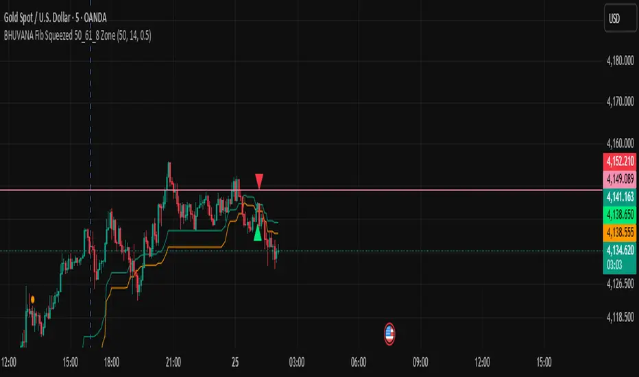
BHUVANA Fibonacci squeezed 50%–61.8% bandThis indicator is designed based on XAUUSD and in the 5 min time frame,When it looks like upstairs it is BUY trend (uptrend),Wjen it looks like downstairs the trend is sell (ie)Down trend)
Swing mapping: Finds the active high/low over a user-defined lookback and computes Fib 50% and Fib 61.8%.
Squeeze detection: Measures the distance between 50% and 61.8%. If the band width is ≤ (ATR × multiplier), the zone is flagged as a Squeeze.
Breakout entries (on close):
Long when price crosses up through 50% while squeezed.
Short when price crosses down through 61.8% while squeezed.
Risk framework: Auto-plots stop lines from the signal bar:
Long SL = swing low; Short SL = swing high.
Visuals: Fib lines (50/61.8) + optional yellow zone highlight during squeeze.
𝙐𝙡𝙩𝙧𝙖 𝘼𝙡𝙜𝙤Ultra Algo एक multi-layer trend analysis system है जो price behavior, range expansion और trend flow ko combine करके साफ़ और structured market indications प्रदान करता है।
इसका उद्देश्य chart को simplify करके traders ko directional clarity aur disciplined analysis में मदद देना है।
Core Features
Trend direction aur strength identify करने वाला dynamic filter
Structured rules par आधारित automatic long/short indications
Pre-defined levels par आधारित take-profit markers
ATR logic par बना हुआ risk reference framework
Coral-based visual trend component jo market flow को smooth तरीके से दिखाता है
Use Case
यह system short-term से mid-term analysis tak किसी भी trading style के साथ उपयोग किया जा सकता है।
Script ka उद्देश्य:
✔ clearer structure
✔ reduced chart noise
✔ disciplined analysis
✔ better trend visibility
provide करना है ताकि user market movement ko zyada organized तरीके से समझ सके।
Important Note
Yeh tool discretionary decision-making ko replace nahi karta, balki chart-reading ko structured banane mein madad karta hai.

Alt Trading: Regime Detection
A clean, high-performance trend and regime-detection indicator powered by volatility-based analytics. It features an intuitive on-chart status table that identifies favorable conditions for long setups, short setups, or periods where staying flat is might be optimal—helping traders align their strategy with evolving market dynamics.

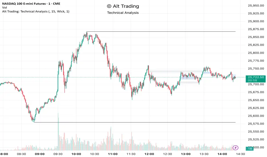
Alt Trading: Technical Analysis
A streamlined, high-quality indicator that displays the essential intraday levels. It highlights the Current Day High/Low (CDH/CDL), Previous Day High/Low (PDH/PDL), Current Week High/Low (CWH/CWL), and the most recent Fair Value Gaps (FVGs or iFVGs) on any selected timeframe—providing clear structural context for informed intraday decision-making.

cc AJ TIME WITH TIME EXTENSIONcc AJ TIME WITH TIME EXTENSION – Flexible Session & Time-Based Highlighter (v6)
A fully customizable Pine Script® indicator that lets you highlight specific times of day using three different calculation methods and draw extended background rectangles (session boxes) forward in time.
Features:
• Up to 6 independent time rules
• Three selectable detection methods for each rule (you can combine them):
– Direct minute match (e.g. when the current minute = your target)
– Addition method (hour + minute = target value)
– Subtraction method (minute − hour = target value)
• Each rule can independently color candles (barcolor) and/or draw a price-level rectangle
• Rectangles automatically extend right for a user-defined duration (hours + minutes)
• Individual control over fill color, opacity, border color, and border thickness
• Works on any timeframe and any symbol
• Uses UTC+2 as reference timezone (common for many European/London-based sessions – change in code if needed)
Perfect for marking custom session windows, recurring intraday time windows, or any personal time-based confluences you trade.
No external data, no repainting, no hidden calculations – completely transparent and compliant with TradingView House Rules.
Educational / personal use only • Not financial advice
NAS Oracle AlgoThe NAS Oracle Algo is a powerful and versatile daily trading indicator designed to provide clear, automated support and resistance levels for both long and short trading strategies. By calculating a dynamic range based on the previous day's price action, it projects key entry points, stop-losses, and up to six profit targets onto your chart, giving you a complete roadmap for the trading day.
Key Features:
Dual-Sided Strategy: Generates independent levels for BUY and SELL setups, making it effective for both directional and range-bound markets.
Customizable Reference Point: Choose between using the current day's "Open" or the previous day's "Pre Close" as the base for all calculations.
Comprehensive Levels:
Entry Level: The price level to execute a trade.
Stop Loss: A predefined level to limit potential losses.
Profit Targets (1-6): Six incremental take-profit levels, allowing for partial profit-taking strategies.
Multiple Display Options:
Visual Levels & Labels: Clean horizontal lines and text labels are drawn directly on the chart for easy price reference.
Information Table: A highly customizable data table that summarizes all key levels, which can be positioned at the Top or Bottom of the chart and resized.
Flexible Configuration: Toggle the visibility of levels and choose to show either 3 or 6 profit targets to suit your trading style and avoid chart clutter.
How to Use:
Add the Indicator: Apply the "NAS Oracle Algo" to your chart. It works best on daily and intraday timeframes.
Configure Settings: In the indicator's settings, choose your preferred Option (Open/Pre Close), toggle levels and the table on/off, and adjust their position and size.
Interpret the Signals:
BUY Setup: When the price moves above the green "Buy Above" level, consider a long entry.
Stop Loss: Place your stop loss at the BUY_SL level.
Take Profit: Scale out of your position at the six progressively higher target levels (T1 to T6).
SELL Setup: When the price moves below the red "Sell Below" level, consider a short entry.
Stop Loss: Place your stop loss at the SELL_SL level.

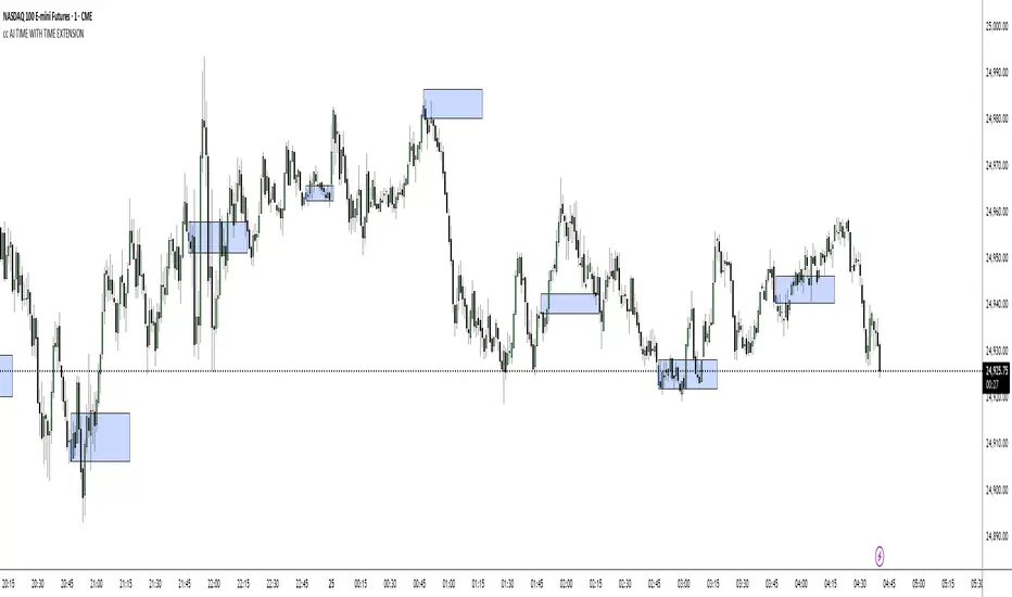
IC Opposite Candle Zones – BOXESWhat this does
✔ Detects bullish & bearish institutional candles
✔ Finds the last opposite candle before it
✔ Creates a zone using that candle’s full wick range
✔ Draws it with actual boxes that extend forward
✔ Deletes old boxes so your chart doesn’t get cluttered

Hamaada RangeThis indicator plots the Daily DR/IDR range (19:30–23:00 NY) for each weekday, Monday to Friday.
It automatically draws the Daily Range (DR) and Initial Daily Range (IDR) highs, lows, midlines, and opening price.
Each day’s DR/IDR box extends into the following session for clarity and projection.
All lines and colors are fully customizable per-day.
Tracks 3-bar swings after the DR window closes.
Automatically detects when price violates the DR high or low.
Draws a “Swing Violation Line” from the last valid swing to the end of the extension period.
Friday DR extends to next Monday and supports cross-week swing violation detection.
Background shading, labels, and opening lines are optional.
Designed for precision session modeling in NY timezone (America/New_York recommended).

[GetSparx] Nova Pro⚡ Nova Pro – Position Calculator
This indicator is a user-friendly TradingView indicator designed to help traders plan and visualize their entry and exit points, calculate position sizing, and instantly display key risk metrics. By simply entering three price levels (Entry, Take Profit and Stop Loss) along with a risk amount in USD, the indicator draws color-coded lines and labels on the chart, and generates a concise table with all computed values. This allows you to assess the risk-reward profile of any trade at a glance, without performing manual calculations.
⚙️ How It Works
When the indicator is added to the chart it will ask to specify the price inputs and the risk amount in USD.
Price Inputs (Entry, TP, SL)
• You specify three price levels: the entry price, the profit target (Take Profit) and the loss threshold (Stop Loss).
• Inputs use TradingView’s native price-picker fields. Any change is immediately reflected on the chart.
Visual Display
• Each level is plotted as a line stretching into the future for enough room.
• Labels on the right show the exact price, color-coded: orange for Entry, green for TP and red for SL.
• Previous lines and labels are automatically removed when parameters change, ensuring the chart remains clean.
Risk Calculations
• The entered risk amount (in USD) is combined with the distance between Entry and SL to compute the optimal number of units (Qty) to trade.
• The script automatically detects whether it’s a long or short trade based on the relative positions of Entry and TP.
• Note that the risk and reward calculations do not factor in exchange fees, slippage, funding rates or any other trading costs. Actual profit and loss may differ once transaction fees and market execution variances are applied, so be sure to adjust your position sizing and expectations accordingly.
🎯 What You Can Do With It
• Consistent Position Sizing
Automate your position size so you consistently risk the same dollar amount, regardless of price volatility or stop distance.
• Clear Risk Management
Instantly view your Reward-to-Risk ratio, potential profit in USD and exact risk amount, so you make well-informed decisions.
• Rapid Scenario Analysis
Adjust TP, SL or Entry on the fly to see how each change affects your potential profit, loss and RR ratio.
• Publication-Ready Charts
The visual elements and integrated table are optimized for TradingView publications, giving your analysis a professional, polished look.
📊 Explanation of Table Values
• Entry
Calculation: rounded to the nearest tick of your entered entry price.
Marks the exact level at which you initiate the trade and serves as the reference point for all further risk and reward calculations.
• Quantity (Qty)
Calculation: Risk USD ÷ (Entry − Stop Loss).
Determines how many units, contracts or shares to trade so that a stop-out at your SL equals exactly your predefined dollar risk, resulting in consistent per-trade exposure.
• Risk to Reward (RR)
Calculation: (Take Profit − Entry) ÷ (Entry − Stop Loss).
Expresses how many dollars of potential profit you target for each dollar you risk. Values above 1 mean the reward exceeds the risk, guiding you to favorable setups.
• Take Profit (TP)
Calculation: rounded to the nearest tick of your entered take-profit price.
Your target exit level for booking gains, highlighted in green on the chart. Shows where you plan to capture profits if the market moves in your favor.
• Profit
Calculation: Qty × (Take Profit − Entry).
Gives the absolute potential gain in USD if price reaches your TP. Useful for comparing total return across different instruments or setups.
• Stop Loss (SL)
Calculation: rounded to the nearest tick of your entered stop-loss price.
The level at which your trade is automatically closed to cap losses, highlighted in red on the chart. Ensures you never lose more than your defined risk amount.
• Risk
Calculation: equals the entered Risk USD.
The maximum dollar amount you’re willing to lose on this trade. Acts as the upper boundary for your exposure, keeping your position sizing disciplined.
📝 Examples
• Long Example 1: Bitcoin/USD
Entry: $11851.1
Take Profit: $123853.9
Stop Loss: $115467.7
Risk USD: $500
The Risk to Reward ratio results in 2.25, which means the reward exceeds the risk.
For each dollar you risk, this setup has potential gains of 2.25 dollars.
• Long Example 2: Algorand/USD
Entry: $0.2919
Take Profit: $0.3491
Stop Loss: $0.2655
Risk USD: $1000
The Risk to Reward ratio on this trade results in 2.17 and has a potential profit target of $2166.67. With a risk of $1000 USD the table conveniently shows a quantity of 37878 ALGO is needed for the trade.
• Short Example 1: Forex EUR/USD
Entry: $1.16666
Take Profit: $1.15459
Stop Loss: $1.17374
Risk USD: $200
With a risk of $200 USD and a RR of 2.17, this example shows how a short trade can be accomplished on EUR/USD.
• Short Example 2: Gold
Entry: $3366.29
Take Profit: $3272.01
Stop Loss: $3386.87
Risk USD: $1500
Within this short setup a risk of $1500 USD is used, which results in a RR of 4.58. The potential profit for this trade is $6871.72.
⚠ Disclaimer
This tool is for educational and analytical use only. It does not provide financial advice or trading signals. Always use proper risk management and do your own due diligence.
