Wick Ranges (GG)Simple data box that tracks candle wick largest, smallest, and average sizes by price within specified time ranges. Displays labels for upper and lower wicks of current candle.
Helpful if your entry model is entering on the close/open of momentum candles.
-GG
Candle

RSI Level Candles [fmb]RSI Level Candles
What it is
RSI Level Candles is a minimal, high-signal overlay that keeps your attention on price. It paints candles by RSI regime and adds tiny edge dots to highlight extreme momentum. The design goal is speed and clarity with no clutter.
Why it was built
Most RSI tools sit in a separate pane and introduce noise with extra lines, labels, and overlapping thresholds. This indicator moves the information onto price itself. You see regime directly on the candles and only the most important alerts when RSI is in extreme territory.
What it does
Candles change color according to RSI. Above the neutral high (default 60) they turn green. At the high extreme (default 70, or 80 if you prefer) they turn lime. Between 40 and 60 you may show a soft yellow neutral band or leave candles unpainted. Below the neutral low (default 40) candles turn red, and at or below the low extreme (default 30, or 20 if you prefer) they turn maroon. The indicator also prints small dots at the top and bottom of the pane to spotlight extremes. A green dot appears at the top on any bar with RSI at or above the high extreme. A red dot appears at the bottom on any bar with RSI at or below the low extreme.
How this helps
You get an instant read on momentum regime without leaving the price chart. Extremes are easy to spot which helps manage chase or exhaustion risk. The neutral band behavior helps distinguish trend days from range days and supports cleaner add or trim decisions within an existing trend.
Best practices
Treat 60 and 40 as momentum gates. Above 60 favors a long bias and additive entries on pullbacks. Below 40 favors a defensive posture on longs or a short bias. Use extremes for management rather than automatic reversal calls. In strong trends RSI can remain extreme for extended periods. Look for a change in market structure or a clear reclaim of 60 or 40 before shifting bias. Combine this overlay with simple structure and trend filters such as support and resistance, a 20 or 50 period moving average, and volume or volatility context.
Inputs
You can set RSI source and length, choose neutral low and high, and choose extreme low and high. The neutral band can be shown in soft yellow between 40 and 60 or turned off entirely. You can also toggle candle painting on or off if you only want the extreme dots.
Reading the colors
Lime indicates the extreme bullish zone. Green indicates bullish momentum. Yellow indicates the optional neutral band. Red indicates bearish momentum. Maroon indicates the extreme bearish zone. A small green dot at the top means the bar is in the high extreme. A small red dot at the bottom means the bar is in the low extreme.
Use cases
For trend following, stay aligned with the prevailing regime while avoiding overreactions to small fluctuations. For swing entries, buy pullbacks while RSI holds above 40 in uptrends, and fade bounces that stall under 60 in downtrends. For risk control, trim strength that pushes into extremes and stalls, then re-add on momentum reclaims.
Limitations
RSI measures momentum, not direction by itself. Do not use it in isolation. Extremes can persist during strong trends, so wait for structure or momentum re-tests before changing bias. Very illiquid symbols can create noisy signals.
Notes
Dots are designed to appear on every bar that sits inside the extreme zones. If you prefer single entry dots, change the logic to look for crosses rather than conditions. There is no separate RSI pane, no text labels, and no cross markers. The objective is simplicity and speed.

My Candle (HTF Overlay)
This indicator overlays Higher Timeframe (HTF) candles, such as Daily or Weekly, onto your current chart background. It allows you to grasp the larger trend while trading on lower timeframes.
- Accurate Historical Data: By utilizing "lookahead", this script ensures that the High and Low of the HTF candles align perfectly with the price action on historical charts.
- Gap Filling: Includes an option to fill data gaps for a smoother visual experience.
- Customization: You can easily change the timeframe and adjust the transparency of colors to suit your chart theme.
1. Add to the chart.
2. Open settings to select your target timeframe (e.g., "1 Day" or "1 Week").
3. Adjust the "Gap" and "Transparency" settings as needed.

Untested Wickless LevelsUntested Wickless Levels
Overview
Untested Wickless Levels is a specialized price-action tool designed to identify and track "Wickless Candles"—bars where the price opens or closes at the absolute high or low of the candle with zero (or negligible) wick.
In technical analysis, a wickless candle often represents strong, institutional conviction. When a level is created without a wick and remains "untested" (price has not yet returned to pierce that specific coordinate), it often acts as a significant magnet for future price action or a zone of hidden support/resistance.
How It Works
The indicator scans every candle for a "Shaved" top or bottom.
Resistance (No Upper Wick): Created when the high of the candle is equal to the Open or Close. This suggests aggressive selling or a "ceiling" that hasn't been contested yet.
Support (No Lower Wick): Created when the low of the candle is equal to the Open or Close. This suggests aggressive buying or a "floor."
Once a level is identified, the script draws a horizontal line that automatically extends until price action eventually "tests" or breaks the level. Once the level is breached, the line is removed to keep your chart clean and focused only on active, high-probability zones.
Key Features
Automatic Level Extension: Lines track across your chart indefinitely until they are mitigated by price.
Wick Tolerance Setting: Crypto and Forex markets often have "micro-wicks" due to spread. The Wick Tolerance input allows you to include levels that have a 1 or 2 tick margin of error.
Non-Repainting: Signals are confirmed on candle close, ensuring the levels you see are permanent until broken.
Clean Visuals: Fully customizable colors, line styles (Solid, Dashed, Dotted), and widths.
How to Use
Target/Magnet: Use untested wickless levels as potential targets for take-profits, as price frequently returns to "fill" these efficient moves.
S/R Zones: Treat long-standing untested lines as strong areas for potential reversals or entries.
Breakout Confirmation: If price approaches a wickless resistance and fails to break it, it confirms the strength of the original move.

HTF Candle Hourly Display**IMPORTANT:** For best visual results, move the indicator to the FIRST position in Object Tree:
- Right-click on chart → Object Tree
- Drag "Hour Display" to the top (first position above candles)
- This ensures hour labels display cleanly behind candlesticks
HOW TO USE:
1. Add to your H1 or higher timeframe chart
2. Adjust UTC offset to match current time (use 0 or 1 - try both to see which matches)
3. Customize text colors for bullish/bearish candles as needed
4. Enable/disable daily separator at 18:00 based on preference
SETTINGS:
• UTC Offset: Use 0 or 1 to match your current time. The correct value changes throughout the year due to daylight saving time (e.g., January may need 1, July may need 0). Simply try both values and use the one that displays correctly.
• Bullish Candle Text Color: Color for labels on up candles (default: black)
• Bearish Candle Text Color: Color for labels on down candles (default: white)
• Show Daily Separator: Toggle 18:00 vertical line on/off
• Daily Separator Color: Customize separator line color
IMPORTANT: This indicator only works on H1 (1-hour) and higher timeframes. A warning will display if used on lower timeframes.

StO Price Action - Level ReactionShort-Summary
- Multi-timeframe reaction indicator for M5, M15, M30, H1, H4
- Monitors price interaction with higher timeframe levels (Daily, Weekly, H4)
- Detects whether price touches or breaks choosen levels
- Fully configurable colors, visibility and alerts per timeframe and level type
Full Description
Overview
- Tracks market reaction on significant levels across multiple timeframes
- Designed to identify intraday reactions to higher timeframe structure
- Supports both bullish and bearish reactions, with separate visual cues
- Alerts can be enabled to notify traders of touches or breaks
Core Logic
- Choice between detecting a touch or a break of the level
- Configurable reference level: Open, High or Low
- Lookback period can be set to target specific levels from previous candles
Timeframe Reactions
- Supported intraday reaction timeframes: M5, M15, M30, H1, H4, Daily, Weekly
- Each reaction type can be individually toggled for display
- Bullish and bearish reactions have separate color settings
- Alerts configurable per timeframe and reaction type
Alerting
- Alerts can be triggered for touches or breaks
- Supports separate alerts for each timeframe and each direction (bull/bear)
- Useful for real-time monitoring of key level interactions
Notes
- Intended as a market reaction tool not a standalone entry signal
- Helps traders confirm if price respects or violates higher timeframe levels

StO Price Action - Impulse CandleShort Summary
- Highlights impulse candles based on relative momentum
- Compares current or previous closed candles against prior price movement
- Uses a configurable momentum factor to filter significant impulses
- Designed to make strong directional candles visually stand out
Full Description
Overview
- Identifies impulse candles with strong momentum
- Focuses on candle-to-candle expansion rather than trend or structure
- Intended to visually emphasize moments of acceleration in price
- Works as a complementary tool to price action and volatility analysis
Impulse Candle Logic
- Impulse candles are detected by comparing the current candle range to previous candles
- A candle is considered an impulse when its range exceeds prior movement by a defined factor
- The comparison basis can be (current forming Candle, previous fully closed Candle)
Momentum Factor
- The momentum factor defines how much stronger a candle must be compared to earlier candles
- Higher values filter out smaller moves and highlight only extreme impulses
- Lower values allow more frequent impulse detection
- Helps adapt the indicator to different instruments and volatility regimes
Range Calculation
- Two range calculation modes are available:
- Open / Close (Body range):
- Measures body-based momentum
- Focuses on directional conviction
- High / Low (Candle range):
- Measures full volatility expansion
- Includes wicks and intrabar extremes
Visualization
- Impulse candles are highlighted using a customizable bar color
- Designed to remain minimal and unobtrusive
Alerts
- Optional alert can be enabled after detected impulse candles
- Useful for monitoring momentum shifts without constant screen time
Usage
- Suitable for breakout detection and momentum confirmation
- Helps identify volatility expansion phases
- Can be used for entry timing or trade management
Notes
- This indicator does not predict direction on its own
- Impulse candles may occur in both trending and ranging markets
- Best used in combination with structure, levels or higher-timeframe context
- Momentum thresholds should be adjusted per market and timeframe

StO Price Action - Daily Outside BarShort Summary
- Outside Bar indicator with multiple range calculation algorithms
- Highlights where the current range fully engulfs the previous
- Works with Daily candles in Daily, H4, and H1 timeframes only
- Highlights the current bar when it engulfs the previous bar according to the selected method
Full Description
Overview
- Identifies bars where the current period's range fully engulfs the prior period's range
- Offers three algorithms for defining the engulfing range:
- High/Low: uses absolute high and low values
- Open/Close: considers candle direction (bull/bear) and compares opens and closes
- Open/Close II: stricter version with exclusive inequalities for engulfing
- Engulfing behavior is detected automatically and highlighted for easy recognition
- Works on multiple markets but restricted to D, H4, and H1 charts for accuracy
Controls
- Year lookback (YLB) configurable to filter older bars
- Custom background color for highlighting Outside Bars
- Simple toggle interface with minimal chart clutter
Visual Representation
- Highlights engulfing bars with configurable background color
- Color transparency adjustable for clarity
Usage
- Use to identify strong market momentum or potential reversals
- Helps spot high-probability setups based on engulfing price action
Notes
- Only compatible with Daily, H4, and H1 timeframes
- Non-repainting: once an Outside Bar is drawn, it will not adjust retroactively
- Best used as a market structure reference not a direct trade signal

Candle Pip SizeThis script shows previous candle close to low for bullish candles and close to high for bearish candles.
It also shows for current candle price to low for bullish candles and current candle price to high for bearish candles.
It's useful for calculating the stop loss risk.
Change Pip/Tick size input based on the pair (e.g. 1 MNQ, 0.1 USD/JPY)

Crypto Accumulation Candle FinderThis indicator give you long entry signal to dectect MM's entry time.
it's recommended to use it in 5min. time frame.

Nooner's Heikin-Ashi/Bull-Bear CandlesCandles are colored red and green when Heikin-Ashi and Bull/Bear indicator agree. They are colored yellow when they disagree.

Daily Candle by NatantiaIntroduction to the Daily Candle Indicator
The Daily Candle Indicator is a powerful and customizable tool designed for traders to visualize daily price action on any chart timeframe.
This Pine Script (version 5) indicator, built for platforms like TradingView, overlays a single candle representing the day's open, high, low, and close prices, with options to adjust its appearance and session focus.
Key Features:
Customizable Appearance: Users can set the colors for bullish (default green) and bearish (default white) candles, as well as the wick color (default white). The horizontal offset and candle thickness can also be adjusted to fit the chart layout.
Dynamic Updates: The candle updates on the last bar, with wicks drawn to reflect the daily high and low, providing a clear snapshot of the day's price movement.
This is the same version as before, but we had to republish it because the chart contained other indicators, which violated the publication rules. We apologize for the inconvenience.
Have a nice trades!
-Natantia

Renko BandsThis is renko without the candles, just the endpoint plotted as a line with bands around it that represent the brick size. The idea came from thinking about what renko actually gives you once you strip away the visual brick format. At its core, renko is a filtered price series that only updates when price moves a fixed amount, which means it's inherently a trend-following mechanism with built-in noise reduction. By plotting just the renko price level and surrounding it with bands at the brick threshold distances, you get something that works like regular volatility bands while still behaving as a trend indicator.
The center line is the current renko price, which trails actual price based on whichever brick sizing method you've selected. When price moves enough to complete a brick in the renko calculation, the center line jumps to the new brick level. The bands sit at plus and minus one brick size from that center line, showing you exactly how far price needs to move before the next brick would form. This makes the bands function as dynamic breakout levels. When price touches or crosses a band, you know a new renko brick is forming and the trend calculation is updating.
What makes this cool is the dual-purpose nature. You can use it like traditional volatility bands where the outer edges represent boundaries of normal price movement, and breaks beyond those boundaries signal potential trend continuation or exhaustion. But because the underlying calculation is renko rather than standard deviation or ATR around a moving average, the bands also give you direct insight into trend state. When the center line is rising consistently and price stays near the upper band, you're in a clean uptrend. When it's falling and price hugs the lower band, downtrend. When the center line is flat and price is bouncing between both bands, you're ranging.
The three brick sizing methods work the same way as standard renko implementations. Traditional sizing uses a fixed price range, so your bands are always the same absolute distance from the center line. ATR-based sizing calculates brick range from historical volatility, which makes the bands expand and contract based on the ATR measurement you chose at startup. Percentage-based sizing scales the brick size with price level, so the bands naturally widen as price increases and narrow as it decreases. This automatic scaling is particularly useful for instruments that move proportionally rather than in fixed increments.
The visual simplicity compared to full renko bricks makes this more practical for overlay use on your main chart. Instead of trying to read brick patterns in a separate pane or cluttering your price chart with boxes and lines, you get a single smoothed line with two bands that convey the same information about trend state and momentum. The center line shows you the filtered trend direction, the bands show you the threshold levels, and the relationship between price and the bands tells you whether the current move has legs or is stalling out.
From a trend-following perspective, the renko line naturally stays flat during consolidation and only moves when directional momentum is strong enough to complete bricks. This built-in filter removes a lot of the whipsaw that affects moving averages during choppy periods. Traditional moving averages continue updating with every bar regardless of whether meaningful directional movement is happening, which leads to false signals when price is just oscillating. The renko line only responds to sustained moves that meet the brick size threshold, so it tends to stay quiet when price is going nowhere and only signals when something is actually happening.
The bands also serve as natural stop-loss or profit-target references since they represent the distance price needs to move before the trend calculation changes. If you're long and the renko line is rising, you might place stops below the lower band on the theory that if price falls far enough to reverse the renko trend, your thesis is probably invalidated. Conversely, the upper band can mark levels where you'd expect the current brick to complete and potentially see some consolidation or pullback before the next brick forms.
What this really highlights is that renko's value isn't just in the brick visualization, it's in the underlying filtering mechanism. By extracting that mechanism and presenting it in a more traditional band format, you get access to renko's trend-following properties without needing to commit to the brick chart aesthetic or deal with the complications of overlaying brick drawings on a time-based chart. It's renko after all, so you get the trend filtering and directional clarity that makes renko useful, but packaged in a way that integrates more naturally with standard technical analysis workflows.

CFR - Candle Formation RatioDescription
This indicator is designed to detect candles with small bodies and significant wick-to-body ratios, often useful for identifying doji-like structures and potential accumulation areas.
Features
Filter candles by maximum body size (% of the total candle range).
Require that wicks are at least X times larger than the body.
Define the position of the body within the candle (e.g., body must be between 40% and 60% of the candle height).
Visual output: a single arrow marker when conditions are met.
Fully customizable marker color and size.
⚠️ Note: The settings of this version are currently in Turkish. An English version of the settings will be released in the future.

Volume Spread Candle█ Overview
Volume Spread Candle is a Solid tool for VSA (Volume Spread Analysis).
█ Setting
please put on VSCandle above the candle chart.
█ Features
Candle color reflect volume size.
Back ground color reflect Spread size.
Warning Volume is relatively large volume compared to the Volume flow (up volume MA - down volume MA).
Yellow square mark appears when Warning volume.
Volume Density is Volume / Spread.
Yellow circle mark appears when large Volume Density.
█ Usage
Abnormal Volume and Spread hint what about to happen.

Alert N seconds before candle closeThe indicator alerts about the closing of the candle in N seconds.
Instruction:
1. Add an indicator
2. Specify the time in the indicator settings
3. Alt+A, Condition - choose indicator

HTF Candles HTF Candles
Features
• 1-minute, 5-minute, 1-hour, 4-hour, and previous-day daily candles
• Visualizes the remaining time and number of candles from the lower timeframe that form the next higher-timeframe candle.”
•
RSI ALL INOverbought and Oversold with Candle Pattern Confluences
1. Overbought / Oversold signal only
2. RSI + Engulfing Candle
3. RSI + Hammer/Shooting Star
Intrabar Volume Delta — RealTime + History (Stocks/Crypto/Forex)Intrabar Volume Delta Grid — RealTime + History (Stocks/Crypto/Forex)
# Short Description
Shows intrabar Up/Down volume, Delta (absolute/relative) and UpShare% in a compact grid for both real-time and historical bars. Includes an MTF (M1…D1) dashboard, contextual coloring, density controls, and alerts on Δ and UpShare%. Smart historical splitting (“History Mode”) for Crypto/Futures/FX.
---
# What it does (Quick)
* **UpVol / DownVol / Δ / UpShare%** — visualizes order-flow inside each candle.
* **Real-time** — accumulates intrabar volume live by tick-direction.
* **History Mode** — splits Up/Down on closed bars via simple or range-aware logic.
* **MTF Dashboard** — one table view across M1, M5, M15, M30, H1, H4, D1 (Vol, Up/Down, Δ%, Share, Trend).
* **Contextual opacity** — stronger signals appear bolder.
* **Label density** — draw every N-th bar and limit to last X bars for performance.
* **Alerts** — thresholds for |Δ|, Δ%, and UpShare%.
---
# How it works (Real-Time vs History)
* **Real-time (open bar):** volume increments into **UpVolRT** or **DownVolRT** depending on last price move (↑ goes to Up, ↓ to Down). This approximates live order-flow even when full tick history isn’t available.
* **History (closed bars):**
* **None** — no split (Up/Down = 0/0). Safest for equities/indices with unreliable tick history.
* **Approx (Close vs Open)** — all volume goes to candle direction (green → Up 100%, red → Down 100%). Fast but yields many 0/100% bars.
* **Price Action Based** — splits by Close position within High-Low range; strength = |Close−mid|/(High−Low). Above mid → more Up; below mid → more Down. Falls back to direction if High==Low.
* **Auto** — **Stocks/Index → None**, **Crypto/Futures/FX → Approx**. If you see too many 0/100 bars, switch to **Price Action Based**.
---
# Rows & Meaning
* **Volume** — total bar volume (no split).
* **UpVol / DownVol** — directional intrabar volume.
* **Delta (Δ)** — UpVol − DownVol.
* **Absolute**: raw units
* **Relative (Δ%)**: Δ / (Up+Down) × 100
* **Both**: shows both formats
* **UpShare%** — UpVol / (Up+Down) × 100. >50% bullish, <50% bearish.
* Helpful icons: ▲ (>65%), ▼ (<35%).
---
# MTF Dashboard (🔧 Enable Dashboard)
A single table with **Vol, Up, Down, Δ%, Share, Trend (🔼/🔽/⏭️)** for selected timeframes (M1…D1). Great for a fast “panorama” read of flow alignment across horizons.
---
# Inputs (Grouped)
## Display
* Toggle rows: **Volume / Up / Down / Delta / UpShare**
* **Delta Display**: Absolute / Relative / Both
## Realtime & History
* **History Mode**: Auto / None / Approx / Price Action Based
* **Compact Numbers**: 1.2k, 1.25M, 3.4B…
## Theme & UI
* **Theme Mode**: Auto / Light / Dark
* **Row Spacing**: vertical spacing between rows
* **Top Row Y**: moves the whole grid vertically
* **Draw Guide Lines**: faint dotted guides
* **Text Size**: Tiny / Small / Normal / Large
## 🔧 Dashboard Settings
* **Enable Dashboard**
* **📏 Table Text Size**: Tiny…Huge
* **🦓 Zebra Rows**
* **🔲 Table Border**
## ⏰ Timeframes (for Dashboard)
* **M1…D1** toggles
## Contextual Coloring
* **Enable Contextual Coloring**: opacity by signal strength
* **Δ% cap / Share offset cap**: saturation caps
* **Min/Max transparency**: solid vs faint extremes
## Label Density & Size
* **Show every N-th bar**: draw labels only every Nth bar
* **Limit to last X bars**: keep labels only in the most recent X bars
## Colors
* Up / Down / Text / Guide
## Alerts
* **Delta Threshold (abs)** — |Δ| in volume units
* **UpShare > / <** — bullish/bearish thresholds
* **Enable Δ% Alert**, **Δ% > +**, **Δ% < −** — relative delta levels
---
# How to use (Quick Start)
1. Add the indicator to your chart (overlay=false → separate pane).
2. **History Mode**:
* Crypto/Futures/FX → keep **Auto** or switch to **Price Action Based** for richer history.
* Stocks/Index → prefer **None** or **Price Action Based** for safer splits.
3. **Label Density**: start with **Limit to last X bars = 30–150** and **Show every N-th bar = 2–4**.
4. **Contextual Coloring**: keep on to emphasize strong Δ% / Share moves.
5. **Dashboard**: enable and pick only the TFs you actually use.
6. **Alerts**: set thresholds (ideas below).
---
# Alerts (in TradingView)
Add alert → pick this indicator → choose any of:
* **Delta exceeds threshold** (|Δ| > X)
* **UpShare above threshold** (UpShare% > X)
* **UpShare below threshold** (UpShare% < X)
* **Relative Delta above +X%**
* **Relative Delta below −X%**
**Starter thresholds (tune per symbol & TF):**
* **Crypto M1/M5**: Δ% > +25…35 (bullish), Δ% < −25…−35 (bearish)
* **FX (tick volume)**: UpShare > 60–65% or < 40–35%
* **Stocks (liquid)**: set **Absolute Δ** by typical volume scale (e.g., 50k / 100k / 500k)
---
# Notes by Market Type
* **Crypto/Futures**: 24/7 and high liquidity — **Price Action Based** often gives nicer history splits than Approx.
* **Forex (FX)**: TradingView volume is typically **tick volume** (not true exchange volume). Treat Δ/Share as tick-based flow, still very useful intraday.
* **Stocks/Index**: historical tick detail can be limited. **None** or **Price Action Based** is a safer default. If you see too many 0/100% shares, switch away from Approx.
---
# “All Timeframes” accuracy
* Works on **any TF** (M1 → D1/W1).
* **Real-time accuracy** is strong for the open bar (live accumulation).
* **Historical accuracy** depends on your **History Mode** (None = safest, Approx = fastest/simplest, Price Action Based = more nuanced).
* The MTF dashboard uses `request.security` and therefore follows the same logic per TF.
---
# Trade Ideas (Use-Cases)
* **Scalping (M1–M5)**: a spike in Δ% + UpShare>65% + rising total Vol → momentum entries.
* **Intraday (M5–M30–H1)**: when multiple TFs show aligned Δ%/Share (e.g., M5 & M15 bullish), join the trend.
* **Swing (H4–D1)**: persistent Δ% > 0 and UpShare > 55–60% → structural accumulation bias.
---
# Advantages
* **True-feeling live flow** on the open bar.
* **Adaptable history** (three modes) to match data quality.
* **Clean visual layout** with guides, compact numbers, contextual opacity.
* **MTF snapshot** for quick bias read.
* **Performance controls** (last X bars, every N-th bar).
---
# Limitations & Care
* **FX uses tick volume** — interpret Δ/Share accordingly.
* **History Mode is an approximation** — confirm with trend/structure/liquidity context.
* **Illiquid symbols** can produce noisy or contradictory signals.
* **Too many labels** can slow charts → raise N, lower X, or disable guides.
---
# Best Practices (Checklist)
* Crypto/Futures: prefer **Price Action Based** for history.
* Stocks: **None** or **Price Action Based**; be cautious with **Approx**.
* FX: pair Δ% & UpShare% with session context (London/NY) and volatility.
* If labels overlap: tweak **Row Spacing** and **Text Size**.
* In the dashboard, keep only the TFs you actually act on.
* Alerts: start around **Δ% 25–35** for “punchy” moves, then refine per asset.
---
# FAQ
**1) Why do some closed bars show 0%/100% UpShare?**
You’re on **Approx** history mode. Switch to **Price Action Based** for smoother splits.
**2) Δ% looks strong but price doesn’t move — why?**
Δ% is an **order-flow** measure. Price also depends on liquidity pockets, sessions, news, higher-timeframe structure. Use confirmations.
**3) Performance slowdown — what to do?**
Lower **Limit to last X bars** (e.g., 30–100), increase **Show every N-th bar** (2–6), or disable **Draw Guide Lines**.
**4) Dashboard values don’t “match” the grid exactly?**
Dashboard is multi-TF via `request.security` and follows the history logic per TF. Differences are normal.
---
# Short “Store” Marketing Blurb
Intrabar Volume Delta Grid reveals the order-flow inside every candle (Up/Down, Δ, UpShare%) — live and on history. With smart history splitting, an MTF dashboard, contextual emphasis, and flexible alerts, it helps you spot momentum and bias across Crypto, Forex (tick volume), and Stocks. Tidy labels and compact numbers keep the panel readable and fast.

Big CandleBig Candles, most of the times, indicate actions by market makers . Also the candle high and low can be thought of as liquidity zones.
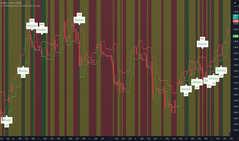
CRT + PO3 Range Theory Hey everyone, I’ve put together a little script for TradingView that tries to show the classic CRT + PO3 (Power of Three) pattern. It’s still a work in progress, so please use it on a demo account and let me know what you think!
What It Does
Accumulation Phase: On each higher‐timeframe bar (e.g. 2-hour), it draws a shaded zone where price is hanging out. That’s when we assume “big players” are quietly building positions.
Manipulation Phase: If price briefly pokes above or below that zone but then slips back inside, it marks that wick as a shake-out.
Distribution Phase: When price finally closes cleanly outside the zone, it draws another shaded area and drops a “Distribution” label plus a big LONG or SHORT arrow on that bar.
You can tweak it so it only shows signals when a bar closes (no more weird flashing mid-bar), or even allow “direct” Distribution on a clean breakout without waiting for a fake wick first.
How to Set It Up
Add the script from your Indicators list.
Pick your HTF (I like 2-hour or 4-hour).
Turn “Show Zone Labels” on or off—these are the little “Accumulation/Manipulation/Distribution” tags.
Turn “Show Entry Signals” on to get the big LONG/SHORT arrows.
If you hate flicker, check “Show signals only at bar close.”
If you want to catch a swift breakout (no fake-out needed), check “Allow direct Distribution on clean breakout.”
There are also sliders for zone colors, transparency, label size, and how far above/below the bars the labels sit.
Why It’s Still a Beta
I’m not a CRT/PO3 guru—this is more of a hobby project and a little facination for this strategy.
There might be edge cases where it misses a shake-out or flags a Distribution too early.
I take no responsibility for your trades—please only run it on a demo account until we’ve worked out the quirks.
Feedback Wanted!
If you try it out, I’d love to hear:
Did the Manipulation wicks line up where you expected?
Were the Distribution arrows on the right bars?
Any ideas for easier settings or extra alerts?
Thanks for testing and helping me turn this into something solid!
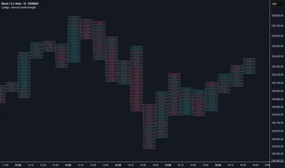
Internal Candle Strength [LuxAlgo]The Internal Candle Strength tool allows traders to divide each chart bar into multiple rows of custom size and inspect the strength of the lower timeframes trends located within each row.
This tool effectively helps traders in identifying the power dynamic between bulls and bears within multiple areas within each bar, providing the ability to conduct LTF analysis.
🔶 USAGE
The strength displayed within each row ranges from 0% to 100%, with 0% being the most bearish and 100% being the most bullish.
Traders should be aware of the extreme probabilities located at the higher/lower end of the bars, as this can signal a change in strength and price direction.
Traders can select the lower timeframe to pull the data from or the row size in the scale of the chart. Selecting a lower timeframe will provide more data to evaluate an area's strength.
Do note that only a timeframe lower than the chart timeframe should be selected.
🔹 Row Size
Selecting a smaller row size will increase the number of rows per bar, allowing for a more detailed analysis. A lower value will also generally mean that less data will be considered when calculating the strength of a specific area.
As we can see on the chart above (all BTCUSD 30m), by selecting a different row size, traders can control how many rows are displayed per bar.
🔶 SETTINGS
Timeframe: Lower timeframe used to calculate the candle strength.
Row Size: Size of each row on the chart scale, expressed as a fraction of the candle range.
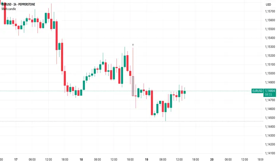
Mark specific candle (e.g. bar 20)This Pine Script indicator, "Mark specific candle (e.g. bar 20)" (short title "Mark candle"), is a simple yet powerful tool to visually highlight a particular candle on your chart.
What it does:
It marks a specific candle (e.g., the 20th, 10th, or any number you choose) counting backwards from the most recent candle on your chart. The marked candle will be colored in a subtle light grey and also feature a tiny, matching grey arrow pointing down from above it.
Why it's useful:
This indicator helps you quickly identify and track a consistent reference point in recent price action. It's great for strategies that depend on fixed look-back periods or for simply keeping an eye on a specific historical candle's position as new data comes in.
Key Features:
Adjustable Candle Number: Easily change which candle is marked (e.g., 20th, 10th, 5th) directly from the indicator settings using the "Candle Number to Mark (from end)" input.
Clear Visuals: Both the candle color and a small arrow provide a subtle, yet effective, visual cue.
How to use:
Simply add this script to your TradingView chart. Then, open the indicator's settings to set your desired candle number.