Exhaustion Zone [by rukich]🟠 OVERVIEW
The indicator shows asset exhaustion — an area of interest where potential buying opportunities can be considered.
🟠 COMPONENTS
The indicator is based on a combination of fundamental tools designed to properly react to price movement and volatility.
It is displayed on the chart as a green line. When the price touches the indicator line, the candle lights up and is highlighted in green.
🟠 HOW TO USE
The best timeframes for using the indicator: 1D and 3D.
Since the indicator is used on higher timeframes, the price rarely reaches the indicator line, but it often shows a strong reaction when it does, which suggests that the indicator can be used for investment purposes.
Since the zone suggests potential buying opportunities, it’s best to act from the zone only when a reaction is confirmed. Confirmation may include a candle close beyond nearby fractals or the invalidation of the nearest resistance zone.
🟠 CONCLUSION
The indicator highlights an area of interest where, upon confirmation of a reaction, buying opportunities may be considered.
Altseason
Altseason IndexDescription of the "Altseason Index" Indicator
The Altseason Index is a powerful and visually minimalist tool designed to objectively identify the onset and conclusion of an "altseason" in the cryptocurrency market. Moving beyond subjective speculation, this indicator employs a clear, mathematical methodology by comparing the performance of a broad basket of altcoins against Bitcoin.
🎯 Core Concept and Utility
An "Altseason" is a market period where altcoins (cryptocurrencies other than Bitcoin) consistently yield higher returns than BTC. This indicator empowers traders and investors to:
Objectively Identify Market Cycles: Precisely pinpoint when capital is actively rotating from Bitcoin into altcoins and vice versa.
Make Data-Driven Decisions: Adjust their strategy in a timely manner: increasing exposure to altcoins during an altseason or rotating back into BTC upon its conclusion.
Avoid Emotional Pitfalls: Steer clear of FOMO (Fear Of Missing Out) and base decisions on hard data rather than market noise.
⚙️ How the Calculation Works
1. Asset Selection: The indicator tracks the performance of 15 leading altcoins across various market segments (Layer 1s, DeFi, Meme, Payments), ensuring a representative sample.
2. Performance Comparison: For each altcoin, the percentage price change over the user-defined lookback period (default: 90 days) is calculated. This performance is then compared to BTC's performance over the same period.
3. Counting the "Outperformers": The index counts the number of altcoins that have "outperformed" BTC.
4. Calculating the Index: The Altseason Index value is the percentage of altcoins in the basket that are outperforming BTC. For example, a value of 60% means that 9 out of the 15 coins performed better than Bitcoin.
🛠️ Indicator Settings
The settings are kept simple and intuitive, allowing you to customize the indicator to your strategy:
Lookback Period (days) (Default: 90):
- Defines the time horizon for the performance calculation.
- Shorter Periods (30-60 days) react faster to new trends but may produce more false signals.
- Longer Periods (90-180 days) provide smoother and more reliable signals, capturing sustained macro-trends.
Altseason Threshold (%) (Default: 75%):
- This is the key parameter that defines what index value constitutes an official "altseason."
- A threshold of 75% means an altseason is declared when at least 11 out of the 15 altcoins (75%) are outperforming BTC.
- You can increase the threshold (e.g., to 85%) for more conservative and stronger signals, or decrease it (e.g., to 65%) for earlier entries.
📊 Interpreting the Readings and Signals
The indicator uses a clear color-coding system and levels for easy interpretation:
🔴 < 30%: "BTC SEASON"
Bitcoin is dominating. The market is in risk-off mode or a state of anticipation. Growth is concentrated in BTC.
⚪ 30% - 49%: "NEUTRAL"
A transitional phase. The market is uncertain. Some alts show strength, but there is no unified trend.
🔵 50% - 74%: "BULLISH"
Growing strength in altcoins. Capital is beginning to rotate actively. This can be an early stage of an altseason.
🟢 ≥ 75% (or your custom threshold): "ALTSEASON"
The active altseason phase. The vast majority of altcoins are rising faster than BTC. This is the period of maximum potential returns for alts.
Signal Markers:
Green Dot: Signals the potential start of an altseason (the index crosses above the threshold).
Red Dot: Signals the potential end of an altseason (the index crosses below the threshold).
ℹ️ Information Panel
The chart displays two clean information panels:
1. Main Info Label:
Current index value (e.g., ⟠ 80%).
Market status (ALTSEASON, BULLISH, etc.).
The ratio of outperforming altcoins (11/15 alts).
2. Dominance & Market Cap Panel:
Alts: Altcoin Dominance (the market cap share of all coins except BTC).
BTC: Bitcoin Dominance.
Market: Total cryptocurrency market capitalization in billions of USD. This helps assess the overall market context (bullish/bearish).
💎 Conclusion
The Altseason Index is your strategic companion for navigating the crypto markets. It transforms the complex task of identifying market cycles into a simple and visual process. Use it to confirm broad market trends, identify potential entry and exit points, and, most importantly, to maintain discipline in your trading strategy by filtering out noise and emotion.
Disclaimer: This indicator is a tool for analysis and does not constitute investment advice. All trading decisions are taken at your own risk.

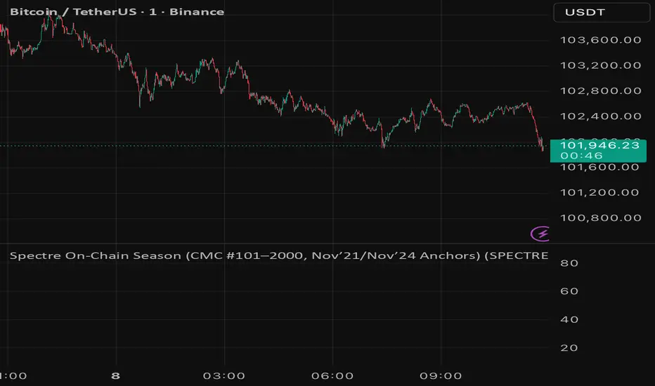
Spectre On-Chain Season (CMC #101–2000, Nov’21/Nov’24 Anchors)Spectre On-Chain Season Index measures the real health of the on-chain market by focusing on the mid-tail of crypto — not Bitcoin, not ETH, not the Top 100.
Instead of tracking hype at the top of the market, this index looks at coins ranked #101–#2000 on CoinMarketCap and compares their current price performance to their cycle highs from:
November 2021 peak
November 2024 peak
Lakshmi - Vajra Energy Signal (VES)Vajra Energy Signal (VES) is an advanced volume analysis indicator that detects energy accumulated inside the market.
When assessing the strength of trading activity, conventional practice looks at the magnitude of volume; VES is designed with the understanding that the same volume can have different meanings depending on the price range.
VES analyzes the complex relationship between price movement and volume with a proprietary algorithm and can detect internal market activities that are invisible from surface‑level price action, visualizing the characteristic whereby the value rises before a breakout.
In other words, VES views the market as an “energy system.” In the energy accumulation phase, relatively high volume occurs relative to the price range, and in the energy release phase, the stored energy is emitted as high volatility in price, that is, a breakout—this is the core concept on which VES is established.
⚡️ Basic Demonstration
i.imgur.com
As you can see in the image above, VES simply displays the highs and lows of energy stored in the market as a thin line in a separate panel.
It is easy for traders to understand its intuitive patterns: it rises when hidden buying accumulation or selling activity continue and sink when a price breakout occurs. It can be applied across symbols and markets (stocks, commodities, cryptocurrencies, spot, and futures). While reducing clutter in price scale labels, it also supports dynamic autoscaling.
⚡️ Practical Usage
VES is expected to be used for the following purposes.
- Entry signal
When the VES value continues to rise—i.e., during energy accumulation—it can be considered on standby for a breakout. After a breakout, a trader can confirm the trend direction and enter.
- Exit signal
If the VES value rises during a trend, consider the possibility of a reversal and consider taking profits.
- Risk management
If the VES value remains elevated for a long period, regard it as increased market uncertainty and an approaching breakout; adopt a cautious trading strategy to prepare for higher volatility and adjust position size.
For example, in the BINANCE:SOLUSDT daily chart below, VES clearly shows how it functions in short‑term trading.
i.imgur.com
In September 2023, when the price was moving around 20 USDT, VES formed frequent small spikes. These early spikes suggest that market participants were still in a wait‑and‑see mode and that small‑scale accumulation was being conducted intermittently.
A decisive change came in early October 2023. While the price still stagnated in the 20–25 USDT range, VES suddenly formed a huge spike. The scale of this spike was far larger than those in September 2023, clearly suggesting that hidden substantial trading activities by large investors had begun.
In mid‑October 2023, the price began to rise. It climbed stepwise from 25 USDT to 40 USDT, then to 60 USDT and 75 USDT, and then surged to above 120 USDT within just a few weeks. This suggests that the energy built in the buy accumulation phase in early October 2023 was converted into price appreciation.
Therefore, after such a large VES signal is observed and the price breaks upward, entering a long position could have been profitable.
A large VES reaction is not only a quiet “buy signal” as in the example above; it can also be a “sell signal.” Such a case is explained below using an example on the BTC chart.
i.imgur.com
This BITSTAMP:BTCUSD 4‑hour chart is a valuable example showing how VES detects top formation on a short timeframe. In the first half of February 2024, the price moved in a relatively narrow 96,000–99,000 USD range. During this period, VES remained stable at low levels, and the market continued a calm uptrend.
The first sign appeared on February 16, 2024. While the price still held around 97,000 USD, VES formed a clearly identifiable small spike. This implied that some large investors had begun to take profits, or that new sellers had started to build short positions. However, at that point, the impact on price was limited, and many traders may have overlooked the signal.
The decisive turning point came on February 23, 2024. With the price moving around 98,000 USD, VES suddenly formed a huge spike. The scale of this spike was far larger than previous moves, clearly indicating that significant energy was accumulating.
Importantly, even at this moment the price still remained at the highs. On the surface, price barely moved and the bull trend appeared intact, but VES detected a major internal change underway.
On February 24, 2024, the price collapsed and began to fall. It dropped about 15% from 97,000 USD to 82,000 USD in a few days. The speed and magnitude of this decline corroborated the quiet “sell signal” indicated by the VES spikes.
The key lesson from this chart is that a VES spike does not necessarily mean buy accumulation. A large VES spike formed at high prices may instead indicate a distribution phase—that is, large investors exiting or building short positions. When the price is at elevated levels, a VES spike should be considered not only as a precursor to further upside but also as a warning of potential downside.
From a trading‑strategy perspective, the huge VES spike on February 23, 2024 was a clear signal to exit or to consider entering short positions. At that point, traders should have either closed long positions or to consider building a short position. The moment when price started to decline from its peak was exactly the entry timing for a short.
On the 4‑hour timeframe, changes in VES appear faster and more dramatically. While this allows more agile responses, the risk of false signals is also higher; therefore, confirmation on other timeframes and comprehensive judgment with price action are essential.
VES is a powerful tool for reading internal market activities, and this chart clearly shows that its interpretation requires flexibility that takes into account market conditions and price location.
⚡️ Parameter Settings
Strength 1: The lower the number, the more it emphasizes responses closer to the present timeframe; the higher the number, the more it emphasizes responses farther from the present timeframe. 5 is recommended.
Strength 2: The lower the number, the greater the volatility of the value; the higher the number, the smaller the volatility. 5 is recommended.
Scale: Adjusts the display scale. −30 is recommended.
⚡️ Conclusion
Vajra Energy Signal (VES) visualizes the cycle of energy accumulation in the market from the relative relationship between price range and volume, detecting hidden activities by market participants that conventional volume analysis cannot capture. VES serves as a powerful auxiliary tool for early detection of turning points, enabling deeper market understanding and more accurate timing decisions. As the examples show, there is a possibility of sensing major price movements in advance. When using VES, flexible interpretation according to market environment and price location is required, and it demonstrates its true value when combined with price action and other analysis methods such as support/resistance.
⚡️ Important Notes
- VES is a tool that infers internal market energy; it does not guarantee trades or suggest future results.
- We strongly recommend using it together with price action analysis and support/resistance.
- Confirmation across different timeframes improves reliability.
- Effectiveness may vary depending on market conditions and liquidity.
- Very illiquid instruments or newly listed assets may produce more noise.
⚡️ How to Get Access
This indicator is Public Invite‑Only. If you would like access, please apply by following the Author’s Instructions.

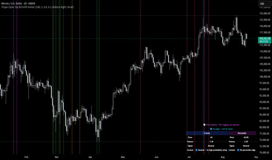
Trojan Cycle: Dip & Profit Hunter📉 Crypto is changing. Your signals should too.
This script doesn’t try to outguess price — it helps you track capital rotation and flow behavior in alignment with the evolving macro structure of the digital asset market.
Trojan Cycle: Dip & Profit Hunter is a signal engine built to support and validate the capital rotation models outlined in the Trojan Cycle and Synthetic Rotation theses — available via RWCS_LTD’s published charts
It is not a classic “buy low, sell high” tool. It is a structural filter that uses price/volume statistics to surface accumulation zones, synthetic traps, and macro context shifts — all aligned with the institutionalization of crypto post-2024.
🧠 Purpose & Value
Crypto no longer follows the retail-led, halving-driven pattern of 2017 or 2021.
Instead, institutional infrastructure, regulatory filters, and equity-market Trojan horses define the new path of capital.
This tool helps you visualize that path by interpreting behavior through statistical imbalances and real-time momentum signals.
Use it to:
Track where capital is accumulating or exiting
Identify signals consistent with true cycle rotation (vs. synthetic traps)
Validate your macro view with real-time statistical context
🔍 How It Works
The engine combines four signal layers:
1. Z-Score Logic
- Measures how far price and volume have deviated from their mean
- Detects dips, blowoffs, and exhaustion zones
2. Percentile Logic
- Compares current price and volume to historical rank distribution
- Flags statistically rare conditions (e.g. bottom 10% price, top 90% volume)
3. Combined Context Engine
- Integrates both models to generate one of 36 unique output states
- Each state provides a labeled market context (e.g., 🟢 Confluent Buy, 🔴 Confluent Sell, 🧨 Synthetic Trap )
4. Momentum Spread & Divergence
- Measures whether price is leading volume (trap risk) or volume is leading price (accumulation)
- Outputs intuitive momentum context with emoji-coded alerts
📋 What You See
🧠 Contextual Table UI with key Z-Scores, percentiles, signals, and market commentary
🎯 Emoji-coded signals to quickly grasp high-probability setups or risk zones
🌊 Optional overlays: price/volume divergence, momentum spread
🎨 Visual table customization (size, position) and chart highlights for signal clarity
🔔 Alert System
✅ Single dynamic alert using alert() that only fires when signal context changes
Prevents alert fatigue and allows clean webhook/automation integration
🧭 Use Cases
For macro cycle traders: Track where we are in the Trojan Cycle using statistical context
For thesis explorers: Use the 36-output signal map to match against your rotation thesis
For capital rotation watchers: Identify structural setups consistent with ETF-driven or compliance-filtered flow
For narrative skeptics: Avoid synthetic altseason traps where volume lags or flow dries up
🧪 Suggested Pairing for Thesis Validation
To use this tool as part of a thesis-confirmation framework , pair it with:
BTC.D — Bitcoin Dominance
ETH/BTC — Ethereum strength vs. Bitcoin
TOTALE100/ETH — Altcoin strength relative to ETH
RWCS_LTD’s published charts and macro cycle models
🏁 Final Note
Crypto has matured. So should your signals.
This tool doesn’t try to game the next 2 candles. It helps you understand the current phase in a compliance-filtered, institutionalized rotation model.
It’s not built for hype — it’s built for conviction.
Explore the thesis → Validate the structure → Trade with clarity.
🚨 Disclaimer
This script is not financial advice. It is an analytical tool designed to support market structure research and rotation thesis validation. Use this as part of a broader framework including technical structure, dominance charts, and macro data.
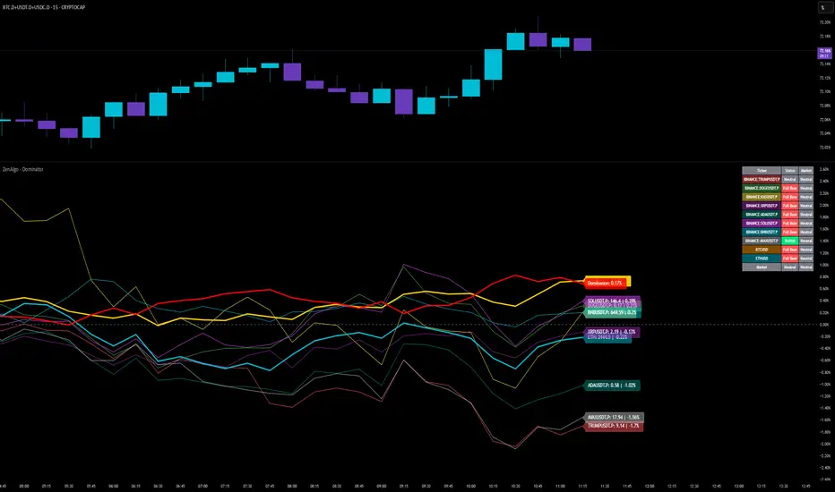
ZenAlgo - DominatorThis indicator provides a structured multi-ticker overview of market momentum and relative strength by analyzing short-term price behavior across selected assets in comparison with broader crypto dominance and Bitcoin/ETH performance.
Ticker and Market Data Handling
The script accepts up to 9 user-defined symbols (tickers) along with BTCUSD and ETHUSD. For each symbol:
It retrieves the current price.
It also requests the daily opening price from the "D" timeframe to compute intraday percentage change.
For BTC, ETH, and dominance (sum of BTC, USDT, and USDC dominance), daily change is calculated using this same method.
This comparison enables tracking relative performance from the daily open, which provides meaningful insight into intraday strength or weakness among different assets.
Dominance Logic
The indicator aggregates dominance data from BTC , USDT , and USDC using TradingView’s CRYPTOCAP indices. This combined dominance is used as a reference in directional and status calculations. ETH dominance is also analyzed independently.
Changes in dominance are used to infer whether market attention is shifting toward Bitcoin/stablecoins (typically indicating risk-off sentiment) or away from them (typically risk-on behavior, benefiting altcoins).
Price Direction Estimation
The script estimates directional bias using an EMA-based deviation technique:
A short EMA (user-defined lookback , default 4 bars) is calculated.
The current close is compared to the EMA to assess directional bias.
Recent candle changes are also inspected to confirm a consistent short-term trend (e.g., 3 consecutive higher closes for "up").
A small threshold is used to avoid classifying flat movements as trends.
This directionality logic is applied separately to:
The selected ticker's price
BTC price
Combined dominance
This allows the script to contextualize the movement of each asset within broader market conditions.
Market Status Evaluation
A custom function analyzes ETH and BTC dominance trends along with their relative strength to define the overall market regime:
Altseason is identified when BTC dominance is declining, ETH dominance rising, and ETH outperforms BTC.
BTC Season occurs when BTC dominance is rising, ETH dominance falling, and BTC outperforms ETH.
If neither condition is met, the state is Neutral .
This classification is shown alongside each ticker's row in the table and helps traders assess whether market conditions favor Bitcoin, Ethereum, or altcoins in general.
Ticker Status Classification
Each ticker is analyzed independently using the earlier directional logic. Its status is then determined as follows:
Full Bull : Ticker is trending up while dominance is declining or BTC is also rising.
Bullish : Ticker is trending up but not supported by broader bullish context.
Bearish : Ticker is trending down but without broader confirmation.
Full Bear : Ticker is trending down while dominance rises or BTC falls.
Neutral : No strong directional bias or conflicting context.
This classification reflects short-term momentum and macro alignment and is color-coded in the results table.
Table Display and Plotting
A configurable table is shown on the chart, which:
Displays the name and status of each selected ticker.
Optionally includes BTC, ETH, and market state.
Uses color-coding for intuitive interpretation.
Additionally, price changes from the daily open are plotted for each selected ticker, BTC, ETH, and combined dominance. These values are also labeled directly on the chart.
Labeling and UX Enhancements
Labels next to the current candle display price and percent change for each active ticker and for BTC, ETH, and combined dominance.
Labels update each bar, and old labels are deleted to avoid clutter.
Ticker names are dynamically shortened by stripping exchange prefixes.
How to Use This Indicator
This tool helps traders:
Spot early rotations between Bitcoin and altcoins.
Identify intraday momentum leaders or laggards.
Monitor which tickers align with or diverge from broader market trends.
Detect possible sentiment shifts based on dominance trends.
It is best used on lower to mid timeframes (15m–4h) to capture intraday to short-term shifts. Users should cross-reference with longer-term trend tools or structural indicators when making directional decisions.
Interpretation of Values
% Change : Measures intraday move from daily open. Strong positive/negative values may indicate breakouts or reversals.
Status : Describes directional strength relative to market conditions.
Market State : Gives a general bias toward BTC dominance, ETH strength, or altcoin momentum.
Limitations & Considerations
The indicator does not analyze liquidity or volume directly.
All logic is based on short-term movements and may produce false signals in ranging or low-volume environments.
Dominance calculations rely on external CRYPTOCAP indices, which may differ from exchange-specific flows.
Added Value Over Other Free Tools
Unlike basic % change tables or price overlays, this indicator:
Integrates dominance-based macro context into ticker evaluation.
Dynamically classifies market regimes (BTC season / Altseason).
Uses multi-factor logic to determine ticker bias, avoiding single-metric interpretation.
Displays consolidated information in a table and chart overlays for rapid assessment.
TOTAL3/BTC This Pine Script™ code, named "TOTAL3/BTC with Arrow," is designed for cryptocurrency analysis on TradingView.
This script essentially provides a visual tool for traders to gauge when altcoins might be gaining or losing ground relative to Bitcoin through moving average analysis and color-coded trend indication.
Intention was to help the community with a script based on classic TA only.
Use it with SASDv2r indicator.
Feel free to make it better. If you did so, please let me know.
Main elements:
Data Fetching: It retrieves market cap data for all cryptocurrencies excluding Bitcoin and Ethereum (TOTAL3) and for Bitcoin (BTC).
Ratio Calculation: The script calculates the ratio of TOTAL3 to BTC market caps, which indicates how altcoins (excluding ETH) are performing relative to Bitcoin.
Plotting the Ratio: This ratio is plotted on the chart with a blue line, allowing traders to see the relative performance visually.
Moving Averages: Two Simple Moving Averages (SMA) are calculated for this ratio, one for 20 periods (ma20) and another for 50 periods (ma50), though these are not plotted in the current version of the code.
Reference Lines: Horizontal lines are added at ratios of 0.3 and 0.8 to serve as visual equilibrium points or thresholds for analysis.
Complex Moving Average: The script uses constants (len, len2, cc, smoothe) from another script, suggesting it's adapting or simplifying another's logic for multi-timeframe analysis.
Average Calculation: Two SMAs (avg and avg2) are computed using the constants defined, focusing on different lengths for trend analysis.
Direction Determination: It checks if the moving average is trending up or down by comparing the current value with its value smoothe bars earlier.
Color Coding: The color of the plotted moving average changes based on its direction (lime for up, red for down, aqua if no clear direction), aiding in quick visual interpretation of trends.
Plotting: Finally, the script plots this multi-timeframe moving average with a dynamic color to reflect the current market trend of the TOTAL3/BTC ratio, with a thicker line for visibility.

skX FVG Enhanced Indicator [1m,5m] skX FVG Indicator
Fair Value Gaps (FVGs) are particularly effective for scalping altcoins due to their tendency to fill price inefficiencies. These gaps occur during strong momentum moves where price leaves an 'empty' zone that often acts as a magnet for price to return to. In the volatile alt market, these gaps frequently present high-probability scalping opportunities.
Why FVGs Work in Alts:
• Quick price movements create more gaps
• Higher volatility increases gap frequency
• Institutional algorithms tend to fill these inefficiencies
• Works especially well in lower timeframes (1-5m)
Key Features:
✓ Automatic FVG detection with size filtering
✓ Smart timeframe adaptation (1m, 5m, Custom settings)
✓ Trend detection using 8/21/55 EMA system
✓ Dynamic TP/SL levels based on ATR
✓ Risk:Reward ratio automation
✓ Visual signals that stick to price levels
✓ Clear information display panel
✓ Built-in alerts system
How to Use:
1. Select your preferred timeframe (1m or 5m recommended)
2. Watch for triangle signals (▲ bullish, ▼ bearish)
3. Confirm with trend direction (shown in panel)
4. Use provided TP/SL levels for trade management
5. Set alerts for new FVG formations
Settings Explained:
• Auto Mode: Adjusts gap size to timeframe
• Custom Gap Size: Manual gap size control
• ATR Period: Volatility measurement window
• ATR Multiplier: Stop loss distance
• Risk:Reward: Take profit ratio
Best Practices:
• Use in conjunction with support/resistance
• Trade in direction of main trend
• Monitor higher timeframe structure
• Start with recommended settings
• Backtest before live trading
Note: This indicator works best in volatile market conditions and should be used as part of a complete trading strategy.
Good luck trading!
-skX

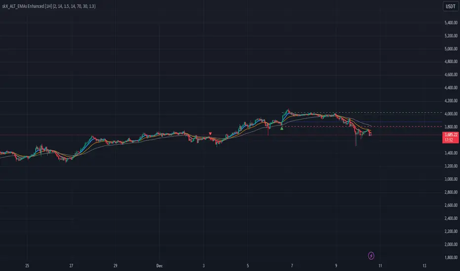
skX_ALT_EMAs Enhanced [1H]An advanced EMA crossover system with dynamic ATR-based risk management, designed
for altcoin trading on the 1H timeframe. Combines trend following with momentum
and volume filters.
CORE COMPONENTS:
1. EMA System:
- 8 EMA (Fast): Primary signal line
- 21 EMA (Medium): Crossover reference
- 55 EMA (Slow): Trend filter
2. Multiple Filters:
- RSI (14): Prevents overbought/oversold entries
- Volume: Optional volume confirmation
- Trend Strength: EMA alignment check
3. Risk Management:
- Dynamic SL: Based on ATR (Average True Range)
- Dynamic TP: Risk:Reward based calculation
- Position entry markers
ENTRY CONDITIONS:
LONG:
- 8 EMA crosses above 21 EMA
- All EMAs aligned bullish (8 > 21 > 55)
- Price above 8 EMA
- RSI below 70 (not overbought)
- Optional: Volume > 1.5x average
SHORT:
- 8 EMA crosses below 21 EMA
- All EMAs aligned bearish (8 < 21 < 55)
- Price below 8 EMA
- RSI above 30 (not oversold)
- Optional: Volume > 1.5x average
RECOMMENDED SETTINGS:
- Timeframe: 1H
- ATR Period: 14
- ATR Multiplier: 1.5
- Risk:Reward: 2.0
- RSI Filter: ON
- Volume Filter: Optional (ON for low liquidity pairs)
VISUAL SIGNALS:
- Green Triangle: Long entry
- Red Triangle: Short entry
- Blue Line: Entry price
- Red Line: Stop Loss
- Green Line: Take Profit
- EMA Colors: Blue/Red for trend direction
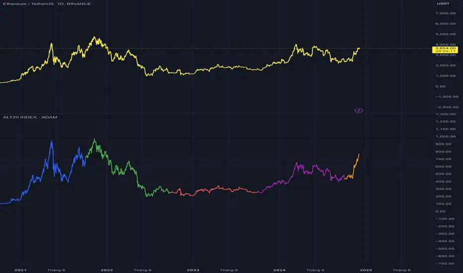
TOP 20 ALTCOIN INDEXIndicator Description
The "ALT20 INDEX" is a financial analysis tool designed to track the aggregate value of the top 20 cryptocurrencies by market capitalization and closing prices over specific periods. This indicator reflects changes in the combined value of these 20 ALTCOINs, providing an overview of trends in the cryptocurrency market.
=================================
Purpose and Practical Applications
1. Tracking Top Cryptocurrencies:
- The indicator allows monitoring the value of the top 20 ALTCOINs, reflecting the general volatility of the cryptocurrency market.
- Helps investors focus on high-capitalization assets.
2. Performance Comparison:
- Serves as a tool to compare the performance of the ALT20 group against other assets like Bitcoin, Ethereum, or traditional financial indices.
3. Assessing Market Health:
- Enables evaluation of market trends, identifying growth or decline periods.
4. Practical Applications:
- Suitable for fund managers, long-term investors, or trend traders to make decisions based on the overall ALTCOIN market performance.
-------------------------------------------
How the Indicator Works
1. Selection of Top 20 ALTCOINs:
- Cryptocurrencies are selected based on their market capitalization at each rebalancing period.
2. Weight Allocation and Calculation:
- Weight: Determined by the market capitalization of each ALTCOIN relative to the total market capitalization of the top 20.
- Token Quantity: Calculated based on weight, total allocation points (e.g., 100 points for T1, 722.63 points for T2, etc.), and each ALTCOIN's closing price.
Formula: Token Quantity = Weight × Total Allocation Points/Closing Price
3. Periodic Rebalancing:
- Rebalancing frequency: Once a year.
- At each rebalancing period, the weights and token quantities are adjusted based on new market capitalization and prices.
4. Portfolio Value Calculation:
- The value of each ALTCOIN is calculated as:
Token Value = Closing Price × Token Quantity
- Index Total: ALT20 Index = 20∑'i=1'Token Value'i'
------------------------------------------
Rebalancing Periods
T1 (2020-2021): Initial period, token quantities calculated based on weights and a total of 100 points.
T2 (2021-2022): Rebalanced with a total allocation of 722.63 points.
T3 (2022-2023): Total allocation of 252.26 points, reflecting portfolio adjustments based on new prices and market caps.
T4 (2023-2024): Total allocation of 261.43 points.
T5 (2024-Present): Total allocation of 437.42 points, updated to reflect the current market.
-----------------------------------------
Indicator Features
- Displays Index Value Over Time:
+ index_value_T1 to index_value_T5 represent the portfolio value during specific timeframes.
+ Values are calculated based on the daily closing prices of ALTCOINs.
- Visualization:
+ The index for each period is plotted on the chart, enabling easy observation of market trends over time.
---------------------------------------
Practical Applications
- Portfolio Management:
+ The indicator helps track the performance of asset groups within the ALTCOIN portfolio.
- Integration into Trading Systems:
+ Used as a reference for automated or manual trading strategies.
- Market Analysis:
+ Assists analysts in evaluating cryptocurrency market movements based on the top 20 ALTCOINs.
Let me know if further optimization or additional information is needed! Thank!
Altcoin ComparatorUse this indicator to compare an altcoin's ratio compared to Bitcoin (orange), the general altcoin market (blue), and the entire cryptocurrency market cap (yellow).
Bright colors indicate the altcoin is outperforming the crypto market while dull colors in imply it is under-performing.
Likewise, staying in the green implies sustained outperformance while staying in the red implies sustained under-perfrmance.
Oversold values imply the altcoin is expensive while overbought imply it is cheap.
Be sure to use market caps: ETH, SOL, ADA, etc. not ETHUSD, SOLUSDT, etc.

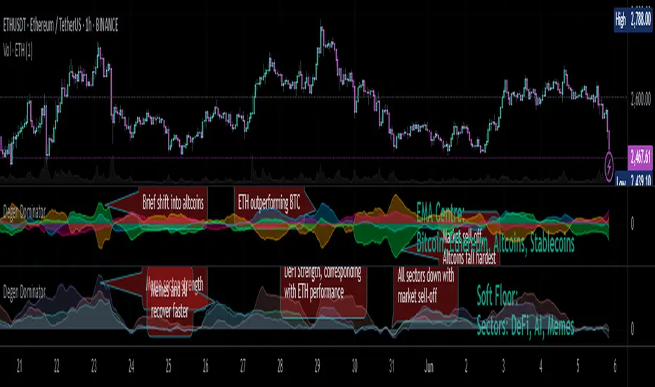
Degen Dominator - (Crypto Dominance Tool) - [mutantdog]A fairly simple one this time. Another crypto dominance tool, consider it a sequel to Dominion if you will. Ready to go out-of-the-box with a selection of presets at hand.
The premise is straightforward, rather than viewing the various marketcap dominance indexes as their standard percentage values, here we have them represented as basic oscillators. This allows for multiple indexes to be viewed in one pane and gives a decent overview of their relative changes and thus the flow of capital within the overall crypto market. As a general rule-of-thumb, when a plot is above zero then the dominance is climbing, thus capital is likely flowing in that direction. The inverse applies when below zero. When the market is quiet, all will be close to zero. Basic overbought/oversold conditions can also be inferred too.
Active as default are:
Bitcoin (0range): CRYPTOCAP:BTC.D
Ethereum (Blue): CRYPTOCAP:ETH.D
Stablecoins (Red): CRYPTOCAP:USDT.D + CRYPTOCAP:USDC.D
Altcoins (Green): 100 - (all of the above)
These are plotted according to the selected oscillator preset and it's length parameter. The default is set to 'EMA Centre'. An optional RMA(3) smoothing filter is also included and active as default. Each index plot has its own colour and opacity settings available on the main page.
Additionally, the following are also available (deactivated as default):
Total DeFi : CRYPTOCAP:TOTALDEFI.D
Current Symbol : Will try to match corresponding dominance index for the chart symbol if available.
Custom Input : Manual text input, will try to match if available.
-------------
The included presets determine the oscillator type used, all are fairly simple and easy to interpret:
EMA Centre
SMA Centre
Median Centre
Midrange Centre
The first 4 are all variations on the same theme, simply calculated as the difference between the actual value and its respective average. EMA is the default and is my personal preference, if you generally favour using an SMA then perhaps that would be your better choice. Like the two MAs, median and midrange are also dependant on the length parameter. Midrange is calculated from the difference between highest and lowest values within the length period, with a little extra smoothing from an RMA(3).
Simple Delta
Weighted Delta
Running Delta
Often referred to as momentum, delta is just change over time. 'Simple' is the most basic of these, the difference between the current value and the value (length) bars prior. A more long-winded way of calculating this would be to take the difference between each bar and its previous then average them with an SMA which results in the same value. 'Weighted' adopts that principle but instead uses a WMA, likewise 'Running' is the same but using an RMA. The latter is actually the basis of RSI calculations before any normalisation is applied, as you can see in the next preset.
RSI
CMO
RSI really should not need explaining, it is however applied a little differently here to the usual, in this case centred around 0. The x100 multiplication factor has been dropped too for the sake of consistency. The same principle applies with CMO, which is basically a 'Simple Delta' version of RSI.
Hard Floor
Soft Floor
These last two are a little different but both can provide useful interpretations. The floor here is simply the lowest value within the chosen length period. 'Hard' plots the difference between the current value and the floor, thus giving a value that is always above 0. In this case, focus should be given to the relative heights of each with a simple interpretation that capital is flowing into those that are climbing and out of those descending. 'Soft' is essentially the same except that the floor is smoothed with an RMA(3), the result being that when new lows are made, the plot will break below 0 before the floor corrects a few bars later. This soft break provides additional information to that given by 'Hard' so is probably the more useful of the two.
------------
To finish it off, a bunch of preset alerts are included for the various 0 crossings.
So that just about covers everything then, all quite straightforward really. Future updates may include some extra stuff, the composition of the stablecoin index may change if necessary too. While this is not really a tweaker's tool like some of my other projects, there's still some room for experimentation here. The 'current' and 'custom' indexes can provide some useful data for compatible altcoins and the possibility to compare inter-related tokens (eg: Doge vs Shib). While i introduced this as a sort of sequel to Dominion, it is not intended as a replacement but more of a companion. This initially started as a feature intended for that one but it quickly grew into its own thing. Both the oscillator view here and the more traditional view have merits, i personally use this one primarily now but frequently refer to Dominion for confirmations etc.
That's it for now anyway. As always, feedback is welcome below. Enjoy!
DashBoard Alt Season by KziHere is a Dashboard to have an overview of the Alt Season oportunity.
Multiple time frame (Month / Week / Daily /4H)
How to use it?
You have 4 columns
TOTAL Crypto / Btc dominance / Btc Price / Alt ?
The alt? column is the resulte of the price and dominance of btc + 1 point with the total crypto
BTC Dominance UP ? Yes = Négatif for ALTS
/// Btc Price UP ?= > Yes = Positif for ALTS
NO = super négatif for ALTS
No = Positif for ALTS
/// Btc Price UP ?= > Yes = super Positif for ALTS
NO = Neutral
The total market just smooth the total.
If Alt columm is Green= It's OK
If Alt columm is orange = carrefull
If Alt Columm is red = leave the alt
You have to considered that you look on the time frame where you want to trade.
The overtime frame help to understand the bigger view.
Hop you like it and give comment to help the évolutions.

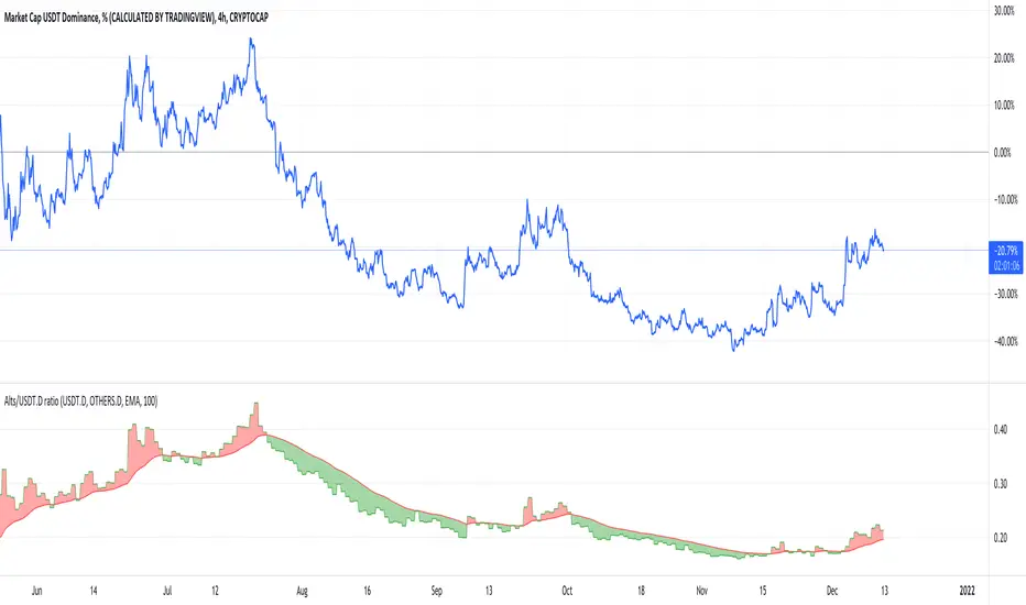
Alts/USDT.D ratioThis indicator shows the ratio between USDT.D and OTHERS.D. The growth of USDT.D may be a sign of the beginning of the bear season.
Red cloud - bear season, green cloud - altseason
credit for @kduhyun for his ratio script and @boitoki for his package of various MAs
Dominion - Bitcoin Altcoin Dominance [mutantdog]A simple and easy reference tool displaying a plot of the market cap dominance values for several significant cryptocurrencies.
The most widely used of these is bitcoin dominance (the top indicator shown above) which calculates the total market cap of bitcoin in relation to the total cryptocurrency market cap, displayed as a percentage. This is commonly used by traders to assess the strength of bitcoin in relation to the broader crypto market; increasing values being indicative of larger bitcoin moves and decreasing values often indicative of potential altcoin cycles. Likewise, ethereum dominance (the bottom indicator shown above) is frequently used as a means to indicate the strength of ethereum in relation to the broader crypto market.
Included options for marketcap dominance values are:
Bitcoin : CRYPTOCAP:BTC.D
Ethereum : CRYPTOCAP:ETH.D
Total DeFi (a composite of multiple top defi tokens): CRYPTOCAP:TOTALDEFI.D
Stablecoins (shows the combined dominance values for usdt and usdc): CRYPTOCAP:USDT.D + CRYPTOCAP:USDC.D
Flippening (shows the difference between bitcoin and ethereum dominance values): CRYPTOCAP:BTC.D - CRYPTOCAP:ETH.D
When used in combination with each other, these can provide a good overview of the general flow of capital within the crypto market.
Additional functionality:
up to three optional moving averages with a choice of SMA, EMA, WMA and RMA for each.
multi timeframe selector
alert condition presets for various moving average crosses.
Please be aware that, while useful as reference, dominance calculations are known to repaint frequently. As such the use of this indicator and its alerts should require caution.
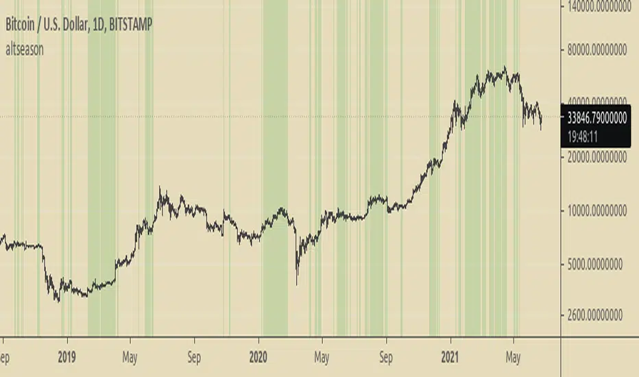
BTC Dominance TrendThis simple script applies the DMI/ADX (trend) indicator to the Bitcoin Dominance Index (BTC.D) to check whether BTC is increasing its dominance or not on that day. It is meant to be applied to altcoins on medium intervals. I put it together to test the following hypothesis: On days when BTC dominance is on the rise, altcoins are harder to take off, because Bitcoin is draining the lifeblood out of them, so caution is needed when opening trades.
Olive background means BTC dominance is rising on that day, purple that it is decreasing. White background means it is not moving significantly in any direction.
You can change the resolution (i.e. apply the DMI/ADX to a different BTC.D interval), just make sure to lower the threshold as well. I hope you find a good use for it! Beware if you try to incorporate it in your strategy, it uses higher timeframe data and hence is prone to repainting.

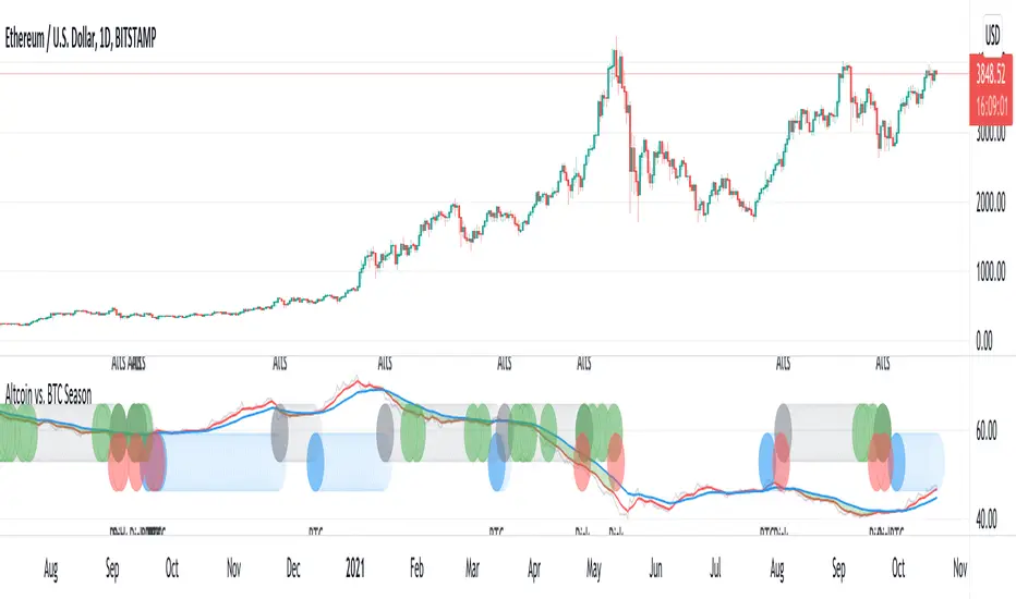
Altcoin vs. BTC SeasonUsing BTC dominance to identify BTC vs. Altcoin season.
Blue: BTC season
Gray: Altcoin season
Green: Altcoin at support - entry with good risk/reward
Red: Potential BTC downside risk
Altseason FinderTo know when to buy altcoins instead of bitcoin.
It is based on BTCUSD and BTC Dominance RSIs.
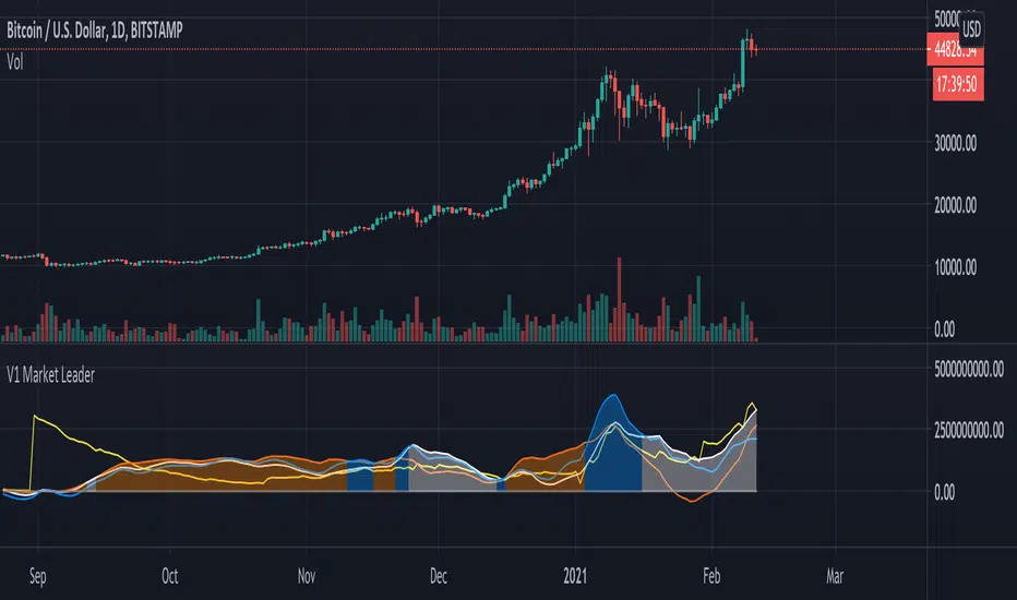
V1 Market Leader
This script aims to identify who the current market leader is between 3 participants, BTC , ETH and ALTS & ETH combined.
Colour coded so you can identify what is what in the settings - Default setting are: BTC = Orange, ETH = Blue and ALTS & ETH = White.
There is also a line to identify the market movement in relation to amount of Tether currently in circulation - Default setting is: Tether = Yellow.
This script can be used on any timeframe but I recommend 12H or greater.
Lines can be turned on and off in settings for cleaner look.

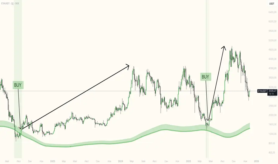
Altcoin Bullphase"Altcoin Bullphase" is an indicator to check if altcoins are currently in a bullphase/altseason.
The indicator is checking if Bitcoin is above or below a certain type of Moving Average and paints the color of the candles on the chart and tradingpair of your choice either green or gray for above or below the Moving Average.
NOTE: You have to disable the border color of the candles or use grayscale to get the look from the preview.
Default setting is 20 week moving average as it has the best history of calling an altcoin season.
Altcoins generally do really well when Bitcoin is above the 20 week moving average and don't do well when it falls below.
This indicator makes it easy to compare the performance of altcoins in these different phases and helps deciding on the future trend of a coin.
This script works for any altcoin, currency or stocks. Even Oil if you like to do that.
You can choose the type of MA between SMA , SMMA , EMA , WMA and VWMA .
You can set a static timeframe from 4h, 1D, 3D and 1W.
You can set any MA from 20 to 200.

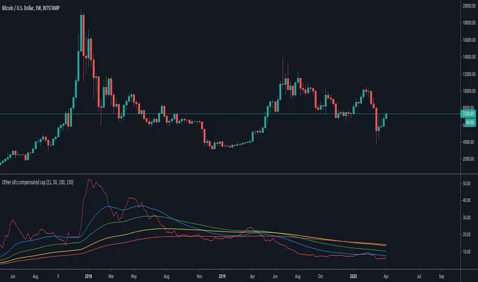
Other alts compensated capitalization [Peregringlk]DISCLAIMER: I'm not a native English speaker, so let me know please about mistakes in my wording.
Introduction
==========
This indicator (the middle one in the image) shows how the "others altcoins" (all altcoins except coins with high capitalization) are adding own value to its capitalization by removing BTC price changes. By "own value" I mean USD value gaining by actual buys in BTC markets beyong arbitrage effects of BTC price changes.
The main idea is that, if bitcoin has increased is value by 20%, and the other altcoins has increased its capitalization by 30%, the chart will only plot an increased of 10%. In other words, it will show its increased capitalization measured in BTC (the combined altcoin/BTC market is uptrending). Its purpose is to try to identify altseasons. A bit more concisely, the graph will only grow when both USD and BTC capitalization are growing. If any of them are going down, the graph will go down as well.
Rationale
========
- Altseasons are characterized by an incresed in BTC value of almost every altcoin during some period of time, although not all at once, but distributed over the altseason. For example, in the crazy altseason of Dec17/Jan18, almost every (low capitalized) altcoin increased its BTC value by a minimum of +300%, some at the beginning of the season, some at the end.
- When this happens, BTC loss capitalization dominance, but this also can happen if BTC is downtrending while altcoins are being bought in BTC markets but its USD value doesn't change too much. This happens when altcoins are uptrending in BTC price, but there are actually no gain of USD value because the BTC gain in value is not enough to compensate the BTC fall in price. Since BTC is losing USD price, but altcoins are not, dominance falls. So, looking at BTC dominance is not enough to spot possible beginnings of altseasons, because of arbitrage of other effects.
- The "big altcoins" are removed from the counting because one single big capitalized altcoin that grows, let's say, a 20%, will have an observable effect on the total altcoin capitalization, even if the rest of the altcoins are stagnated in price. For example, at today's date (8th April 2020), Ethereum by itself has the 23.89% of the total altcoins capitalization. A +10% in Ethereum price will increase the total altcoin capitalization by a +2.38%. I wanted to remove that effect to focus on generalized price changes of all altcoins. Remember that there are only 9 big altcoins 9 coins representing the 71% of the alts capitalization, while there are exists more than 5000 altcoins in total.
- Another key factor is that I want to focus on what happens in alt/BTC markets, because almost every altcoin can be traded against BTC, and most of them can only be traded against BTC. However, big altcoins can usually be traded against USD or other alt coins or fiat currencies as well. Removing the big alts from the equation helps (just a bit) to simplify the interpretation of the chart because arbitrage effects of those "impactfull" alts are limited (although not removed, because arbitrage also happens cross-markets).
- There are situations where BTC price is going up, alts USD capitalization is going up as well, but alts BTC capitalization is going down because altcoins are being sold in BTC markets, it just happens that the speed of the selling is not high enough as to compensated the increased in BTC price. That makes the USD capitalization grows, while alts are really being dumped in BTC markets. I wanted to reflect that effect as well by making sure that the graph is growing only when both USD and BTC capitalization of alts are growing.
Interpretation
============
If you want, you can see this chart as if plotting the Other alts capitalization as if priced against a fictional coin FCOIN, that start by having a price of 1, that combines the up and downs of both BTC price and alts USD capitalization in a very conservative way: if FCOIN price goes up, means that the other alts are gained USD value but only when they have overcome BTC price changes. Otherwise, it goes down.
If this fictional FCOIN has went up during some days straight with a total gain of maybe, greater than 10%, we are maybe in front of the start of an altseason. Sometimes, maybe (it requires some more years to extract a theory out of here), it can be used as proxy of the BTC near future (trend changes or continuations): if this FCOIN goes up, while BTC is doing nothing relevant or even is going down, it could signal that "people" is getting prepared and a generalized altcoin accumulation process has started, because of a combined people's assumption that BTC will start to have an stable uptrend, or will continue the current trend soon. There's some matches in the past about that, but there are also false positives, as usual.
Additionally, four customizable EMAs are added to the script, by default 21, 50, 100 and 150.
Definitions
=========
- Let's call `altcap_btc` the altcoin capitalization in USD, divided by BTC price. In other words, `altcap_btc` is the capitalization in terms of BTC.
- Let's call `x` the BTC price change rate as `btc_price_current_candle / btc_price_previous_candle`. So, if BTC has grown a +20%, `x = 1.20`, and if BTC has gone down a -20%, `x = 0.80`.
- Let's call `y` the `altcap_btc` price change rate, calculated as before but for `altcap_btc`.
- For pure math equivalence, `x * y` is thus the USD capitalization change rate.
Calculation
=========
For plotting the graph, for each candle, I choose a change rate, and then I plot the total accumulated change rate as by `ch0 * ch1 * ch2 * .... * ch_today`, where each `chX` is the choosen change rate of each candle since the beginning of the chart. So, if the "alts compensated value" has grown yesterday +20% and today's -10%, `1.20 * 0.9 = 1.08`, which means that in two days the compensated value has grown an 8% in total.
- If `x * y > 1` (USD cap is growing), I take `y` as change rate (alt/btc change rate).
- If both `x` and `y` are `> 1`, then the graph grows because I'm taking `y`.
- If `x > 1` and `y < 1`, the graph goes down because I'm taking `y`, reflecting the BTC markets are dumping.
- If `x < 1` and `y > 1`, the graph goes up because I'm taking `y`, reflecting the BTC markets are pumping so much that it overcomes the btc fall.
- `x < 1` and `y < 1` is impossible here because `x * y` must be `> 1` by precondition.
- If `x * y < 1` (USD cap is going down), I take `y` or `x * y` depending on the individual change rates:
- If `x` and `y` go in different directions (one up and the other down), I take `x * y` to reflect that USD capitalization has gone down. I don't take `y` here because it could be `> 1`, and I don't want to make the graph grow if alts are lossing USD value. Also, if `y < 1` and I take `y` the graph will go down faster than USD capitalization and I want to show that "alts compensated value is gown down slower than BTC because some boughts are happening". I don't take `x` either here for the same reasons.
- If both `x` and `y` are `< 1`, I take `y`, because otherwise the graph would be less than 0.000001 today after two years of bleeding, making literally impossible to see if alts "grow tomorrow".
- `x > 1` and `y > 1` is impossible here because `x * y` must be `< 1` by precondition.
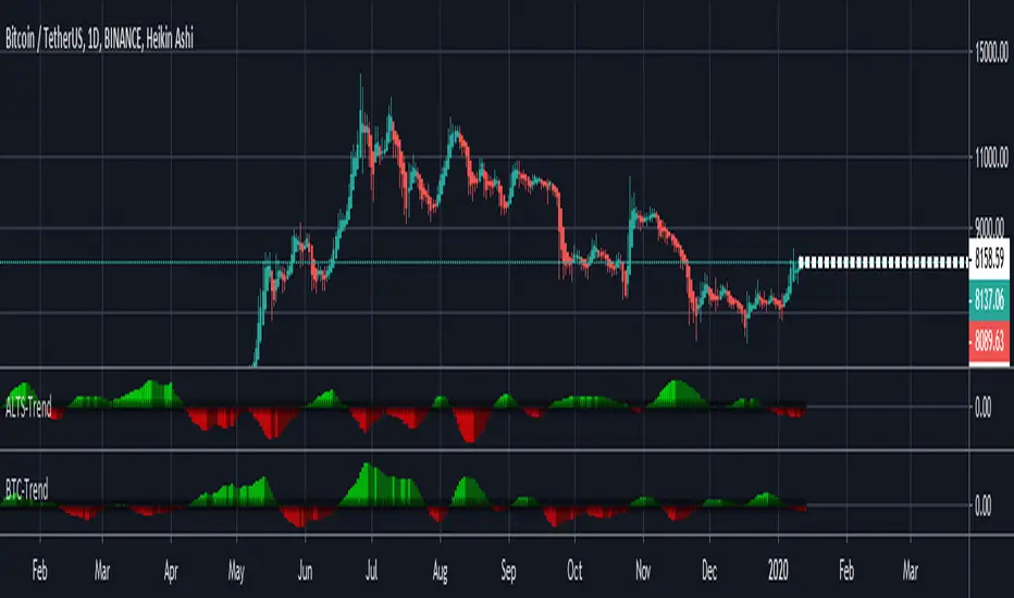
ALTS-Trend
ALTS-Trend
Altcoins-Trend is a technique that shows how much Altcoins is dominating the Marketcap and it's effect over the whole Crypto Market ,and that will show you alts season in each time frame because trend is relative .
*** Features
* Color grading to show you the Increase of domination effect (Green).
* Color grading to show you the Decrease of domination effect (Red) .
* Better understanding to the market ,and that will help you with a very good timed trades at the best trading times for altcoins .
/////////////////////////////////////////////
*Note
Special thanks for Lazybear for his momentum algorithm .