PROTECTED SOURCE SCRIPT
Dynamic Weekly Price Envelope

This is a indicator that I have been developing and personally using for over a year. The basic concept is a dynamic range that is derived from the previous weeks range. The main philosophy followed when designing this indicator was that it should be applicable to all asset classes, and it should provide objective price levels of support and resistance that do not change when price approaches them. This indicator is most useful in range bound price action, but gives a lot of useful information on any market condition at a glance. The indicator also generates a custom vwap that reflects the volume weighted price since the price broke significant levels.
Indicator Description
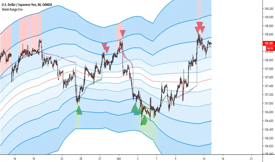
The indicators most important price levels are the top 3 lines and the bottom 3 lines. These lines are distinguished by their wider line thickness with default settings. These levels act as support and resistance, and the price entering these regions indicates that the asset is overbought or oversold. A setting is available to highlight in red or green when price is overbought or oversold. Here is an example:
This example also demonstrates one of my personal favorite signals, which is when the price reenters the central channel, then retests the overbought/oversold region, as it does in the example, shown by the second set of red arrows.
Timeframes
This indicator reacts dynamically, so the levels will look different on different timeframes. The hourly chart works best from my experience in forex and crypto with default settings, but in general lower timeframes will give a more accurate picture during extreme price action. Note: assets that have shorter sessions generally should use a smaller timeframe. I like to use 15min on stocks, this is similar to the hour chart in crypto or forex. Take this GBPUSD chart for example:
As you can see the price has a very extreme impulse, and all resistances are passed. You can see that the lines still act as support when price falls back into the range, but the indicator is not very useful when price exits the range. The solution for this is to drop down to a lower timeframe that will adjust faster to the extreme price movement.
Here you can see that the range shifts with the price movement, indicating support levels throughout the entire price impulse.
I will also drop down to lower timeframes if I want to utilize the price levels within the channel as support and resistance levels for intraday trading. Here is an example with price level interactions indicated by red and green arrows.
THe most significant levels are still the centerline and the top and bottom three levels, but the inner lines also are nice for intraday support and resistance.
Larger time frames like the daily chart also are useful. Let's take the daily Bitcoin chart as an example:
On larger timeframes,
- If price is below the central red line price is trending down, and if price is above central red line, the trend is up
- The asset trading outside of the entire range indicates that the trend is very strong, reentry into the channel indicates that price is likely to consolidate.
- The outer lines still serve as significant support and resistance.
Settings
I have configured the default settings to perform well for most assets, but I allow the user to change settings as they desire.
- Line Color - this setting changes the color of the lines.
- Fill Color - this setting changes the fill color used for the indicator
- Line Transparency - The transparency of the lines, set to 100 to completely hide all lines
- Base Fill Transparency - This setting changes the base transparency for the channel, this transparency will be used for the outermost bands
- Transparency Gradient Step - each band will become this amount more transparent as they come closer to the centerline
- Adjustment Lag - this adjusts how quickly the channel adjusts when the top and bottom levels are breached. I have always used 100, but using much higher or lower values gives interesting results.
- Show Signals - This enables basic swing signals to be shown by red and green triangles. Note that this is only one signal, and the system actually has many signals outside of these triangles. They only indicate optimal entries for a swing trading technique based on the indicator.
- Show Oversold/Overbought Price - ticking this box results in the fill color changing to green when price is oversold, and red when the price is overbought.
That about covers all the basics for using this indicator, please reach out with comments or messages if you would like to know anything more. Thanks for reading, and I hope you can use this tool to help your analysis. A monthly version and a refined strategy are in the works and will be published soon.
Geschütztes Skript
Dieses Script ist als Closed-Source veröffentlicht. Sie können es kostenlos und ohne Einschränkungen verwenden – erfahren Sie hier mehr.
Haftungsausschluss
Die Informationen und Veröffentlichungen sind nicht als Finanz-, Anlage-, Handels- oder andere Arten von Ratschlägen oder Empfehlungen gedacht, die von TradingView bereitgestellt oder gebilligt werden, und stellen diese nicht dar. Lesen Sie mehr in den Nutzungsbedingungen.