PROTECTED SOURCE SCRIPT
Aktualisiert MultiSymbol Multitimeframe Supertrend Table

This is an initial release for four symbols and four timeframes.
Symbols and timeframes are customizable.
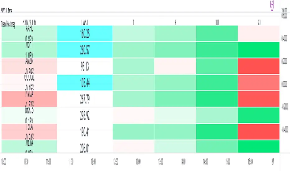
There is a gradient heatmap for the daily percentage change as well as another heatmap for each of the timeframe trends.
The two different forms of heatmap have separate settings so can have different colors and scaling if desired.
The trend used is Trading View's built in Supertrend and the gradient for the trend changes based on how far above or below that timeframe's trend the latest price currently is
It is recommended to place this in a separate pane and use it in the top left so it occupies the whole pane.
You can adjust the cell width and height to fit to your own chart window
Versionshinweise
Substantially revised the codeChoose from 3 to 8 symbols
(Note that because the relative.security function cannot be called from within an if statement I am currently unable to increase the symbol count higher than 8 due to the way the script uses that function)
Choose either 3 or 4 timeframes
Value details now on two lines instead of three so cell height can be reduced allowing more compact vertical footprint and eg allowing multiple copies of this table in a smaller space
That way you can look across more symbols in the same chart window
Added the option of user created custom names for each symbol - particularly useful if one or more of your symbols is based on a long formula that cannot be contained within a cell width
Introduced new coloring functionality for where the daily change or trend change crosses through zero. Users can now set the parameter for which the change will be considered neutral. This allows a wider band at which the neutral or crossover color will appear and can be used as a visual indicator for when the daily change or that timeframe trend is changing from bullish to bearish or vice versa
Versionshinweise
Minor Update v3Allow custom row 1 height to make this more compact
Move custom name input setting to its own row to make settings easier to view
Changed default widths to better illustrate how this can spread across the entire chart tab window
Versionshinweise
This is a correction of a typo that appeared in the script.ie a hotfix only
Versionshinweise
Split first column into two separate columns for readabilityThis helps significantly where the symbol's value has multiple decimal places or is otherwise quite long
Versionshinweise
Added some new functionality for the second column of the table.When the price of any table symbol is at or near its high or low for the day then this column will be colored (default is cyan for high of day and magenta for low of day).
The percentage difference between the current daily change the max daily change can also be customised so this new coloring will still apply even when the symbol price is not at the exact high or low of the day.
The idea is to clearly see which symbols are either at or very close to their highs or lows and for this not to be a momentary flash of color that disappears in a second
This may be helpful in terms of relative strength, weakness, trending and breakout conditions
Versionshinweise
Added the option to choose between percentage change from the open or percentage daily changeMinor code tidying up
Versionshinweise
Added ability to customize width and text size for column 2 independently of column 1Geschütztes Skript
Dieses Script ist als Closed-Source veröffentlicht. Sie können es kostenlos und ohne Einschränkungen verwenden – erfahren Sie hier mehr.
Haftungsausschluss
Die Informationen und Veröffentlichungen sind nicht als Finanz-, Anlage-, Handels- oder andere Arten von Ratschlägen oder Empfehlungen gedacht, die von TradingView bereitgestellt oder gebilligt werden, und stellen diese nicht dar. Lesen Sie mehr in den Nutzungsbedingungen.
Geschütztes Skript
Dieses Script ist als Closed-Source veröffentlicht. Sie können es kostenlos und ohne Einschränkungen verwenden – erfahren Sie hier mehr.
Haftungsausschluss
Die Informationen und Veröffentlichungen sind nicht als Finanz-, Anlage-, Handels- oder andere Arten von Ratschlägen oder Empfehlungen gedacht, die von TradingView bereitgestellt oder gebilligt werden, und stellen diese nicht dar. Lesen Sie mehr in den Nutzungsbedingungen.