Plots
Introduction
The plot() function is the most frequently used function used to display information calculated using Pine scripts. It is versatile and can plot different styles of lines, histograms, areas, columns (like volume columns), fills, circles or crosses.
The use of plot() to create fills is explained in the page on Fills.
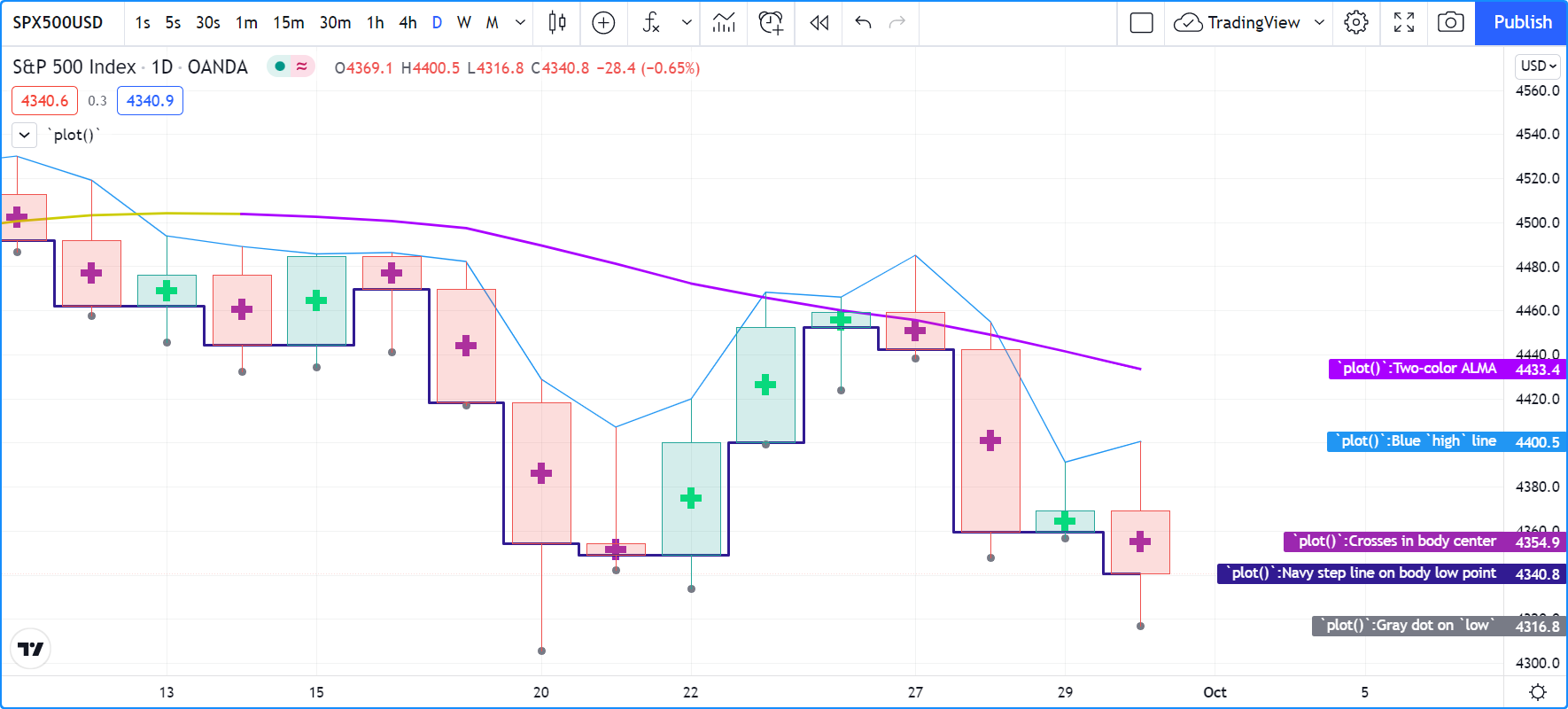
This script showcases a few different uses of plot() in an overlay script:
//@version=5
indicator("`plot()`", "", true)
plot(high, "Blue `high` line")
plot(math.avg(close, open), "Crosses in body center", close > open ? color.lime : color.purple, 6, plot.style_cross)
plot(math.min(open, close), "Navy step line on body low point", color.navy, 3, plot.style_stepline)
plot(low, "Gray dot on `low`", color.gray, 3, plot.style_circles)

color VIOLET = #AA00FF
color GOLD   = #CCCC00
ma = ta.alma(hl2, 40, 0.85, 6)
var almaColor = color.silver
almaColor := ma > ma[2] ? GOLD : ma < ma[2]  ? VIOLET : almaColor
plot(ma, "Two-color ALMA", almaColor, 2)
Note that:
- The first plot() call plots a 1-pixel blue line across the bar highs.
- The second plots crosses at the mid-point of bodies. The crosses are colored lime when the bar is up and purple when it is down.
The argument used for
linewidthis6but it is not a pixel value; just a relative size. - The third call plots a 3-pixel wide step line following the low point of bodies.
- The fourth call plot a gray circle at the bars’ low.
- The last plot requires some preparation. We first define our bull/bear colors, calculate an Arnaud Legoux Moving Average, then make our color calculations. We initialize our color variable on bar zero only, using var. We initialize it to color.silver, so on the dataset’s first bars, until one of our conditions causes the color to change, the line will be silver. The conditions that change the color of the line require it to be higher/lower than its value two bars ago. This makes for less noisy color transitions than if we merely looked for a higher/lower value than the previous one.
This script shows other uses of plot() in a pane:
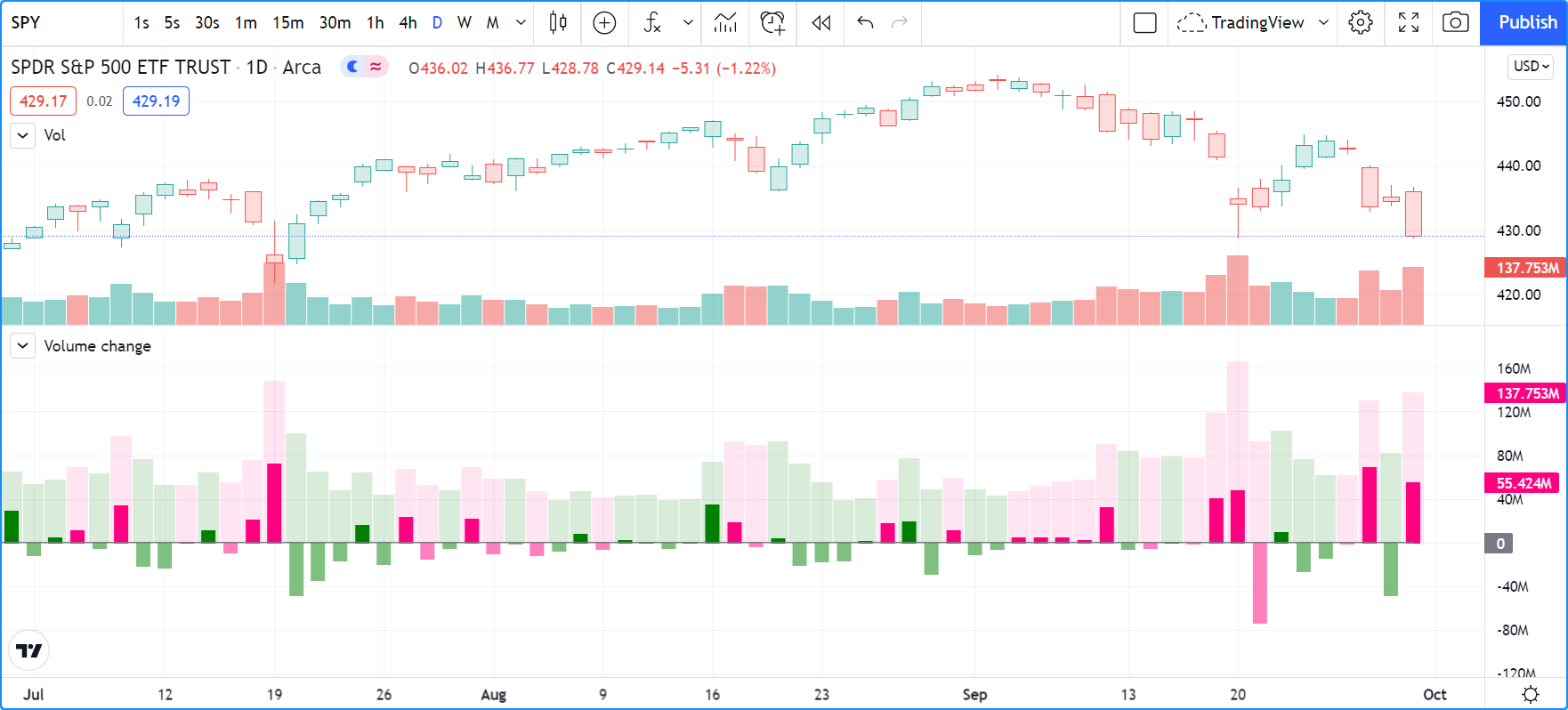
//@version=5
indicator("Volume change", format = format.volume)

color GREEN         = #008000
color GREEN_LIGHT   = color.new(GREEN, 50)
color GREEN_LIGHTER = color.new(GREEN, 85)
color PINK          = #FF0080
color PINK_LIGHT    = color.new(PINK, 50)
color PINK_LIGHTER  = color.new(PINK, 90)

bool  barUp = ta.rising(close, 1)
bool  barDn = ta.falling(close, 1)
float volumeChange = ta.change(volume)

volumeColor = barUp ? GREEN_LIGHTER : barDn ? PINK_LIGHTER : color.gray
plot(volume, "Volume columns", volumeColor, style = plot.style_columns)

volumeChangeColor = barUp ? volumeChange > 0 ? GREEN : GREEN_LIGHT : volumeChange > 0 ? PINK : PINK_LIGHT
plot(volumeChange, "Volume change columns", volumeChangeColor, 12, plot.style_histogram)

plot(0, "Zero line", color.gray)
Note that:
- We are plotting normal volume
values as wide columns above the zero line
(see the
style = plot.style_columnsin our plot() call). - Before plotting the columns we calculate our
volumeColorby using the values of thebarUpandbarDnboolean variables. They become respectivelytruewhen the current bar’s close is higher/lower than the previous one. Note that the “Volume” built-in does not use the same condition; it identifies an up bar withclose > open. We use theGREEN_LIGHTERandPINK_LIGHTERcolors for the volume columns. - Because the first plot plots columns, we do not use the
linewidthparameter, as it has no effect on columns. - Our script’s second plot is the change in volume, which we have calculated earlier using
ta.change(volume). This value is plotted as a histogram, for which thelinewidthparameter controls the width of the column. We make this width12so that histogram elements are thinner than the columns of the first plot. Positive/negativevolumeChangevalues plot above/below the zero line; no manipulation is required to achieve this effect. - Before plotting the histogram of
volumeChangevalues, we calculate its color value, which can be one of four different colors. We use the brightGREENorPINKcolors when the bar is up/down AND the volume has increased since the last bar (volumeChange > 0). BecausevolumeChangeis positive in this case, the histogram’s element will be plotted above the zero line. We use the brightGREEN_LIGHTorPINK_LIGHTcolors when the bar is up/down AND the volume has NOT increased since the last bar. BecausevolumeChangeis negative in this case, the histogram’s element will be plotted below the zero line. - Finally, we plot a zero line. We could just as well have used
hline(0)there. - We use
format = format.volumein our indicator() call so that large values displayed for this script are abbreviated like those of the built-in “Volume” indicator.
plot() calls must always be placed in a line’s first position, which entails they are always in the script’s global scope. They can’t be placed in user-defined functions or structures like if, for, etc. Calls to plot() can, however, be designed to plot conditionally in two ways, which we cover in the Conditional plots section of this page.
A script can only plot in its own visual space, whether it is in a pane or on the chart as an overlay. Scripts running in a pane can only color bars in the chart area.
`plot()` parameters
The plot() function has the following signature:
plot(series, title, color, linewidth, style, trackprice, histbase, offset, join, editable, show_last, display) → plot
The parameters of plot() are:
series- It is the only mandatory parameter. Its argument must be of “series int/float” type.
Note that because the auto-casting rules in Pine Script™ convert in the int 🠆 float 🠆 bool direction,
a “bool” type variable cannot be used as is; it must be converted to an “int” or a “float” for use as an argument.
For example, if
newDayis of “bool” type, thennewDay ? 1 : 0can be used to plot 1 when the variable istrue, and zero when it isfalse. titleRequires a “const string” argument, so it must be known at compile time. The string appears:
- In the script’s scale when the “Chart settings/Scales/Indicator Name Label” field is checked.
- In the Data Window.
- In the “Settings/Style” tab.
- In the dropdown of input.source() fields.
- In the “Condition” field of the “Create Alert” dialog box, when the script is selected.
- As the column header when exporting chart data to a CSV file.
color- Accepts “series color”, so can be calculated on the fly, bar by bar. Plotting with na as the color, or any color with a transparency of 100, is one way to hide plots when they are not needed.
linewidth- Is the plotted element’s size, but it does not apply to all styles. When a line is plotted, the unit is pixels. It has no impact when plot.style_columns is used.
styleThe available arguments are:
- plot.style_line (the default):
It plots a continous line using the
linewidthargument in pixels for its width. na values will not plot as a line, but they will be bridged when a value that is not na comes in. Non-na values are only bridged if they are visible on the chart. - plot.style_linebr: Allows the plotting of discontinuous lines by not plotting on na values, and not joining gaps, i.e., bridging over na values.
- plot.style_stepline: Plots using a staircase effect. Transitions between changes in values are done using a vertical line drawn in middle of bars, as opposed to a point-to-point diagonal joining the midpoints of bars. Can also be used to achieve an effect similar to that of plot.style_linebr, but only if care is taken to plot no color on na values.
- plot.style_area:
plots a line of
linewidthwidth, filling the area between the line and thehistbase. Thecolorargument is used for both the line and the fill. You can make the line a different color by using another plot() call. Positive values are plotted above thehistbase, negative values below it. - plot.style_areabr:
This is similar to plot.style_area
but it doesn’t bridge over na values.
Another difference is how the indicator’s scale is calculated.
Only the plotted values serve in the calculation of the y range of the script’s visual space.
If only high values situated far away from the
histbaseare plotted, for example, those values will be used to calculate the y scale of the script’s visual space. Positive values are plotted above thehistbase, negative values below it. - plot.style_columns:
Plots columns similar to those of the “Volume” built-in indicator. The
linewidthvalue does not affect the width of the columns. Positive values are plotted above thehistbase, negative values below it. Always includes the value ofhistbasein the y scale of the script’s visual space. - plot.style_histogram:
Plots columns similar to those of the “Volume” built-in indicator, except that the
linewidthvalue is used to determine the width of the histogram’s bars in pixels. Note that sincelinewidthrequires an “input int” value, the width of the histogram’s bars cannot vary bar to bar. Positive values are plotted above thehistbase, negative values below it. Always includes the value ofhistbasein the y scale of the script’s visual space. - plot.style_circles and
plot.style_cross:
These plot a shape that is not joined across bars unless
join = trueis also used. For these styles, thelinewidthargument becomes a relative sizing measure — its units are not pixels.
- plot.style_line (the default):
It plots a continous line using the
trackprice- The default value of this is
false. When it istrue, a dotted line made up of small squares will be plotted the full width of the script’s visual space. It is often used in conjuction withshow_last = 1, offset = -99999to hide the actual plot and only leave the residual dotted line. histbase- It is the reference point used with plot.style_area,
plot.style_columns and
plot.style_histogram.
It determines the level separating positive and negative values of the
seriesargument. It cannot be calculated dynamically, as an “input int/float” is required. offset- This allows shifting the plot in the past/future using a negative/positive offset in bars. The value cannot change during the script’s execution.
join- This only affect styles plot.style_circles or
plot.style_cross.
When
true, the shapes are joined by a one-pixel line. editable- This boolean parameter controls whether or not the plot’s properties can be edited in the “Settings/Style” tab.
Its default value is
true. show_last- Allows control over how many of the last bars the plotted values are visible. An “input int” argument is required, so it cannot be calculated dynamically.
display- The default is display.all.
When it is set to display.none,
plotted values will not affect the scale of the script’s visual space.
The plot will be invisible and will not appear in indicator values or the Data Window.
It can be useful in plots destined for use as external inputs for other scripts,
or for plots used with the
{{plot("[plot_title]")}}placeholder in alertcondition() calls, e.g.:
//@version=5
indicator("")
r = ta.rsi(close, 14)
xUp = ta.crossover(r, 50)
plot(r, "RSI", display = display.none)
alertcondition(xUp, "xUp alert", message = 'RSI is bullish at: {{plot("RSI")}}')
Plotting conditionally
plot() calls cannot be used in conditional structures such as if, but they can be controlled by varying their plotted values, or their color. When no plot is required, you can either plot na values, or plot values using na color or any color with 100 transparency (which also makes it invisible).
Value control
One way to control the display of plots is to plot na values
when no plot is needed. Sometimes, values returned by functions such as
request.security()
will return na values, when gaps = barmerge.gaps_on is used, for example.
In both these cases it is sometimes useful to plot discontinuous lines.
This script shows a few ways to do it:
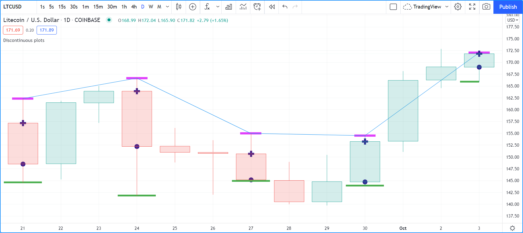
//@version=5
indicator("Discontinuous plots", "", true)
bool plotValues = bar_index % 3 == 0
plot(plotValues ? high : na, color = color.fuchsia, linewidth = 6, style = plot.style_linebr)
plot(plotValues ? high : na)
plot(plotValues ? math.max(open, close) : na, color = color.navy, linewidth = 6, style = plot.style_cross)
plot(plotValues ? math.min(open, close) : na, color = color.navy, linewidth = 6, style = plot.style_circles)
plot(plotValues ? low : na, color = plotValues ? color.green : na, linewidth = 6, style = plot.style_stepline)
Note that:
- We define the condition determining when we plot using
bar_index % 3 == 0, which becomestruewhen the remainder of the division of the bar index by 3 is zero. This will happen every three bars. - In the first plot, we use plot.style_linebr, which plots the fuchsia line on highs. It is centered on the bar’s horizontal midpoint.
- The second plot shows the result of plotting the same values, but without using special care to break the line. What’s happening here is that the thin blue line of the plain plot() call is automatically bridged over na values (or gaps), so the plot does not interrupt.
- We then plot navy blue crosses and circles on the body tops and bottoms. The plot.style_circles and plot.style_cross style are a simple way to plot discontinuous values, e.g., for stop or take profit levels, or support & resistance levels.
- The last plot in green on the bar lows is done using plot.style_stepline. Note how its segments are wider than the fuchsia line segments plotted with plot.style_linebr. Also note how on the last bar, it only plots halfway until the next bar comes in.
- The plotting order of each plot is controlled by their order of appearance in the script. See
This script shows how you can restrict plotting to bars after a user-defined date. We use the input.time() function to create an input widget allowing script users to select a date and time, using Jan 1st 2021 as its default value:
//@version=5
indicator("", "", true)
startInput = input.time(timestamp("2021-01-01"))
plot(time > startInput ? close : na)
Color control
The Conditional coloring section of the page on colors discusses color control for plots. We’ll look here at a few examples.
The value of the color parameter in plot() can be a constant,
such as one of the built-in constant colors or a color literal.
In Pine Script™, the qualified type of such colors is called “const color” (see the Type system page).
They are known at compile time:
//@version=5
indicator("", "", true)
plot(close, color = color.gray)
The color of a plot can also be determined using information that is only known when the script begins execution on the first historical bar of a chart
(bar zero, i.e., bar_index == 0 or barstate.isfirst == true), as will be the case when the information needed to determine a color depends on the chart the script is running on.
Here, we calculate a plot color using the syminfo.type built-in variable,
which returns the type of the chart’s symbol. The qualified type of plotColor in this case will be “simple color”:
//@version=5
indicator("", "", true)
plotColor = switch syminfo.type
    "stock"     => color.purple
    "futures"   => color.red
    "index"     => color.gray
    "forex"     => color.fuchsia
    "crypto"    => color.lime
    "fund"      => color.orange
    "dr"        => color.aqua
    "cfd"       => color.blue
plot(close, color = plotColor)
printTable(txt) => var table t = table.new(position.middle_right, 1, 1), table.cell(t, 0, 0, txt, bgcolor = color.yellow)
printTable(syminfo.type)
Plot colors can also be chosen through a script’s inputs. In this case, the lineColorInput variable is of the “input color” type:
//@version=5
indicator("", "", true)
color lineColorInput  = input(#1848CC, "Line color")
plot(close, color = lineColorInput)
Finally, plot colors can also be dynamic values, i.e., calculated values that can change on each bar. These values are of the “series color” type:
//@version=5
indicator("", "", true)
plotColor = close >= open ? color.lime : color.red
plot(close, color = plotColor)
When plotting pivot levels, one common requirement is to avoid plotting level transitions. Using lines is one alternative, but you can also use plot() like this:
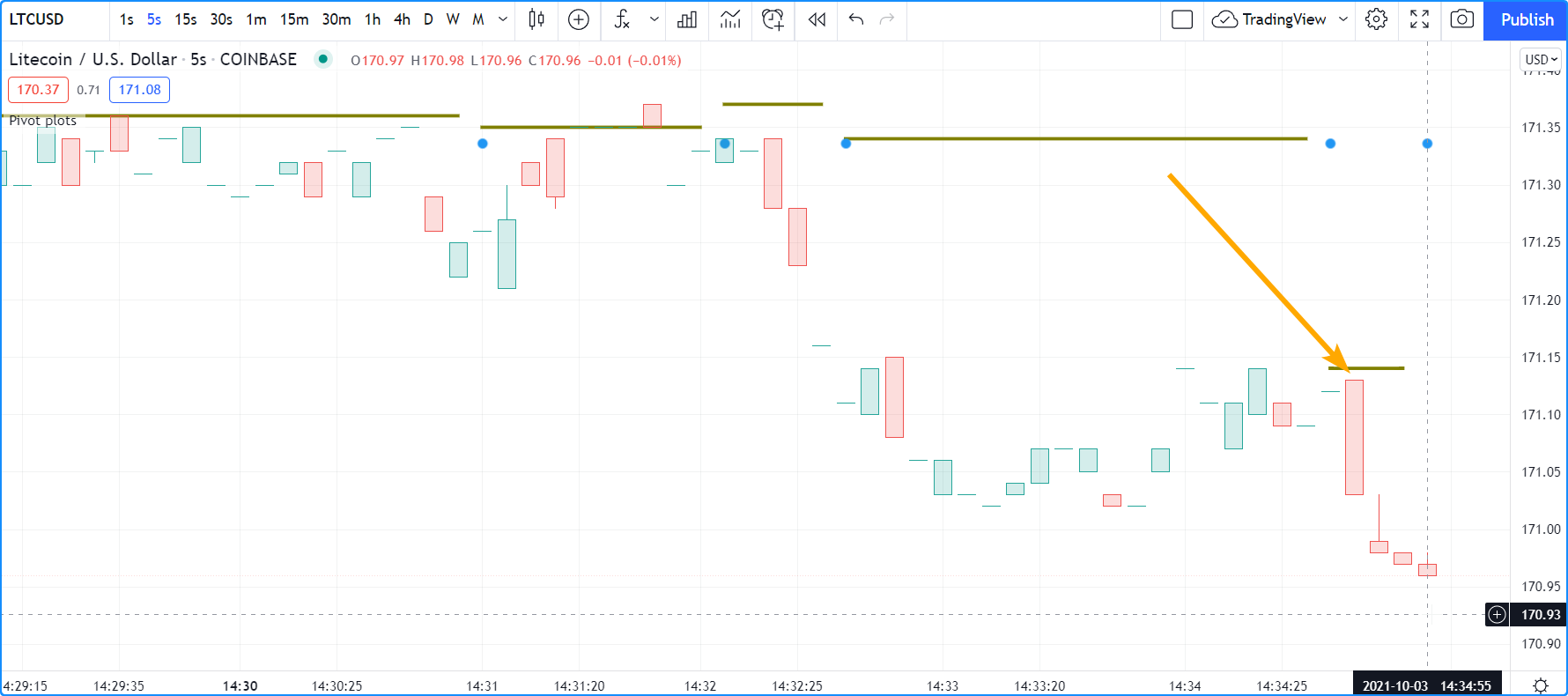
//@version=5
indicator("Pivot plots", "", true)
pivotHigh = fixnan(ta.pivothigh(3,3))
plot(pivotHigh, "High pivot", ta.change(pivotHigh) ? na : color.olive, 3)
plotchar(ta.change(pivotHigh), "ta.change(pivotHigh)", "•", location.top, size = size.small)
Note that:
- We use
pivotHigh = fixnan(ta.pivothigh(3,3))to hold our pivot values. Because ta.pivothigh() only returns a value when a new pivot is found, we use fixnan() to fill the gaps with the last pivot value returned. The gaps here refer to the na values ta.pivothigh() returns when no new pivot is found. - Our pivots are detected three bars after they occur because we use the argument
3for both theleftbarsandrightbarsparameters in our ta.pivothigh() call. - The last plot is plotting a continuous value, but it is setting the plot’s color to na when the pivot’s value changes, so the plot isn’t visible then. Because of this, a visible plot will only appear on the bar following the one where we plotted using na color.
- The blue dot indicates when a new high pivot is detected and no plot is drawn between the preceding bar and that one. Note how the pivot on the bar indicated by the arrow has just been detected in the realtime bar, three bars later, and how no plot is drawn. The plot will only appear on the next bar, making the plot visible four bars after the actual pivot.
Levels
Pine Script™ has an hline()
function to plot horizontal lines (see the page on Levels).
hline()
is useful because it has some line styles unavailable with plot(),
but it also has some limitations, namely that it does not accept “series color”,
and that its price parameter requires an “input int/float”, so cannot vary during the script’s execution.
You can plot levels with plot() in a few different ways. This shows a CCI indicator with levels plotted using plot():
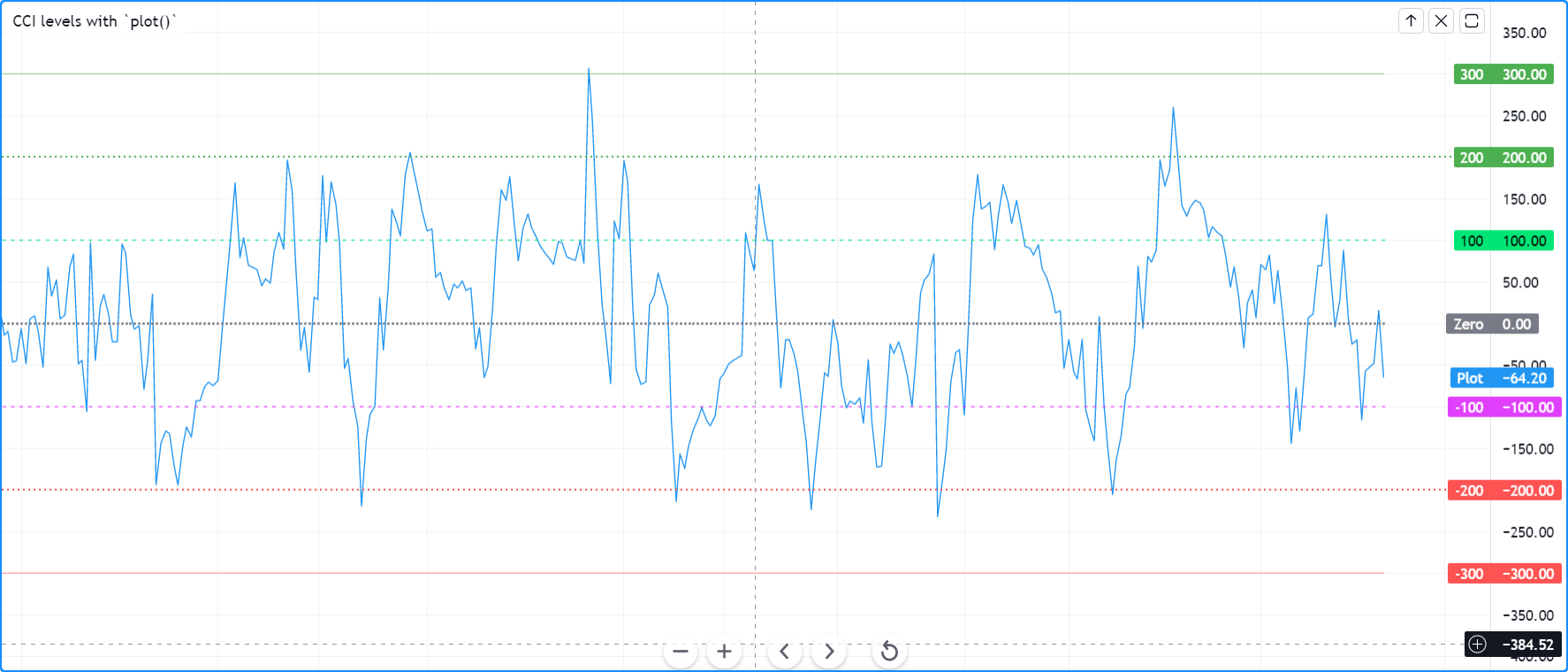
//@version=5
indicator("CCI levels with `plot()`")
plot(ta.cci(close, 20))
plot(0,  "Zero", color.gray, 1, plot.style_circles)
plot(bar_index % 2 == 0 ?  100 : na,  "100", color.lime, 1, plot.style_linebr)
plot(bar_index % 2 == 0 ? -100 : na, "-100", color.fuchsia, 1, plot.style_linebr)
plot( 200,  "200", color.green, 2, trackprice = true, show_last = 1, offset = -99999)
plot(-200, "-200", color.red,   2, trackprice = true, show_last = 1, offset = -99999)
plot( 300,  "300", color.new(color.green, 50), 1)
plot(-300, "-300", color.new(color.red, 50),   1)
Note that:
- The zero level is plotted using plot.style_circles.
- The 100 levels are plotted using a conditional value that only plots every second bar. In order to prevent the na values from being bridged, we use the plot.style_linebr line style.
- The 200 levels are plotted using
trackprice = trueto plot a distinct pattern of small squares that extends the full width of the script’s visual space. Theshow_last = 1in there displays only the last plotted value, which would appear as a one-bar straight line if the next trick wasn’t also used: theoffset = -99999pushes that one-bar segment far away in the past so that it is never visible. - The 300 levels are plotted using a continuous line, but a lighter transparency is used to make them less prominent.
Offsets
The offset parameter specifies the shift used when the line is plotted
(negative values shift in the past, positive values shift into the future). For example:
//@version=5
indicator("", "", true)
plot(close, color = color.red, offset = -5)
plot(close, color = color.lime, offset = 5)
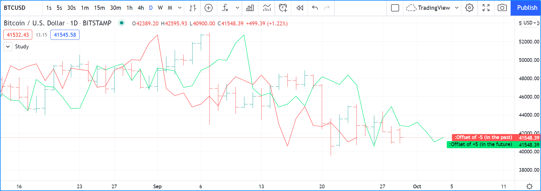
As can be seen in the screenshot, the red series has been shifted to the left (since the argument’s value is negative), while the green series has been shifted to the right (its value is positive).
Plot count limit
Each script is limited to a maximum plot count of 64.
All plot*() calls and alertcondition() calls
count in the plot count of a script. Some types of calls count for more than one in the total plot count.
plot()
calls count for one in the total plot count if they use a “const color” argument for the color parameter,
which means it is known at compile time, e.g.:
plot(close, color = color.green)
When they use another qualified type, such as any one of these, they will count for two in the total plot count:
plot(close, color = syminfo.mintick > 0.0001 ? color.green : color.red) //🠆 "simple color"
plot(close, color = input.color(color.purple)) //🠆 "input color"
plot(close, color = close > open ? color.green : color.red) //🠆 "series color"
plot(close, color = color.new(color.silver, close > open ? 40 : 0)) //🠆 "series color"
Scale
Not all values can be plotted everywhere. Your script’s visual space is always bound by upper and lower limits that are dynamically adjusted with the values plotted. An RSI indicator will plot values between 0 and 100, which is why it is usually displayed in a distinct pane — or area — above or below the chart. If RSI values were plotted as an overlay on the chart, the effect would be to distort the symbol’s normal price scale, unless it just hapenned to be close to RSI’s 0 to 100 range. This shows an RSI signal line and a centerline at the 50 level, with the script running in a separate pane:
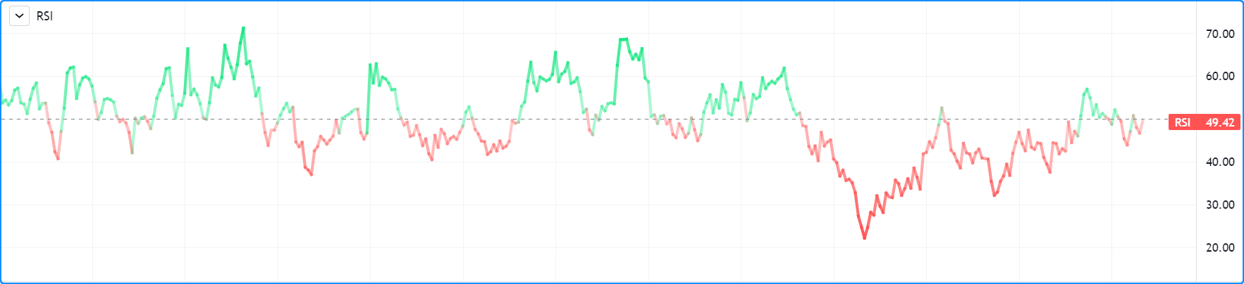
//@version=5
indicator("RSI")
myRSI = ta.rsi(close, 20)
bullColor = color.from_gradient(myRSI, 50, 80, color.new(color.lime, 70), color.new(color.lime, 0))
bearColor = color.from_gradient(myRSI, 20, 50, color.new(color.red,   0), color.new(color.red, 70))
myRSIColor = myRSI > 50 ? bullColor : bearColor
plot(myRSI, "RSI", myRSIColor, 3)
hline(50)
Note that the y axis of our script’s visual space is automatically sized using the range of values plotted, i.e., the values of RSI. See the page on Colors for more information on the color.from_gradient() function used in the script.
If we try to plot the symbol’s close values in the same space by adding the following line to our script:
plot(close)
This is what happens:
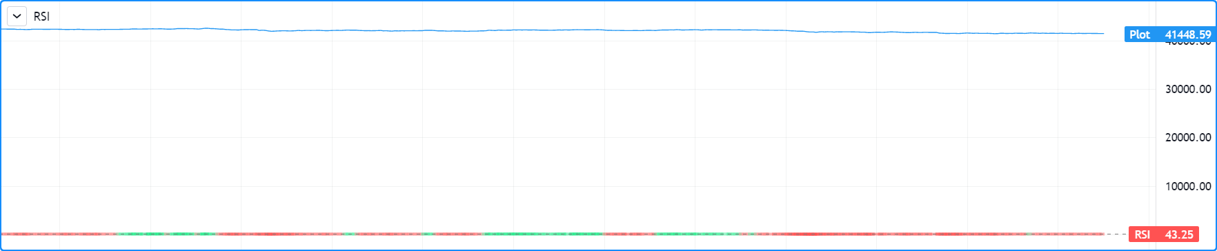
The chart is on the BTCUSD symbol, whose close prices are around 40000 during this period. Plotting values in the 40000 range makes our RSI plots in the 0 to 100 range indiscernible. The same distorted plots would occur if we placed the RSI indicator on the chart as an overlay.
Merging two indicators
If you are planning to merge two signals in one script, first consider the scale of each. It is impossible, for example, to correctly plot an RSI and a MACD in the same script’s visual space because RSI has a fixed range (0 to 100) while MACD doesn’t, as it plots moving averages calculated on price._
If both your indicators used fixed ranges, you can shift the values of one of them so they do not overlap. We could, for example, plot both RSI (0 to 100) and the True Strength Indicator (TSI) (-100 to +100) by displacing one of them. Our strategy here will be to compress and shift the TSI values so they plot over RSI:
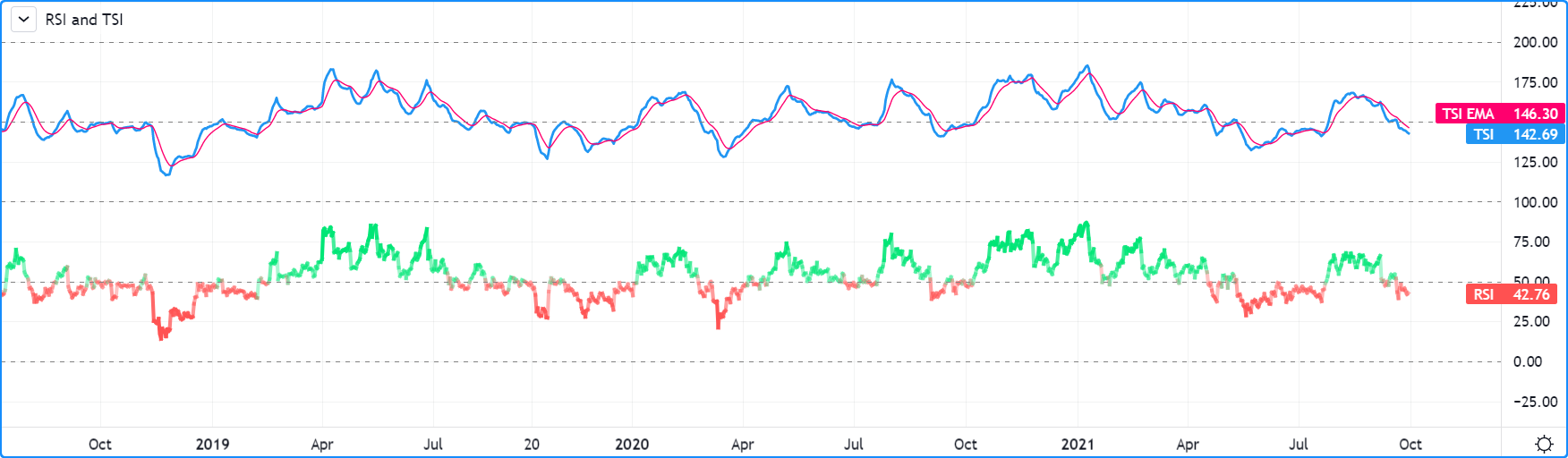
//@version=5
indicator("RSI and TSI")
myRSI = ta.rsi(close, 20)
bullColor = color.from_gradient(myRSI, 50, 80, color.new(color.lime, 70), color.new(color.lime, 0))
bearColor = color.from_gradient(myRSI, 20, 50, color.new(color.red,   0), color.new(color.red, 70))
myRSIColor = myRSI > 50 ? bullColor : bearColor
plot(myRSI, "RSI", myRSIColor, 3)
hline(100)
hline(50)
hline(0)

// 1. Compress TSI's range from -100/100 to -50/50.
// 2. Shift it higher by 150, so its -50 min value becomes 100.
myTSI = 150 + (100 * ta.tsi(close, 13, 25) / 2)
plot(myTSI, "TSI", color.blue, 2)
plot(ta.ema(myTSI, 13), "TSI EMA", #FF006E)
hline(200)
hline(150)
Note that:
We have added levels using hline to situate both signals.
In order for both signal lines to oscillate on the same range of 100, we divide the TSI value by 2 because it has a 200 range (-100 to +100). We then shift this value up by 150 so it oscillates between 100 and 200, making 150 its centerline.
The manipulations we make here are typical of the compromises required to bring two indicators with different scales in the same visual space, even when their values, contrary to MACD, are bounded in a fixed range.
